Printing Winning Perfect Bound Publications

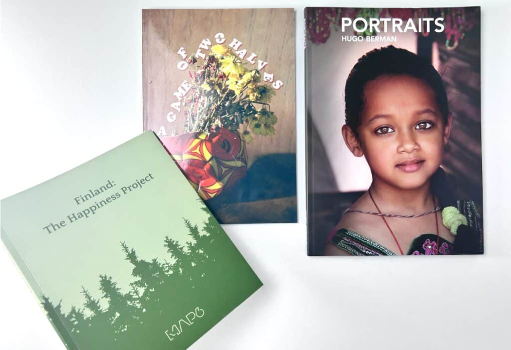
Styling A Perfect Bound Book at Ex Why Zed, the UK Print Company
You are about to enjoy and digest the following insight:
- Ex Why Zed, a UK print company, specialises in crafting unique and high-quality perfect bound zines.
- The process of creating a perfect bound zine involves careful selection of paper type, attention to the cover and inside pages specifications, and an understanding of the printing process.
- Showcased successful projects: a professional-looking self-promo portfolio, an impressive square format zine, a weighty photography zine, Ephemera Magazine, Moof Magazine, and Shooter Lit Mag.
- Important design tips include maintaining safe margins, ensuring visibility of spine text, and avoiding content loss in the gutter area.
- The second issue of Able Zine illustrates a successful launch of a new perfect bound zine with diverse cover options and engaging content.
- Cost-saving amendments can include switching the paper finish, adjusting the cover weight, changing the lamination, modifying the zine’s size, enhancing the inside pages, or adding extra features.
- Printing winning perfect bound publications requires patience, creativity, and continuous learning.
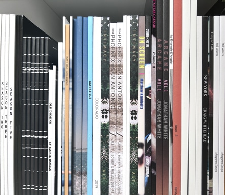
In the dynamic world of zine production, one factor always remains the same – the longing for a publication that seamlessly amalgamates quality, creativity, and affordability. As one of the leading UK print companies, Ex Why Zed has transformed this desire into reality, bringing to life an array of winning perfect bound zines over the years. This article will take you behind the scenes of our print production, showcasing some of our star performers that are not just high quality and cost-effective, but also adored by readers around the world.
Star Performers: Showcasing Perfect Bound Zines
A zine is more than just a medium of communication – it’s a representation of the creator’s artistic vision and identity. Let’s dive into our assembly line and see the champions that have made a difference.
Showcase 1: The Professional Portfolio
When you are looking for a professional-looking zine at a good unit price, ideal for a self-promo portfolio, our A5 Perfect Bound Books rise to the occasion. With a 4pp cover printed onto 300gsm uncoated and matt lamination on the outside, this model adds an air of professionalism to your portfolio. The 60pp text onto 115gsm uncoated and the four-colour print throughout ensure high-quality content delivery. The cost per copy decreases significantly with higher print runs, making it a cost-effective option.
Showcase 2: The Versatile Square Format Zine
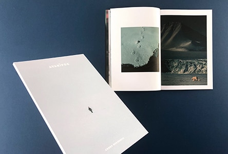
A versatile and impressive square format zine is perfect for an annual report or a photo set from a recent foreign trip. Our 210x210mm Perfect Bound Books are printed on a 4pp cover onto 300gsm uncoated, with matt lamination on the outer surface for a sleek finish. The 76pp text printed onto 170gsm silk offers a quality tactile experience, and the four-colour print throughout ensures vibrant image reproduction.
Showcase 3: The Weighty Photography Zine
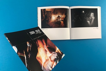
The exquisite weighty photography zine, ‘Intimacy’ by Ashton Thorp, is a perfect example of Ex Why Zed’s craftsmanship. The 4pp cover printed onto 300gsm uncoated and matt laminated to the outer, housing 160 inside pages printed onto 130gsm Silk, this four-colour printed zine not only captures Ashton’s photo sets from the last decade but also provides a substantial photo journal experience to the reader. The 9mm spine and an impressive landscape photo that wraps around the cover add a distinctive design appeal to this model.
If any of these champions fit your project bill, get a personalised quote from us. We are just an email away at hello@exwhyzed.fixed-staging.co.uk. In the world of zines, you pick, and we deliver!
Now that we have looked at some of the standard specifications, let’s delve into some other exceptional showcases.
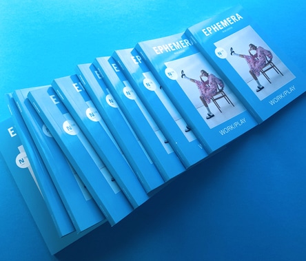
Showcase 4: The Evocative Ephemera Magazine Issue 7 & 8
An engrossing blend of art, photography, and insightful articles, Ephemera Magazine Issue 7 & 8 is a reader’s delight. With its perfect binding and unique design aesthetic, it is a model example of what Ex Why Zed can deliver.
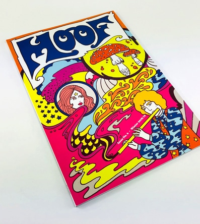
Showcase 5: The Captivating MOOF Magazine Issue 6
MOOF Magazine Issue 6 takes the reader on a psychedelic journey through music and art, bound together with Ex Why Zed’s perfect binding. The magazine’s eclectic content combined with our quality print production makes for a winning combo.
Showcase 6: The Engaging Shooter Literary Magazine
With its riveting collection of short fiction, non-fiction, and poetry, Shooter Literary Magazine is a testament to our perfect binding technique’s versatility.
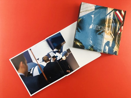
Showcase 7: The Vibrant New York by Sixstreetunder
This zine brings the city’s vibrance to life with its stunning photographs, perfectly bound to make each page a window to the city’s soul.
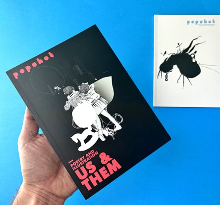
Showcase 8: The Enthralling Popshot Magazine
Popshot Magazine, with its captivating illustrations and engaging content, shines as a sterling example of our perfect binding prowess.
Unveiling the Art of Perfect Bound Book Design
As we move further, we delve into the nuances of perfect bound book design. Mastering these aspects will ensure your zine not only looks good on a shelf or a coffee table but also creates an immersive reading experience. In this section, we’ll provide professional tips, including insights from our guide to perfect binding set-up, to help you steer clear of common pitfalls and ensure your project achieves the aesthetic it deserves.
Consider Page Layout Carefully
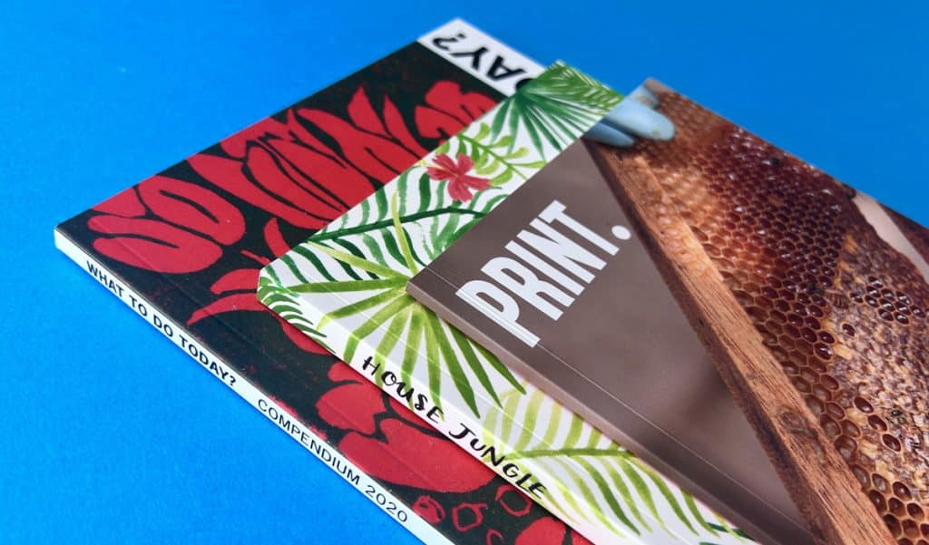
Designing a zine isn’t just about the cover; it’s about every page. Placing important content in the centre gutter can result in it being lost when the book is bound. To avoid this, we recommend using white borders or displaying one image per page. This approach ensures all content is easy to see, and your readers don’t have to strain their eyes or miss out on anything important.
Understanding Spine Width and Gutter Visibility
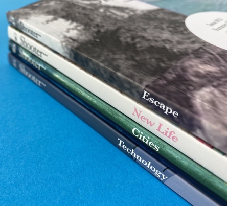
When it comes to designing perfect bound books, one of the key challenges is the narrow spine and the effect it can have on content visibility in the gutter. To counter this issue, it’s crucial to keep any content out of the seven-millimetre area of the cover hinge, ideally 12 millimetres plus from the side of the four affected pages. This ensures that your content remains visible, and nothing important disappears into the centre gutter.
Consider Alternative Binding Methods
While perfect binding offers a professional and polished look, other methods like stapling or wire stitching can sometimes be more suitable depending on the nature of your project. For instance, wire stitching can be an excellent alternative for thinner publications.
Enhancing Your Zine with Unique Features
Adding unique features to your zine can take it to the next level. Let’s look at some ideas using examples from our portfolio.
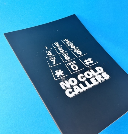
This zine showcases the power of a powerful cover design and uncoated paper, offering a unique feel that enhances the reading experience.
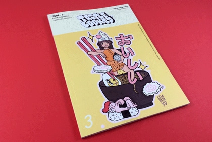
This issue of Triple Cooked exemplifies the effective use of vibrant colours and a balance of text and images for a captivating aesthetic.
Loyle Life
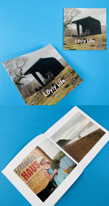
Expanding the lens of our showcase to bring you an inspiring piece of art that marries passion, culture, and craftsmanship, we bring you the ‘Loyle Life’ by the talented George Cory. This acclaimed photographer is known for his stark yet captivating compositions and a keen eye for detail. His work isn’t just photography; it’s storytelling at its most immersive, a characteristic that’s perfectly embodied in ‘Loyle Life’.
The ‘Loyle Life’ project is an exhilarating odyssey into the vibrant, pulsating heart of the British sauna culture. Through a series of evocative monochrome visuals, Cory deftly captures the unique camaraderie, warmth, and soulful rhythm that define this communal activity. Our Instagram post encapsulates the aesthetic brilliance of this project. From the perfectly timed shutter clicks to the meticulous arrangement of the elements, ‘Loyle Life’ exemplifies the power of print in telling compelling stories. With its visual brilliance and rich narrative, this project underlines why perfect bound zines are the preferred choice for photographers seeking to present their work in an aesthetically pleasing, high-quality format.
Launching and Refining Your Perfect Bound Zine
Now that you’ve got the basics down and explored design possibilities, it’s time to launch your zine into the world and consider cost-saving amendments to make your project even more economical. In this section, we’ll illustrate with a case study and provide tips to refine your print specs without compromising the zine’s appeal.
Launching a New Perfect Bound Zine: A Case Study
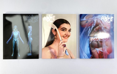
Launching a new zine can be exhilarating and daunting in equal measure. To inspire you, let’s take a look at Able Zine, a zine exploring the theme of the environment through the lens of disability and perspectives of the wider disabled community. The printed version offers a choice of five covers by various creatives, each packed with over 180 pages of content, images, and interviews. The glossy cover and carefully curated inside pages offer an engaging read while also emulating the look of high-fashion magazines.
Watch our short video guide on launching a perfect bound zine
A critical aspect of creating a winning zine is striking a balance between cost and quality. Here are some potential cost-saving amendments that can add value to your zine print specifications without breaking the bank:
- Switch the Finish: From uncoated to silk to make the images sharper and brighter. Silk is also cheaper.
- Modify the Cover Weight: Reducing the cover to 250gsm or 200gsm makes it easier to open, while increasing to 350gsm makes it more substantial and harder wearing.
- Change the Aesthetics: Switch to gloss lamination for a shiny aesthetic.
- Adjust the Size: Increase the size to A4 for more surface area for your images, or decrease the size to A5, A6 or 148x148mm to make it pocket-sized and cheaper to print.
- Enhance the Inside Pages: Increase the weight of the inside pages to 170gsm, making it more substantial and prestigious for the reader.
- Add Extra Features: Consider using Spot UV varnish, foil or embossing to highlight some content on the cover.
Crafting a winning perfect bound publication requires patience, creativity, and a keen eye for detail. At Ex Why Zed, we are passionate about providing our customers with the support they need to make their dream zines a reality. Whether you’re a seasoned pro or a budding zinester, we hope this guide has given you valuable insights and inspiration. Remember, the journey to crafting ‘winning perfect bound zines’ is a process of continuous learning and creativity – so, let’s embark on it together!


 Print Journey