210x148mm books
4pp cover onto 250gsm Silk
Matt laminated to outside
56 inside pages onto 130gsm Silk
Four colour print throughout
Trimmed, collated, and perfect bound
Step into the evocative world of ‘Of Kent: England Re-Opening’, a perfect bound photobook that captures the resilient spirit of Kent post-lockdown. Journey with author Marianne Dissard as her vivid photography and the artful printing by Ex Why Zed unfold in a compelling narrative. From the technical nuances of colour profiles to the precise spine measurements, discover how Ex Why Zed transformed Dissard’s vision into a tangible celebration of normality’s return. Experience a tale of two stories: the charming aesthetics of the photobook and the exemplary customer service that brought it to life.
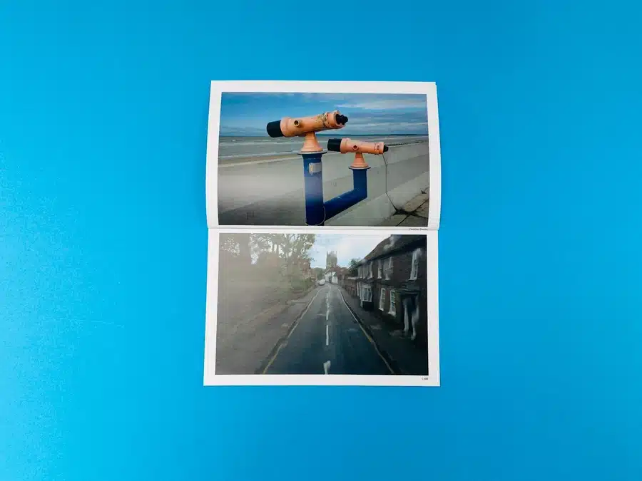
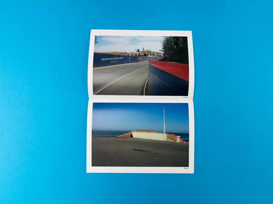
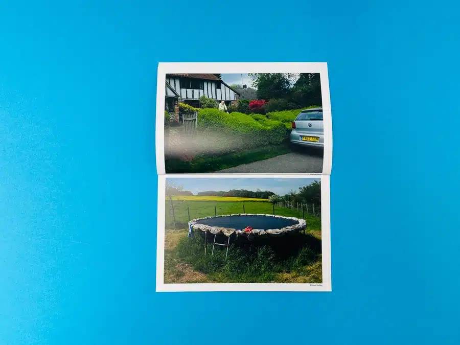
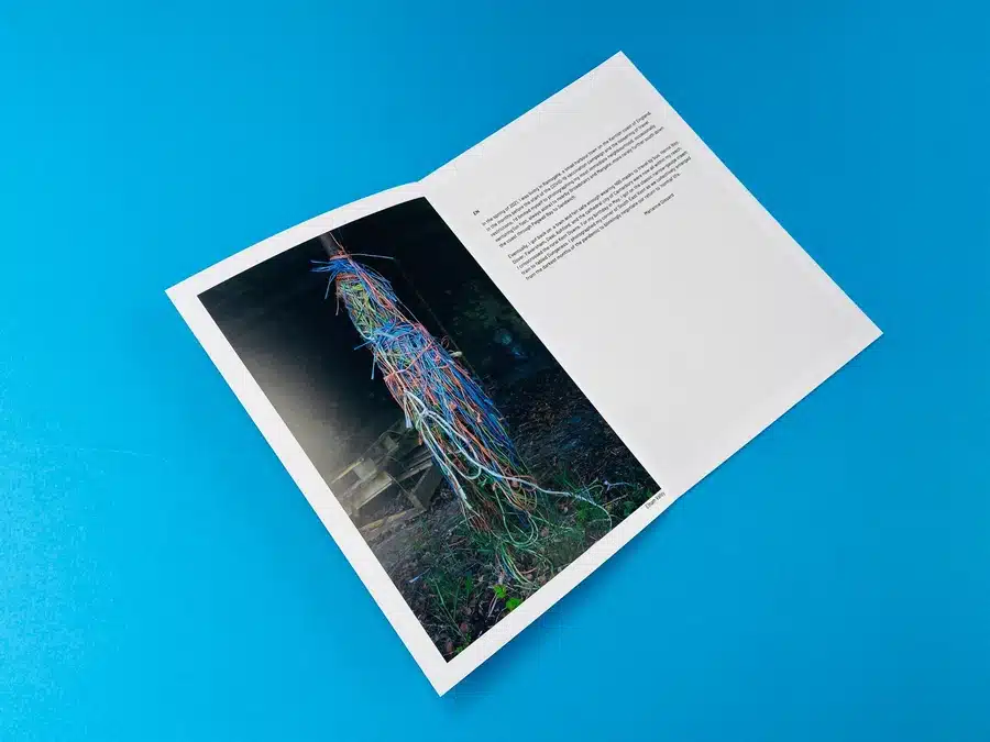
In the insightful photo journal Of Kent: England Re-Opening, Marianne Dissard casts a poignant light on the ordinary yet stirring facets of life along the Kentish coast. The 210×148.5mm perfect bound photobook is a tangible artefact of England’s emergence from the grips of the pandemic, breathing visual narrative into the newly ‘legal’ freedom as vaccinations began to usher in hope.
The book’s 56 silk pages ripple with Dissard’s keen eye for storytelling. Each photograph, a silent monologue of landscapes and faces, tells a story of resilience and tentative steps back to normalcy. Dissard navigates the spectrum of her artistry, encapsulating Dover’s cliffs and the unassuming charm of Herne Bay, as well as the domestic tranquillity of a backyard in Ramsgate.
The visual syntax of this photo zine is simple yet profound. The matte lamination of the cover is an apt choice, hinting at the tactile memories of pre-pandemic explorations. The design choices resonate with the thematic gravitas of the content, enabling the book’s physicality to complement its visual ethos seamlessly.
Amidst the colour and chaos of reawakening streets and fields, Dissard’s use of typography on the cover stands out—bold yet unobtrusive, much like the stoic English spirit. The colour palette, vibrant yet not overpowering, reflects the cautious optimism of a nation in healing.
The perfect binding, both literal and figurative, holds not just the pages but the collective breath of a region on the cusp of revival. It is a binding style that speaks to the permanence of the moments captured—a firm resolution after a tremulous pause.
Actionable Insights:
• Employ a restrained colour palette to evoke emotion subtly.
• Perfect binding can serve as a metaphor for cohesion and strength.
• Use typography to complement, not overpower, photographic narratives.
• Embrace minimalistic design to allow content to speak volumes.
• Let the book’s physicality echo its thematic essence.
Key Takeaways:
• Client engagement was courteous and focused on specific technical details.
• Ex Why Zed showcased expertise in guiding the author through the printing specifications.
• A collaborative problem-solving approach was employed throughout the interaction.
• The conversation moved efficiently from enquiry to approval of the final proof.
Marianne Dissard’s aspirations for her photobook ‘Of Kent: England Re-Opening’ were met with the supportive expertise of Ex Why Zed. The interaction began with a straightforward question regarding the colour profile suitable for the project, to which Ex Why Zed promptly advised the use of Fogra39. This initial exchange set the tone for a professional and solution-oriented dialogue.
As the conversation progressed, Dissard sought a spine template for her photobook, a request met with quick accommodation by Ex Why Zed. This exemplifies the company’s readiness to go beyond standard services, providing customised solutions. Despite an initial miscommunication regarding the number of pages, Ex Why Zed demonstrated remarkable attention to detail and patience, ensuring every aspect of the book’s design was clear and accurate.
The conversation highlights the mutual effort, with Dissard contributing significant work in Photoshop and Ex Why Zed meticulously rotating images to fit the portrait orientation of the book. The interaction is characterised by a shared enthusiasm for the project, underscored by Dissard’s words, “these things are a lot of work. But oh man, the fun!”
Ex Why Zed’s role was pivotal in transforming Dissard’s vision into a tangible product. Their keen oversight and detailed confirmations, such as the final price for printing, allowed for a smooth transition from concept to physical form. Furthermore, their provision of a proof link for final review before printing highlights their commitment to client satisfaction and quality assurance.
In concluding the project, Dissard’s approval of the proof reflects her satisfaction and trust in Ex Why Zed. The anticipation is palpable in her final approval, with a quick and positive response, “Good to go. Thanks for pulling it for a second review. Approved.”
In summary, the email interaction between Marianne Dissard and Ex Why Zed is a testament to the print company’s ability to meet an artist’s needs with expertise, adaptability, and a spirit of collaboration. It showcases Ex Why Zed not just as a service provider, but as a partner in the creative process, embodying the principles of good customer service and demonstrating expertise, authoritativeness, and trustworthiness.
‘Of Kent: England Re-Opening’ is more than a photobook; it’s a chronicle of human endurance through the lens of Marianne Dissard, masterfully brought to print by Ex Why Zed. The intricate details of the publication, from the silk pages to the perfect binding, reflect a triumph of design and execution. This case study delves into the heart of collaboration, showcasing the expertise and commitment of Ex Why Zed in producing a photobook that echoes the soul of Kent’s coastal life. It stands as a beacon for artists and designers seeking a print company that truly partners in the creative process, ensuring every page resonates with quality and intent.
