Winning Newspaper Style Ideas and Inspiration

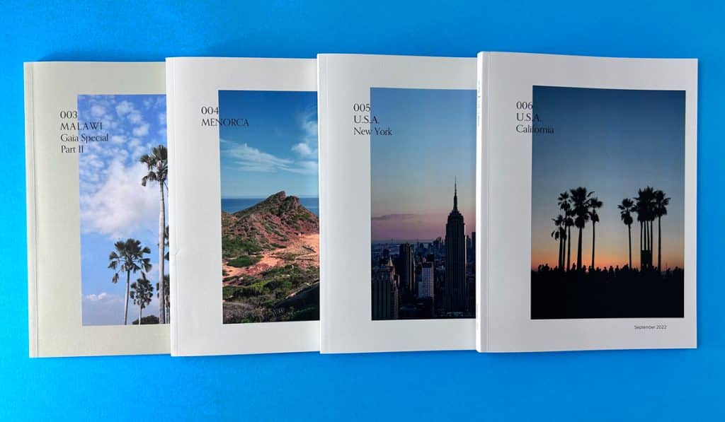
Extra, Extra! Read all about it! The world of newspaper design is vast, and it can be challenging to know where to start. Whether you’re a seasoned designer or just starting with newspaper design, this blog post is for you. We will take you through the fundamentals of newspaper design, from creating a strong headline to exploring innovative layout ideas. You’ll also learn how to master the inner page layout and maintain consistency across pages. We’ll provide tips on dos and dont’s of newspaper design and share tried-and-tested strategies for success.
But that’s not all – we’ll also delve into the importance of creativity in newspaper printing and design. A unique and eye-catching layout is essential in today’s competitive market. So let’s get started on this journey to winning newspaper style ideas and inspiration!
Understanding the Fundamentals of Newspaper Design
When it comes to newspaper design, understanding the fundamentals is crucial. The grid layout serves as the backbone of a well-designed newspaper, organising content in a visually appealing and structured manner. Captivating headlines play a vital role in grabbing the reader’s attention and enticing them to delve further into the articles. Achieving a cohesive design involves striking a balance between editorial content and advertisements, ensuring a seamless reading experience. Subheads act as signposts, guiding readers through the main text and enhancing comprehension. Typography also plays a significant role in newspaper design, enhancing readability and setting the tone for the publication. By mastering these fundamentals, publishers can create visually appealing and engaging newspapers that captivate their readers.

Subheads and their Role in Engagement
Enhancing readability and page scanning is a breeze with well-crafted subheadings. These informative and engaging subheads break up content, creating a hierarchy of information that guides readers through the text. Subheads offer the perfect opportunity to tease upcoming sections, keeping readers engaged and intrigued. So, whether you’re publishing in The New York Times or a local newspaper, don’t underestimate the power of subheads in capturing and retaining your reader’s attention. They’re the secret sauce to winning newspaper styles.
The Art and Science Behind Layout and Flow
Mastering the art and science of newspaper layout and flow involves understanding the psychological impact it has on reader engagement. By employing visual hierarchy, you can guide readers through the content, ensuring they don’t miss important information. Strategic use of white space creates a clean and organised layout, enhancing readability. Balancing text and imagery is crucial for an aesthetically pleasing design that captures the reader’s attention. So, whether you’re publishing in The New York Times or creating your own newspaper, mastering layout and flow is essential to capture and maintain your reader’s attention.
Highlighting Our Winning Newspaper Prices ?
380x289mm Newspapers
Staple Bound and Ready to Distribute
- 24 Printed Pages
- Full Colour Printing
- 100gsm Silk, Gloss or Uncoated
- Order 100 for £439
A3 Stapled Newspapers
Promote Your Brand to a New Audience
- 16 Printed Pages
- Full Colour Printing
- 100gsm Silk, Gloss or Uncoated
- Order 1000 for £1070
245x172mm Mini Papers
Ideal for University Student Hand Outs
- 32 Printed Pages
- Full Colour Printing
- 100gsm Silk, Gloss or Uncoated
- FREE UK Delivery
Winning Newspaper Styles: Drawing Inspiration from the Greats
Crafting Your Unique Print Voice
Dive into the rich tapestry of newspaper history and discover how design has evolved over the centuries. From the refined elegance of broadsheets to the punchy appeal of tabloids, every style tells a story.
At the heart of our ethos at Ex Why Zed lies the belief that every newspaper should be as unique as its creator. Let’s explore how you can harness the power of design to make your mark in the world of print.
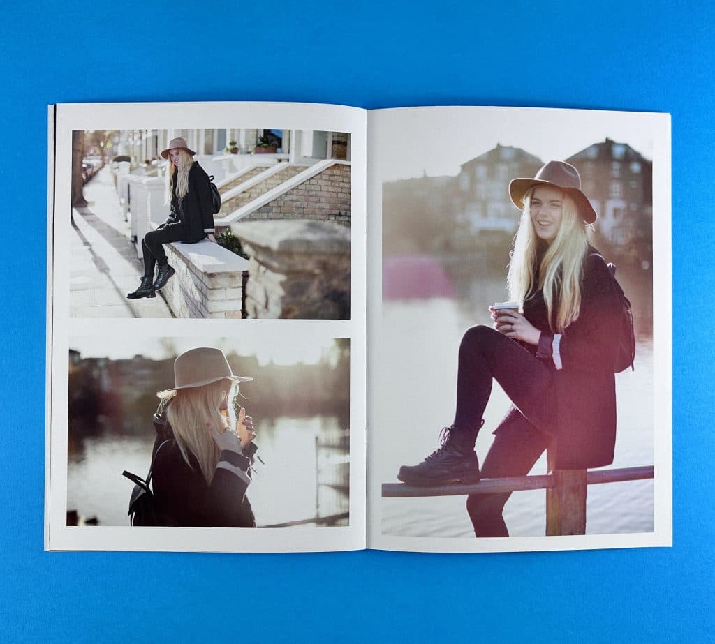
Global Inspirations: Newspapers that Define Excellence
The Telegraph (UK): Best At: In-depth analysis and authoritative commentary. Iconic Because: A British institution since the 19th century, The Telegraph has consistently delivered quality journalism, earning a reputation for reliability. Graphic Design Standout: Elegance meets functionality. Their design balances tradition with modern aesthetics, making the newspaper both visually appealing and easy to navigate.
La Repubblica (Italy): Best At: Dynamic reporting with a European touch. Iconic Because: Established in the 1970s, La Repubblica quickly became a staple for Italian readers, known for its fearless journalism and liberal stance. Graphic Design Standout: A lively blend of Italian flair and structured design. The newspaper seamlessly incorporates vibrant images with its fluid typography.
The Hindu (India): Best At: Comprehensive coverage with a South Asian perspective. Iconic Because: As one of India’s oldest newspapers, The Hindu is revered for its balanced reporting and insightful analysis. Graphic Design Standout: A classic design that places emphasis on content. The layout is organized, with clear sections and a harmonious colour palette.
El País (Spain): Best At: Reporting Spanish news with a global context. Iconic Because: Spain’s leading newspaper is known for its investigative journalism and its commitment to democratic values. Graphic Design Standout: A blend of modern European design with traditional elements. The use of imagery is particularly striking, often telling a story in its own right.
Sydney Morning Herald (Australia): Best At: Combining Australian news with global insights. Iconic Because: A staple for Australians, the SMH is renowned for its independent journalism and in-depth analyses. Graphic Design Standout: Fresh and vibrant. The design captures the Australian spirit, with bold headlines and a breezy layout.
The Anatomy of a Winning Newspaper Cover Design
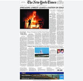
When it comes to styling for print perfection, the cover design is key and there are several key elements to consider. First and foremost, the cover needs to be visually appealing in order to grab the reader’s attention. This can be achieved through the use of eye-catching colours, typography, and layout.
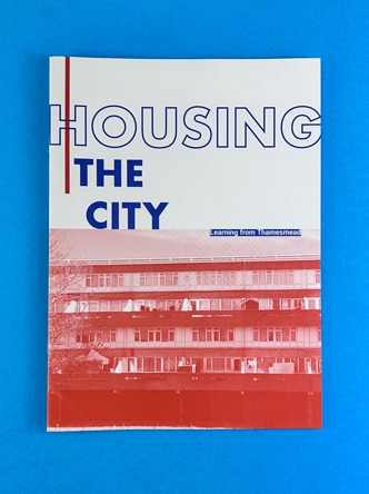
One of the most important aspects of a newspaper cover is the main headline. It should capture the essence of the front page story and entice readers to delve further into the publication. A compelling headline can make all the difference in attracting readers and piquing their curiosity.
In addition to a strong headline, the use of compelling images or illustrations on the cover can greatly enhance its appeal. Visuals have the power to convey information quickly and effectively, drawing readers in and enticing them to explore the content further.
Furthermore, it is crucial to design a cover that reflects the tone and theme of the publication. A cohesive and consistent aesthetic helps to build brand recognition and loyalty among readers.
Lastly, incorporating NLP terms, can add an extra layer of engagement to the cover lines and teasers. These terms not only optimise the content for search engines but also demonstrate a deep knowledge of the industry.
The Impact of Font Size on Readership
Your font size plays a crucial role in capturing readers’ attention and ensuring readability. Different age groups have varying levels of visual acuity, so it’s important to choose font sizes that cater to their needs. Larger font sizes are ideal for headlines as they grab readers’ attention and entice them to read further. Experimenting with font sizes can create visual interest and hierarchy in the layout, making the content more engaging. Customising font sizes based on the target audience and publication style is essential for a cohesive design.
Exploring Innovative Layout Ideas
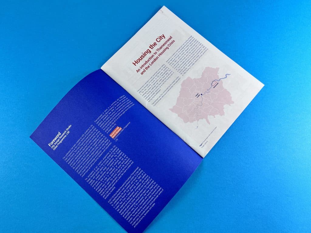
Designing newspaper for print relies on thinking outside the box and creating unique and visually stunning layouts. Embracing asymmetry and unconventional grids can give your newspaper a modern and dynamic look. To engage readers, consider incorporating interactive elements or multimedia into your layout. However, it’s important to strike a balance between creativity and usability to ensure a seamless reading experience. By pushing boundaries and exploring innovative layout ideas, you can create a newspaper that captures the reader’s attention and keeps them coming back for more.
Mastering the Inner Page Layout
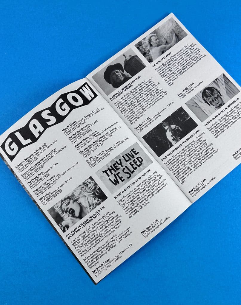
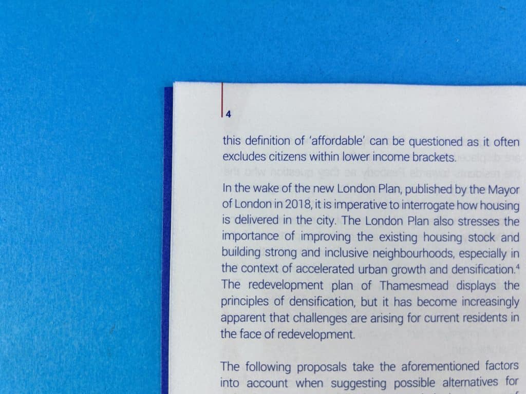
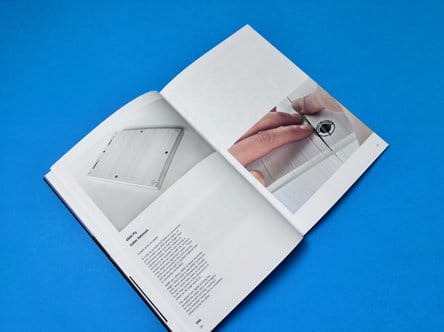
There are several strategies that can help create a seamless flow from the cover. Consistency is key, so maintaining the same typography, colour scheme, and overall style throughout the publication is important. Page numbers, like you see on the image here can guide the reader through the newspaper and also act as a vehicle for you to reference back to in a Contents page. Effective use of columns and alignment can help organise the content and make it more reader-friendly. Incorporating pull quotes and sidebars can highlight important information and grab the reader’s attention.
The Balance between Text, Paragraphs and Imagery
Finding the perfect equilibrium between text and visuals is crucial for captivating reader’s attention. High-quality images that complement and enhance the written content can elevate the overall visual appeal of the newspaper. Infographics and data visualisations are effective tools for presenting complex information in a digestible format. Experimenting with different image placement and sizing options adds visual impact and creates a dynamic reading experience. The balance between text and imagery is the key to creating an engaging and visually appealing newspaper layout.
How to Maintain Consistency Across Pages
Consistency is key when it comes to maintaining a cohesive visual identity throughout your newspaper publication. By utilising design elements that are consistent across pages, you can establish a strong and recognisable brand presence. One way to achieve this is through the use of style guides, which ensure uniformity in typography and colour palette. Additionally, applying consistent spacing, margins, and alignment throughout the publication creates a sense of coherence. Incorporating recurring design elements or motifs further enhances brand recognition.
The Dos and Don’ts of Newspaper Design
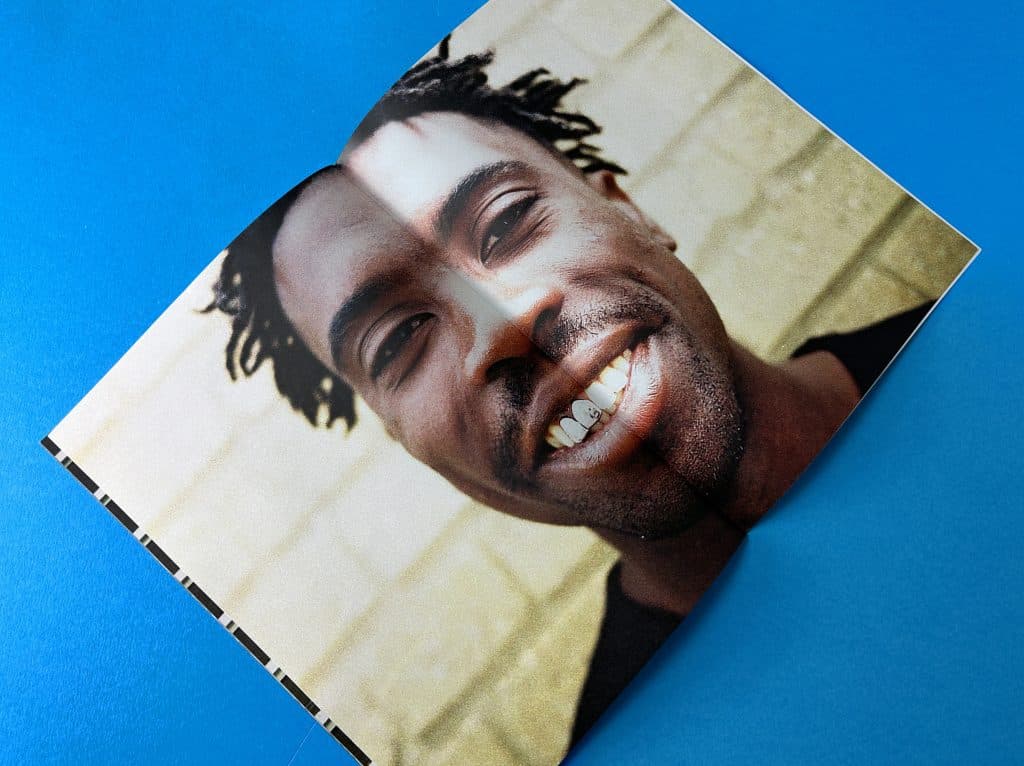
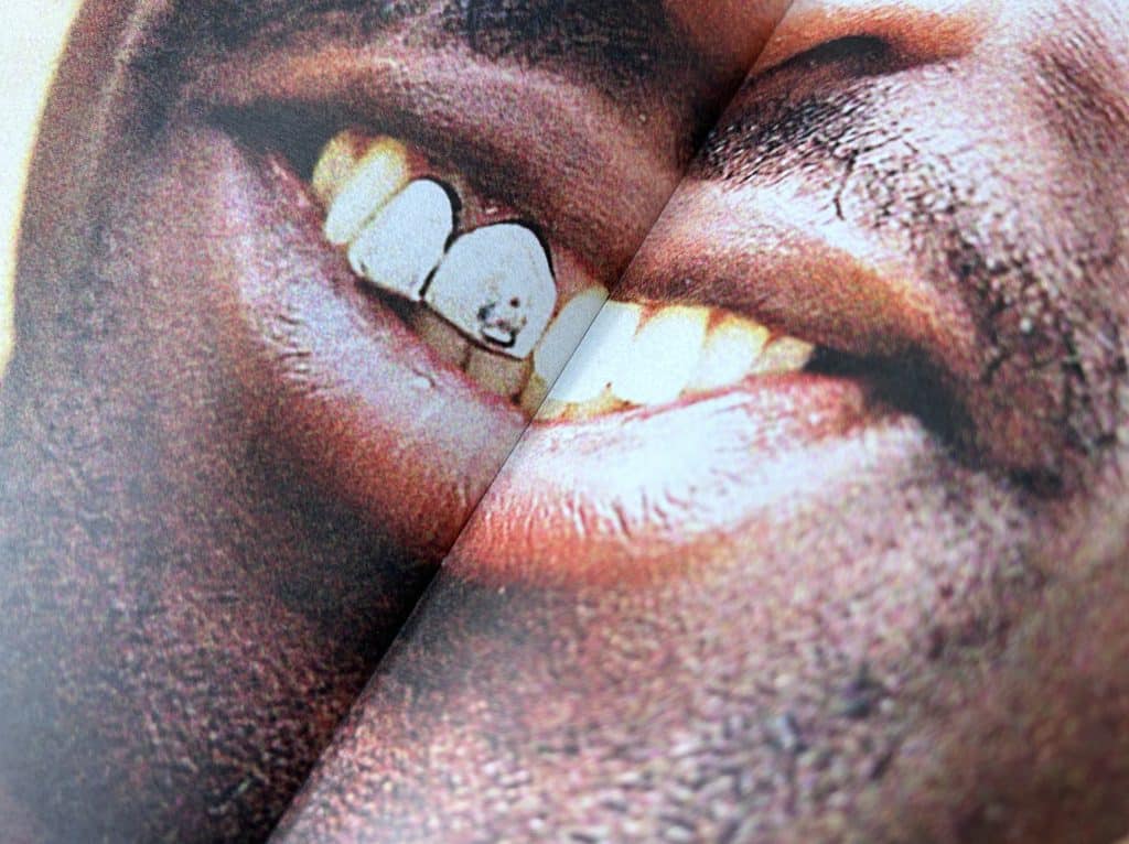
There is a small spine gutter on a stapled newspaper, where a fraction of the content is slightly obscured. This only tends to be around 1mm though. You can see on the image here there is a double page spread image and the mouth is right on the page join.
Simplicity in design is key to ensuring easy navigation for readers. Avoid cluttered layouts that overwhelm them, instead focusing on clean and organised designs. Proper use of white space enhances readability, allowing the eyes to rest and absorb information more easily. Consistent use of fonts and colours throughout the newspaper maintains visual harmony and helps establish a cohesive brand identity. Remember, a well-designed newspaper layout will engage readers and keep them coming back for more.
Top Mistakes to Avoid in Newspaper Design
There are several common mistakes that should be avoided. One of the key mistakes is overcrowding the front page with too many elements. This can overwhelm readers and make it difficult for them to find the information they’re looking for. Another mistake to steer clear of is using too many different font styles. This can be distracting and make the design appear messy. It’s also important to have a clear hierarchy of information, ensuring that the most important stories or headlines are easily distinguishable. Additionally, long paragraphs should be avoided as they can make the content difficult to read. Breaking them into smaller chunks promotes better readability. Lastly, don’t forget to proofread for any spelling or grammatical errors. These mistakes can undermine the credibility of the publication. By avoiding these common pitfalls, newspaper designers can create more visually appealing and reader-friendly layouts.
The Grid Layout – A Tried and Tested Strategy for Success
To create winning newspaper styles, it’s essential to implement tried and tested strategies for success. One effective strategy is using grid systems to achieve an organised and structured layout. Grid systems help maintain consistency and make it easier for readers to navigate through the newspaper. Another strategy is incorporating visually appealing images that grab the reader’s attention and enhance engagement.
Balancing the placement of imagery and text is also crucial for a harmonious look. By following editorial guidelines, such as consistent formatting, newspapers can establish a professional and polished appearance. Finally, understanding your target audience and catering to their interests ensures that the content resonates with readers.
How does Creativity Influence Newspaper Design?
Creativity plays a significant role in newspaper design. Unique layouts, typography, and illustrations capture readers’ attention and enhance storytelling. Innovative colour schemes create a memorable reading experience, while thinking outside the box helps newspapers stand out from the competition.
Why is a Unique, Eye-Catching Design Essential?
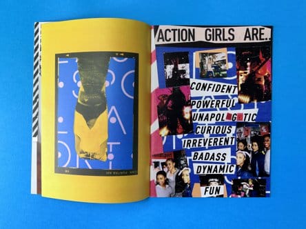
Creating a unique and eye-catching design for newspapers is essential for several reasons. Firstly, it helps establish the brand identity of the newspaper. Secondly, eye-catching designs attract more readers and increase circulation. Additionally, standout designs are more likely to be shared on social media, giving the newspaper more exposure. Lastly, unique designs differentiate newspapers from online sources and create a lasting impression on readers.
The Back Cover
Newspaper design is an art that combines creativity, knowledge, and strategy to create engaging and visually appealing content. From the impactful headline to the layout and flow, every element plays a crucial role in capturing the reader’s attention. The cover design sets the tone for the entire newspaper, with font size and innovative layout ideas making a big impact. Inner page layout requires a balance between text and imagery, while maintaining consistency across pages. To ensure success, it’s important to avoid common mistakes and follow tried and tested strategies. Lastly, creativity is key in newspaper design, as it helps create a unique and eye-catching design that stands out from the crowd. So, let your imagination run wild and create winning newspaper designs that captivate readers.
380x289mm Newspapers
Staple Bound and Ready to Distribute
- 24 Printed Pages
- Full Colour Printing
- 100gsm Silk, Gloss or Uncoated
- Order 100 for £439
A3 Stapled Newspapers
Promote Your Brand to a New Audience
- 16 Printed Pages
- Full Colour Printing
- 100gsm Silk, Gloss or Uncoated
- Order 1000 for £1070
245x172mm Mini Papers
Ideal for University Student Hand Outs
- 32 Printed Pages
- Full Colour Printing
- 100gsm Silk, Gloss or Uncoated
- FREE UK Delivery


