Love the Print Spec? Note it down and we can quote the same for your next project ?
240x170mm Books
4pp Cover onto 300gsm Silk
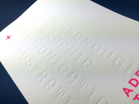
Soft Touch Lamination and Debossing to outer cover
One spot colour double sided
162pp Text onto 120gsm Uncoated
Four colour throughout
Trimmed, collated and perfect bound
Ah the Loughborough Graphic Communication and Illustration catalogue from 2016…pretty much as good as it gets for a degree show catalogue!
Early in April we entered into discussions with Leah bravo and Lily Scowen who were keen to put Loughborough’s course on the UK map. After all, their Uni had just been voted number 2 for design and arts in the Guardian league tables.
https://www.theguardian.com/education/ng-interactive/2016/may/23/university-league-tables-2017#S410
They had a strong vision from the outset and we matched their ideas against a range of print options. An initial set of quotes was supplied for an all-singing all-dancing catalogue down to a more light weight, budget friendly offering. A liquid email conversation helped refine the spec to the budget and a brilliant combination of options was agreed.
Recipe for success
So what makes this the best catalogue we printed in 2016?
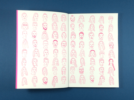
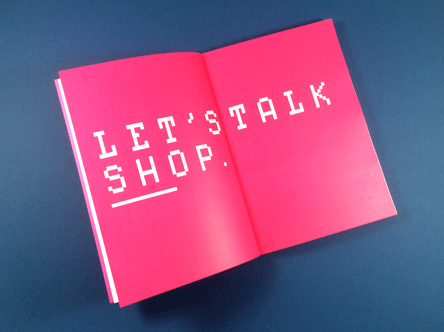
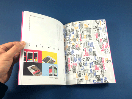
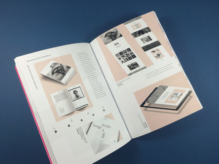
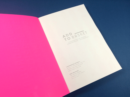
Well, let’s judge a book by its cover!…this is super slick with soft touch lamination, fluorescent spot colour and debossed course title. It’s a sensory overload. Visually striking and intriguing to the touch as well. Inside the uncoated papers form a surprising contrast to the cover. The size offers plenty of room for each student to present their work as a spread. There are some rules for the layout: the position of some core elements, the title font and body font size but the rest of the page is a lucid structure dictated by each student.
The font size is small but legible, it is a graphic design catalogue not a children’s book. There is also generous leading meaning the paragraphs have room to breathe and don’t overload the reader.
We delivered the finished catalogues in plenty of time for the students to vacuum pack them ready to send out to London agencies and present at their shows.
