A6 Booklets
4pp Cover onto 300gsm Uncoated
Matt Lamination to outer
36pp Text onto 150gsm Uncoated
Four colour print throughout
Trimmed, collated and wire stitched
Discover the journey of ‘The Reduction Series’, an A6 booklet printing triumph by Thrown Contemporary Gallery that marries artistic finesse with print perfection. This case study delves into the collaborative process between the gallery and Ex Why Zed, revealing the meticulous care in bringing Nadire Gokmen’s vision into a tangible form. Witness the blend of fine art with high-quality custom art book printing that elevated the exhibition to new heights.
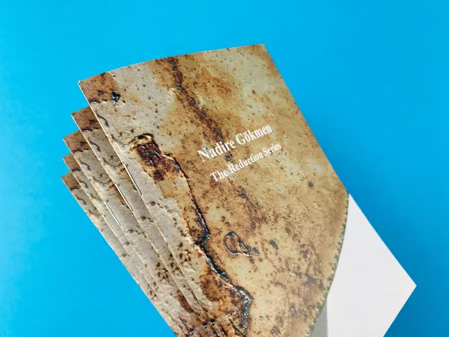
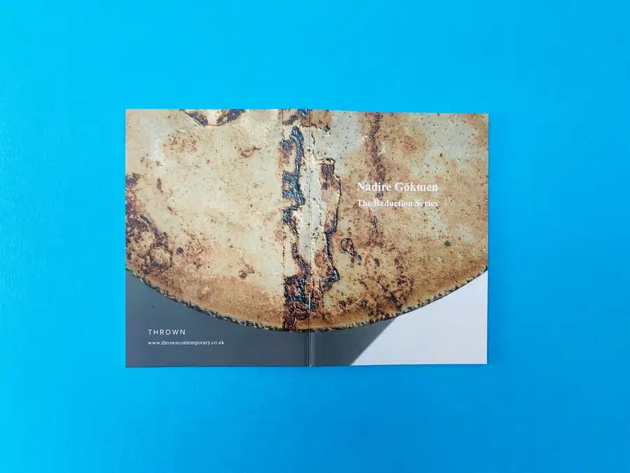
The Reduction Series immediately strikes a chord with its minimalist cover design, which confidently carries the textured abstraction of Nadire Gokmen’s artwork. The choice of a rustic, earth-toned palette subtly communicates the organic and reductionist approach that is central to Gokmen’s work. The visual impact is immediate, yet it allows the observer’s eye to wander and engage with the textural details that suggest a deeper exploration of the materiality in her art.
In terms of typography, the decision to employ a clean, sans-serif font enhances the contemporary feel of the booklet. It complements the artwork without competing for attention, maintaining a harmonious balance between word and image. This typographic treatment resonates with the thematic intention of the series, serving as a quiet yet firm guide through the artist’s conceptual landscape.
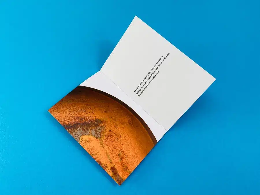
Each page of the booklet is a testament to deliberate design choices that resonate with the thematic elements of the series. The wire stitching binding is not merely a method of assembly but echoes the raw, exposed nature of Gokmen’s work. It’s a physical manifestation of the ‘reduction’ process, stripping down to the essentials yet holding everything together with an understated elegance.
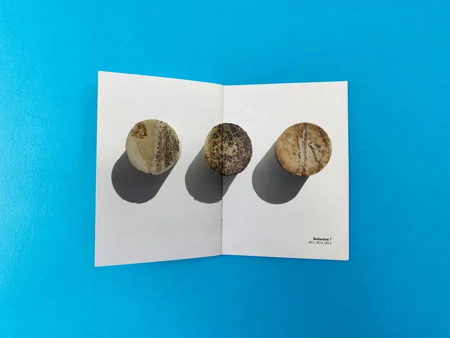
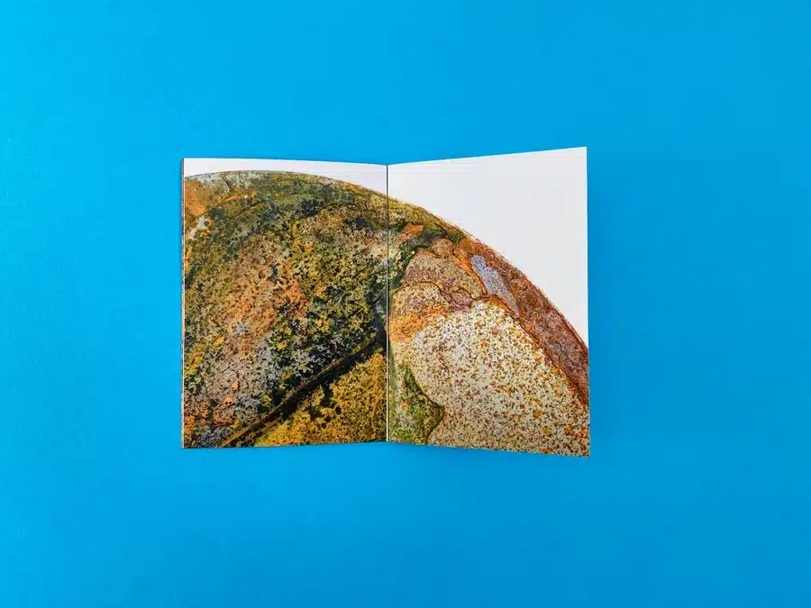
The colour palette used throughout the pages of the booklet is reminiscent of Gokmen’s palette knife on canvas, scraping and layering to reveal hues that tell a story. The vibrancy of the prints inside the booklet is testament to the high-quality colour reproduction, ensuring that the viewer’s experience is as close to the original artwork as possible. It’s a dance of CMYK that replicates the artist’s original RGB intentions with fidelity and grace.
The choice of an A6 size is particularly striking, offering an intimate experience that invites personal reflection. Its portability speaks to the gallery’s understanding of the modern art enthusiast’s lifestyle, seamlessly blending into a world where art is not just observed but carried, shared, and discussed in diverse settings.
The page layout within the booklet is a masterclass in storytelling. Each spread is carefully curated to present the artworks in a way that both narrates and invites dialogue. The use of white space is not empty but rather a canvas that allows the viewer’s imagination to engage with the pieces in a personal dialogue, crafting a unique experience for every reader.
Actionable Insights for Future Designers:
Concluding the design section of our case study, “The Reduction Series” booklet is a triumph of design that respects the art it contains. From the tactile cover to the thoughtfully laid out interior pages, every element serves to elevate the art work, offering a tactile and visual experience that lingers beyond the final page.
In the interaction between Thrown Contemporary Gallery and Ex Why Zed, the gallery’s representative, Claire, engaged with Ex Why Zed’s print specialists to bring their vision for “The Reduction Series” catalogue to fruition. The emails reveal a client-focused approach, with Ex Why Zed offering detailed guidance on booklet specifications, print options, and quotes tailored to varying quantities. They demonstrated patience and expertise, addressing Claire’s questions and last-minute changes with swift and thorough responses.
Claire’s initial inquiry and subsequent discussions reflected a search for quality and precision in printing the gallery’s A6 booklets. Ex Why Zed responded with a warm and informative introduction, showcasing their portfolio and offering a clear quote for the project. They communicated the importance of time management and provided detailed information to avoid any artwork or delivery issues.
Claire’s follow-up emails showed a deepening trust in Ex Why Zed’s process as they ironed out the final details of the publication’s size and page count. With Ex Why Zed’s guidance, the gallery realised the need for pagination to be in multiples of four, a detail that reflects the printer’s attention to the technical aspects of booklet design.
Ex Why Zed’s responses, particularly from Mike, were filled with enthusiasm for the project, noting how impressive the ceramics would look when printed. They provided encouragement and a vision of the finished product, which surely instilled confidence in the gallery.
The final exchange included praise for the design and a clear path forward for payment and production. The emails ended on a high note with an approval of the artwork and an anticipation of the printed catalogues, which would soon become tangible representations of Nadire Gokmen’s art.
This positive interaction exemplifies how Ex Why Zed leverages expertise and client care to transform creative ideas into high-quality printed works, reinforcing their reputation as a leading choice for artists and galleries. The testimonial-like comment from Claire, expressing gratitude and readiness to proceed, serves as a strong endorsement of Ex Why Zed’s services.
Reflecting on ‘The Reduction Series’ A6 booklets, we find a harmonious blend of design and functionality, a testament to the successful partnership between Thrown Contemporary Gallery and Ex Why Zed. From the tactile quality of the materials to the precise colour reproduction and the flexible, client-led print solutions, this project showcases the exemplary standards and creativity at the heart of contemporary art book production.
