240x160mm Degree Show Catalogues
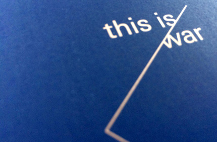
4pp Cover onto 140gsm GFSmith Plike Dark Blue
Pantone Metallic Bronze double sided
172pp Text onto 120gsm Uncoated
CMYK+Pantone Metallic Bronze throughout
Trimmed, collated and perfect bound
Goldsmiths, University of London, is renowned for its innovative and creative degree shows. The 2013 Goldsmiths Design degree show was no exception. This event showcased the exceptional talent and creativity of the students, leaving a lasting impression on all who attended. This article delves into the details of the Goldsmiths Design 2013 degree show and the unique catalogue printed by Ex Why Zed Print.
The Goldsmiths Design 2013 degree show was a grand event that showcased the creativity and innovation of the students. The show was a culmination of the students’ hard work and dedication, and it provided them with an opportunity to display their unique projects to the public. The show was a blend of various disciplines, including animation, art, fashion, fine art, journalism, media, and photography, among others.
The degree show was held in New Cross, London, and it attracted a large audience, including industry professionals, art enthusiasts, and the general public. The show was a testament to the high standard of education at Goldsmiths and the creative abilities of its students.
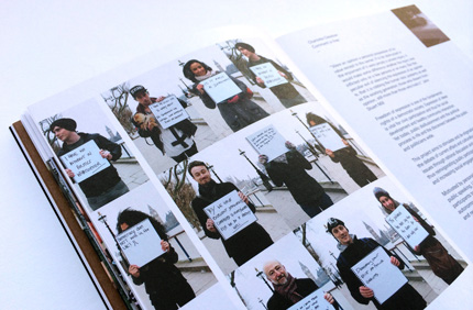
To commemorate this event, a special catalogue was printed by Ex Why Zed Print. The catalogue was designed to reflect the creativity and innovation displayed at the degree show. The catalogue was printed in a 240x160mm format, making it a handy and portable memento of the event.
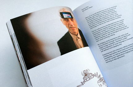
The catalogue had a 4pp cover printed onto 140gsm GFSmith Plike Dark Blue, with a Pantone Metallic Bronze double-sided print. The text was printed onto 120gsm Uncoated paper, with CMYK+Pantone Metallic Bronze throughout. The catalogue was trimmed, collated, and perfect bound, resulting in a high-quality and professional finish.
The navy blue cover with gold Pantone may not seem as dynamic at first glance, but the gold metallic ink used throughout the inside pages created a unique vibe. The Goldsmiths Design students chose the magnificent GF Smith Plike for the cover of their final exhibition book, adding a metallic bronze print throughout to create a uniquely striking catalogue to showcase their best work.
The Goldsmiths Design 2013 catalogue is a testament to the quality and creativity of Ex Why Zed Print. The company’s commitment to delivering high-quality print products is evident in the catalogue’s professional finish and attention to detail.
The catalogue serves as a great example of the possibilities of print and the impact it can have in showcasing creative work. It is a testament to the power of print in capturing and preserving the essence of a creative event like the Goldsmiths Design 2013 degree show.
The Goldsmiths Design 2013 degree show and the accompanying catalogue were a celebration of creativity and innovation. The event and the catalogue showcased the talent of the students and the high standard of education at Goldsmiths. The catalogue, printed by Ex Why Zed Print, was a high-quality memento of the event, reflecting the creativity and innovation displayed at the show.
Whether you’re planning a degree show, an art exhibition, or any other event, consider the power of print in showcasing your work. Ex Why Zed Print offers a range of printing services, including degree show catalogue printing and premium extras, to help you create a lasting impression.
For more examples of Ex Why
Zed’s work, check out these other case studies:
If you’re thinking about printing your next project onto Plike from GF Smith, check out their range here at the G.F Smith website. Then email us at hello@exwhyzed.fixed-staging.co.uk for a quote.
In the golden era of degree shows, Goldsmiths Design 2013 stands out as a testament to the power of creativity and the impact of high-quality print. The navy blue cover with gold Pantone and the gold metallic ink throughout the inside pages created a unique vibe that perfectly encapsulated the spirit of the event.
Remember, “The Goldsmiths Graphic Design chaps created this lovely identity around the idea of a gold wire.” – It’s Nice That


