Expert Tips on Hardback Book Design

Creativity Meets Functionality in Book Design
Ah, the art of graphic design for hardback book pages—a realm where creativity meets functionality, and where every pixel and print has a purpose. Let’s delve into this captivating world, shall we?
Key Elements to Consider
- Typography: The font you choose sets the tone. A serif font like Times New Roman exudes professionalism, while sans-serif fonts like Arial offer a modern touch.
- Colour Scheme: The colours should align with the book’s theme. A monochrome palette can evoke sophistication, while vibrant hues can make the book more inviting.
- Imagery: High-quality images or illustrations can elevate the book’s aesthetic and complement the text.
- Hierarchy: Establish a clear hierarchy for titles, subtitles, and body text to guide the reader’s eye.
Recommended Font Sizes
- Title: A font size of 36–48 points is generally recommended for hardback titles to make them stand out.
- Body: For the body text, a size of 9–12 point is often ideal, balancing readability with space efficiency.
The Magic of White Space
White space is the unsung hero of design. It’s not just “empty” space; it’s a powerful design element. It gives the eyes a break, making the layout easier to navigate. It can also draw attention to specific content, making it pop. In essence, white space is to design what silence is to music—absolutely essential.
Varied Layouts for Engagement
A monotonous layout can be a reader’s worst enemy. Mixing it up with columns, pull quotes, and sidebars can keep the reader engaged. Consider adding full-page images or infographics to break up long sections of text.
Bonus Tip: Consistency is Key
While variety is important, maintaining a consistent style throughout the book is crucial. This creates a cohesive look and enhances the reader’s experience.
So, whether you’re a seasoned designer or a newbie, remember that every choice you make—from font size to white space—plays a pivotal role in crafting a hardback book that’s not just read, but experienced. Now, who’s ready to create their next design masterpiece?
Let’s Analyse the Styling of Three Winning Book Designs
Before we begin, the Styling Hub in our Print Journey is also a great place to spend some time and find inspiration for your next project. But first, keep scrolling for some crucial takeaways of what makes for good book design.
Today meets Yesterday by Yang Liu

Pros:
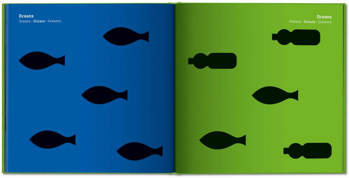
- Visual Storytelling: Yang Liu’s pictograms are a masterclass in visual storytelling, offering a crisp, discerning distillation of our ever-evolving world.
- Cultural Commentary: The book explores fundamental shifts in society, from geopolitics to daily experiences.
- Multi-Lingual: Available in English, French, German, and Spanish, making it accessible to a global audience.
Cons:
- Limited Text: The book relies heavily on pictograms, which might not offer the in-depth analysis some readers seek.
Studio’s Mark:
- Graphic Precision: Yang Liu’s design studio is known for its incisive observation of behavior patterns, and this book is no exception.
- Global Recognition: Liu’s works have won numerous international prizes and are found in museums worldwide.
What Sets It Apart:
- Scope and Ambition: The book juxtaposes past with present, exploring shifts in society, ideologies, and technology.
- Irony and Awareness: The book brings fresh awareness and ironies to who we are and where we came from.
So, if you’re looking to design a hardback book that’s not just a read but an experience, “Today meets Yesterday” offers a treasure trove of inspiration.
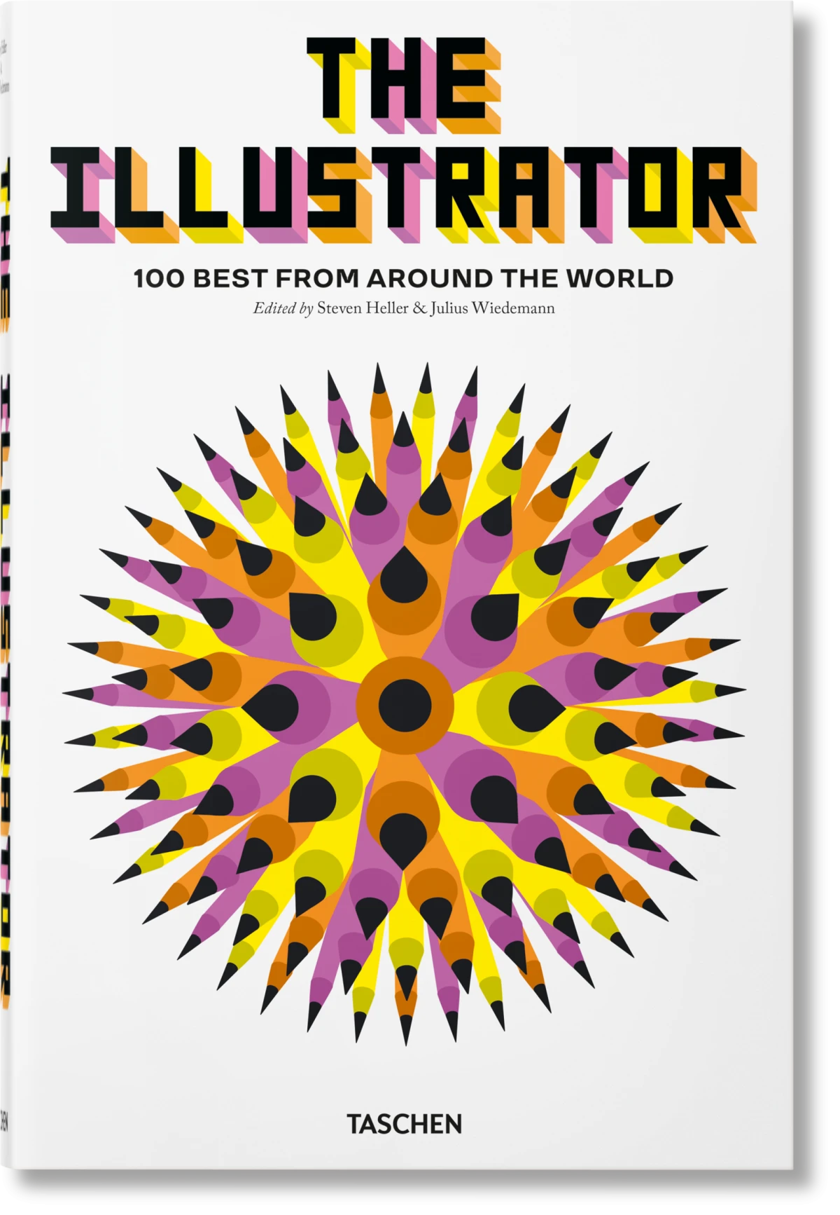
The Illustrator: 100 Best from around the World

Pros:
- Diverse Talent: This book is a global compilation of 100 must-know artists, offering a kaleidoscope of styles and techniques.
- Historical Context: The book traces the evolution of illustration, from its traditional roots to its modern digital forms.
- Comprehensive: With 664 pages, it’s a treasure trove of brilliantly reproduced works, artist biographies, and even an index of illustration agencies.
Cons:
- Overwhelming: The sheer volume of content might be a bit too much for someone looking for quick inspiration.
Studio’s Mark:
- Editorial Excellence: Edited by Steven Heller and Julius Wiedemann, who have a rich history in visual communication and design.
- Quality Assurance: The book has received high praise and ratings, making it a reliable source for design inspiration.
What Sets It Apart:
- In-Depth Analysis: Each artist featured comes with a detailed biography, philosophy, motivations, and contact details.
- Global Reach: The book is available in English, French, and German, making it accessible to a wide audience.
So, if you’re aiming to craft a hardback book that serves as a comprehensive guide in your field, “The Illustrator: 100 Best from around the World” is a masterclass in how to do it right.
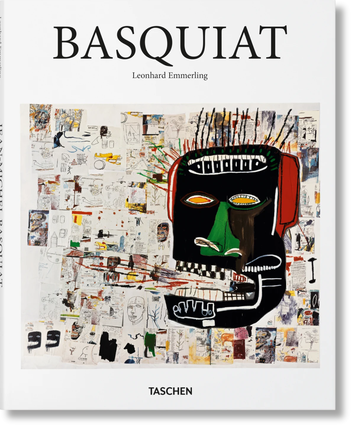
Basquiat by Leonhard Emmerling

Pros:
- Cultural Relevance: Basquiat’s work is a potent social commentary, touching on themes of poverty, power, and racism.
- Artistic Fusion: The book showcases Basquiat’s unique blend of abstraction and figuration, poetry and painting.
- Diverse Inspirations: From Greek, Roman, and African art to French poetry and jazz, the book is a melting pot of influences.
Cons:
- Short Career: Basquiat’s career was tragically short, leaving readers yearning for more of his groundbreaking work.
Studio’s Mark:
- Trailblazing: Basquiat was a pioneer in merging graffiti and gallery art, making his work a cult figure of artistic social commentary.
- Quality Curation: The book is edited by Leonhard Emmerling, known for his scholarly approach to art.
What Sets It Apart:
- Visceral Impact: The book presents a vivid, visceral mix of words, African emblems, cartoonish figures, and bold colours.
- Ever-Relevant Issues: Basquiat’s work remains profoundly relevant, addressing issues of integration, segregation, poverty, and wealth.
So there you have it, a whirlwind tour of three iconic hardback books that are not just reads but experiences. Each offers a unique lens through which to view the world and provides ample design inspiration for anyone looking to make their mark in the realm of hardback book design. Ready to transform these insights into your next masterpiece? Let’s start your print journey!


