In the vibrant world of indie music culture, few publications have made as significant an impact as So Young Magazine. From its humble beginnings to its current status as a must-read publication for indie enthusiasts, So Young has consistently showcased emerging artists, captured the spirit of the indie scene, and provided a platform for creative expression. This article will take you on a journey through the evolution of So Young Magazine, from its first issue to its 43rd, highlighting its artistic direction, visual aesthetics, and editorial choices.
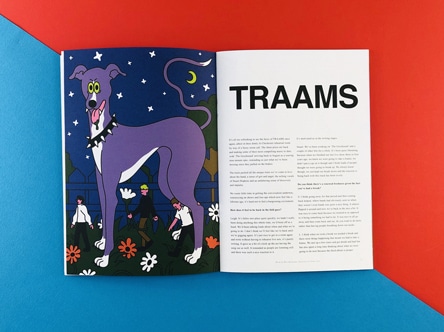
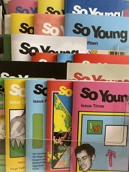
So Young Magazine began as a compact A5 zine, with each issue featuring around 44 to 52 pages of content. The creators, who were new to the world of zine printing, brought their project to Ex Why Zed, where we helped them navigate the often daunting marketplace of print. Over time, the magazine has evolved, growing in size and content, and increasing its print run with each issue. The magazine’s iconic masthead has remained a constant throughout its evolution, providing a strong visual identity that is instantly recognisable. The masthead, along with the unique colour scheme of each issue, has helped to create a sense of progression through the series. This visual consistency, combined with the magazine’s commitment to showcasing the best of indie music, has made So Young a staple in the indie music scene.
As So Young grew in popularity, the format and size of the magazine evolved. By issue ten, the magazine had expanded to a perfect bound special edition, A4 size. This larger format allowed for more content and featured a stunning double-page spread in the middle, showcasing the musical artists featured in that issue. By issue eleven, the magazine had made another step up in size to B5 (250x176mm), allowing even more content to be squeezed in. This format continued through to issue 23, with each issue featuring a different photography, illustration, or colour backdrop. This creative approach to design ensured that each issue of So Young was unique, while still maintaining the magazine’s distinctive visual identity.
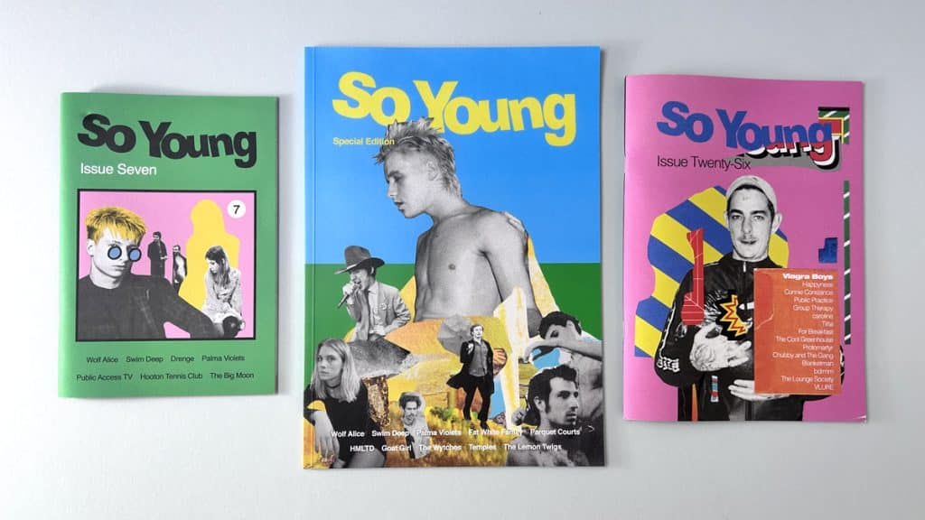
With the magazine’s increasing print run, we made the decision to start litho printing So Young. This allowed us to trim a little off the height and width of the magazine, making it a more competitive size for printing. This change meant we could print more copies for less, increasing the magazine’s margins while still maintaining its high-quality look and feel. Despite these changes, So Young has remained committed to its original design ethos. The magazine still features its iconic double-page spread in the centre and continues to use 200gsm uncoated for the cover and 120gsm uncoated for the inside pages. The result is a neat, tactile zine that smells as magnificent as it looks.
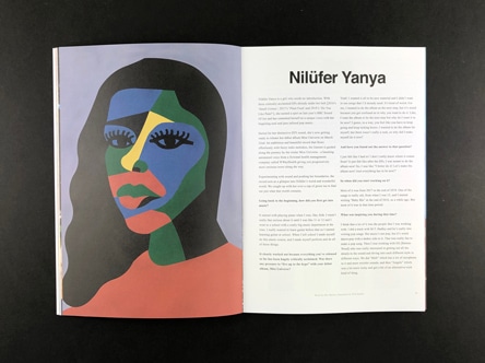
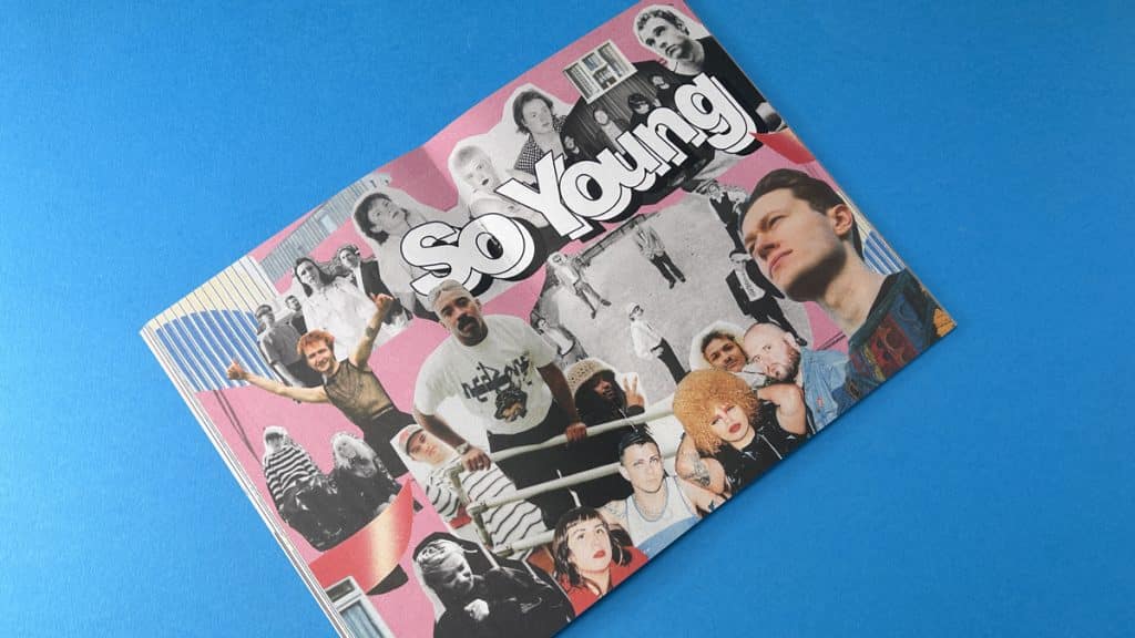
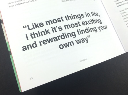
Over the years, So Young Magazine has played a significant role in the indie music scene. The magazine has helped to give exposure to up-and-coming bands, contributing to their success and growth. Bands like Wolf Alice, who graced the cover of So Young issue 7, have gone on to achieve world domination, demonstrating the impact that a feature in So Young can have. So Young Magazine is more than just a music zine; it’s a celebration of indie music culture. Each issue is a testament to the passion and creativity of the indie scene, showcasing the best of emerging talent and providing a platform for artistic expression. If you haven’t yet experienced So Young Magazine, we encourage you to grab a print edition or check it out online. It’s a rock n roll journey you won’t want to miss.
So Young Magazine has become an integral part of the indie music scene, not just as a platform for emerging artists, but also as a source of inspiration for music lovers and creatives alike. The magazine’s commitment to showcasing the best of indie music, combined with its unique visual aesthetics and editorial choices, has made it a definitive voice in indie music culture. The magazine’s evolution from a compact A5 zine to a larger, litho-printed publication is a testament to its success and the growing demand for high-quality, indie-focused content. Each issue is a testament to the magazine’s creative rigour, with its iconic masthead, unique colour schemes, and stunning double-page spreads creating a distinctive visual identity and a perfect example of a printed music publication.
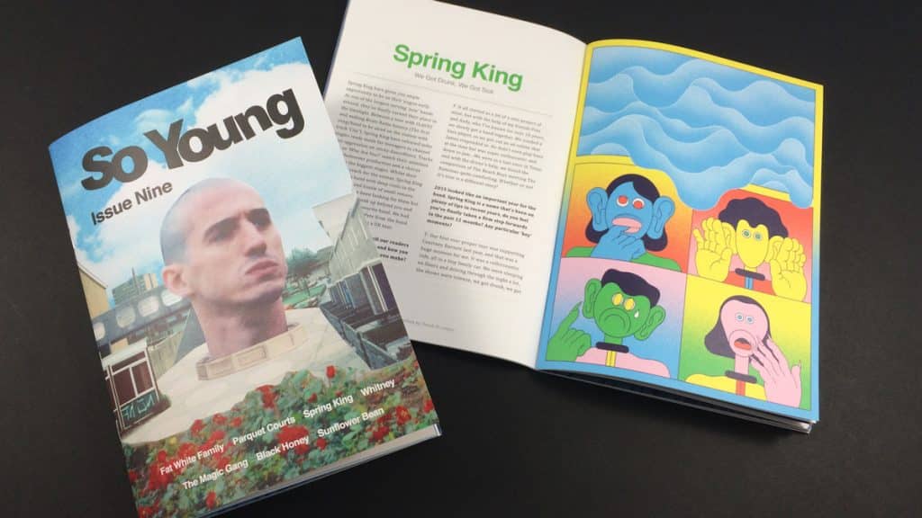
As So Young Magazine continues to evolve, its commitment to showcasing the best of indie music remains unwavering. With each new issue, the magazine continues to push the boundaries of what a music zine can be, offering a platform for emerging artists and providing a unique perspective on the indie music scene. Whether you’re an artist looking for exposure, a music lover in search of new bands, or a creative seeking inspiration, So Young Magazine is a must-read. Its unique blend of music, art, and culture makes it a standout publication in the world of music zines. And with each new issue, So Young continues to prove that print is far from dead—it’s alive, vibrant, and rocking the indie music scene. So, if you’re about to print a music magazine or any other creative project, don’t hesitate to get in touch with us at Ex Why Zed. We’re here to guide you through the process, from choosing the right format and paper to ensuring your artwork is print-ready. Let’s create something amazing together.

Coming up with an idea for a poetry zine can be an exciting journey. Here are some steps to help you get started:
Poetry is a deeply personal form of expression, and the best ideas often come from your own experiences, emotions, and observations. Reflect on what moves you, whether it’s love, nature, social issues, or personal growth.
A theme can provide a unifying thread for your poetry zine. It could be as broad as “love and loss” or as specific as “the changing seasons in my hometown.” A theme can help guide your writing and give your zine a cohesive feel.
Think about who you’re writing for. Are you aiming to connect with other poets, or do you want to reach a broader audience? Understanding your audience can help shape your content and style.
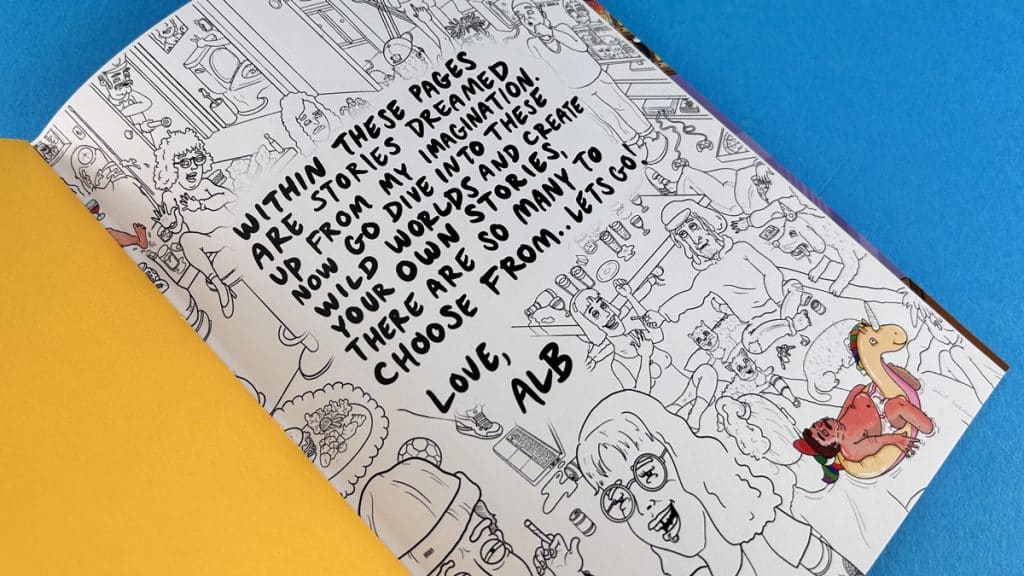
Poetry comes in many forms, from traditional sonnets and haikus to free verse and experimental styles. Don’t be afraid to play around with different forms to see what resonates with you.
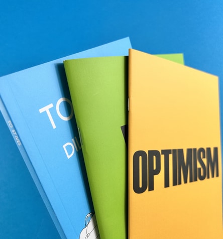

A mood board can be a great way to visualize your ideas and inspirations. You can include images, colours, words, and anything else that captures the vibe you want for your zine.
Remember, there’s no right or wrong way to create a poetry zine. It’s all about expressing your unique voice and perspective. So let your creativity flow and enjoy the process!
Popshot, a renowned platform for poets and illustrators, began their print journey with Ex Why Zed. Recognised for being zine printing experts, we at Ex Why Zed were thrilled to assist Popshot in bringing their creative vision to life. From the initial stages of design to the final print, we worked closely with Popshot to ensure their zine was a true reflection of their unique brand. Today, Popshot continues to inspire and engage audiences with their beautifully crafted zines, and we’re proud to have played a part in their journey.
For more tips and guidance on creating your own zine, check out our Definitive Zine Printing Guide.
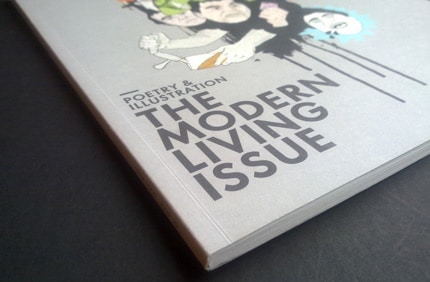
Hey there, creative superstar! Are you ready to dive into the world of indie poetry zines? These little gems are a hotbed of creativity, showcasing the talents of poets and artists alike. They’re a testament to the power of self-publishing, proving that you don’t need a big publishing house to make your voice heard. So, let’s take a closer look at these indie poetry zines that are making waves in the literary world.
First up, we’ve got The Chapess, a zine that’s all about showcasing the work of women writers. It’s a brilliant platform for female voices, offering a space for them to share their unique perspectives. The Chapess is a testament to the power of indie publishing, proving that you don’t need a big budget to create something truly impactful.
Next, we have OOMK, a zine that’s all about celebrating creativity and spirituality. It’s a beautiful blend of art, culture, and faith, offering a fresh perspective on what it means to be a creative individual in today’s world. OOMK is a perfect example of how zines can be a platform for exploring complex themes and ideas.
The Happy Reader is a zine that’s all about celebrating the joy of reading. Each issue features a deep dive into a classic book, along with interviews with notable figures in the literary world. It’s a must-read for any book lover, offering a fresh and engaging take on the world of literature.
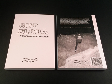
Synchronise Witches is a zine that’s all about showcasing the work of female and non-binary writers. It’s a space for these voices to be heard, offering a platform for them to share their unique perspectives and experiences. Synchronise Witches is a testament to the power of indie publishing, proving that you don’t need a big budget to create something truly impactful.
Last but certainly not least, we have The Poetry Review, a zine that’s all about celebrating the best in contemporary poetry. Each issue features a selection of poems from both established and emerging poets, offering a snapshot of the current poetry landscape. The Poetry Review is a must-read for any poetry book lover, offering a fresh and engaging take on the world of poetry.
So there you have it, folks! These indie creative writing books are a testament to the power of self-publishing, proving that you don’t need a big budget to create something truly impactful. So why not give them a read, or better yet, start your own zine? With Ex Why Zed by your side, you’ll have all the support you need to bring your creative vision to life. Happy reading, and happy creating!
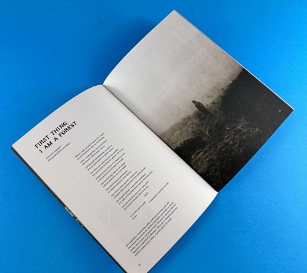
Zines have always been a platform for self-expression, a space where creators can let their imagination run wild. Whether it’s a literary magazine like Shooter, a typographic marvel like No Cold Callers, or a poetry zine, each one is a unique piece of art. In this post, we’ll take a closer look at these three distinct types of zines, each showcasing a different facet of creativity and individuality.
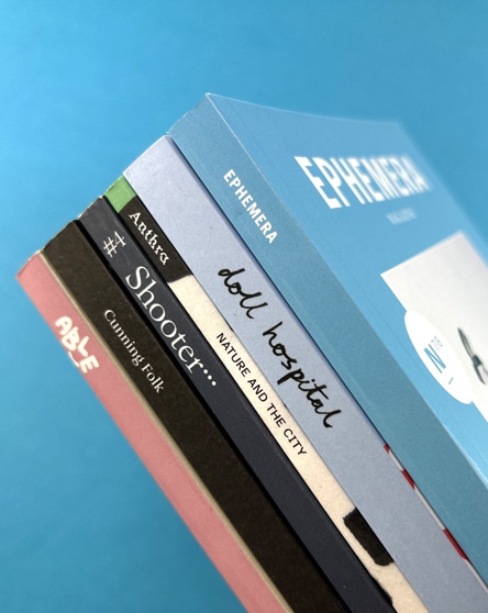
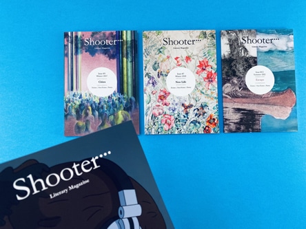
Shooter literary magazine is a testament to the diversity of topics that can be explored in zines. Each issue is centred around a different theme, providing a platform for a multitude of voices to be heard. For instance, the ‘Cities’ issue features neatly arranged text following a grid format, showcasing the poetry and creative writing of various writers. The text is intertwined with full-colour pages, acting as a backdrop to the creative writing.
The Shooter zines are perfect bound, with a neat spine that comfortably accommodates the title and the name of the magazine. This binding style not only gives the zine a professional look but also ensures durability.
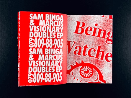
No Cold Callers is a zine that truly embodies the phrase “no rules for zines”. It’s a typographic feast, with layers upon layers of type stacked over each other. The inside pages are printed on 190gsm paper, showcasing what can be achieved with type.
The zine’s design is reminiscent of the iconic work of David Carson and Ray Gun, with its engaging one-colour print and consistent colours per page. The mix of images, photography, and a 70s style typeface creates a visually captivating experience. This compact, A6 wire stitch zine is a testament to the limitless possibilities of zine design.
Poetry zines offer a canvas for expressive words, a space where poets can share their thoughts and emotions. One such zine is an A5 perfect bound zine with 40 inside pages printed onto 90gsm uncoated paper. The cover is a 300gsm silk card with matt lamination on the outside, providing a professional appearance and added durability.
This zine, along with others like it, showcases the unique ways of creating a typographic zine. Each page is designed to attract the reader and grab their attention, with careful consideration given to the size of the font to ensure legibility.
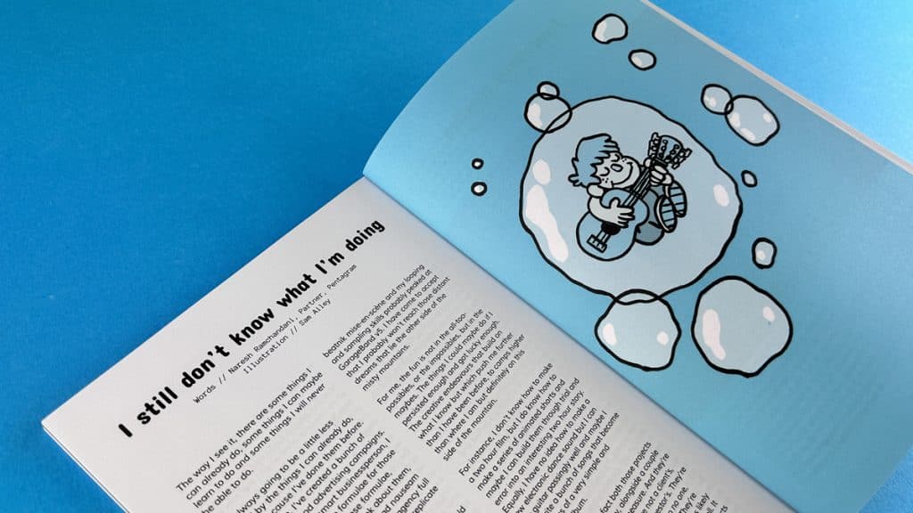
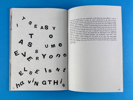
When it comes to styling your typographic zine, there are a few key considerations to keep in mind. The type on each page should be designed to attract the reader and grab their attention. The size of the font plays a crucial role in making your content legible. Check out our Definitive Zine Printing Guide for styling and aesthetic ideas.
For instance, you might want to consider using a larger font size for headers to make them stand out. For body text, a smaller font size would be more appropriate. Splash text, which is used to highlight important information or quotes, can be set in a larger font size and a different typeface to draw attention.
For more information on zine creation and printing, check out these resources:
Creative writing is a broad field that encompasses various forms, each with its unique characteristics and purposes. The four primary forms of creative writing are:
Creative writing is a vast field with numerous types and sub-genres. Here are nine types of creative writing that you might explore:
The five basic forms of creative writing are:
The three key elements of creative writing are:
The seven key elements of creative writing are:
The six traits of creative writing are:
While creative writing is an art form that encourages freedom of expression, there are some general guidelines that can help you improve your craft:

The seven styles of writing are:
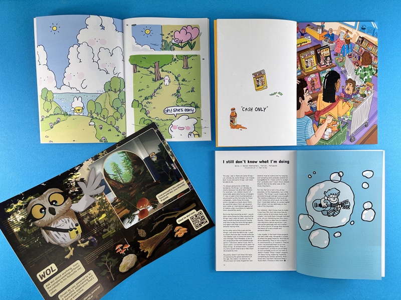
When it comes to zine production, the binding method you choose can significantly impact the final product’s look and feel. One popular method for binding zines, particularly those with a higher page count, is perfect binding. This method offers a neat, professional finish that can elevate your zine’s aesthetic which can command a higher cover price and allow you scope for more content within. In this post, we’ll delve into the world of perfect bound zines, exploring the design considerations, binding process, and technical tips you need to know.
Perfect binding is a method commonly used in Bookazine printing and for zines with 36 pages or more. This method involves trimming the inside pages into a text block, roughening up the left-hand edges, applying glue, and then wrapping a continuous cover around the text block. The result is a neat, professional-looking zine with a flat spine.
Perfect binding offers several advantages that make it an appealing choice for zine creators. You’ve all seen Little White Lies, Shooter and Moof, they are all perfect bound. Firstly, it provides a more high-end, professional look compared to other binding methods. This can be particularly beneficial if you’re creating a zine for a professional context or if you’re aiming for a more polished aesthetic.
Secondly, perfect binding allows for more illustrations, photography and poetry self-publishing and creative writing to be packed in. While wire stitching is suitable for zines with up to 40 pages, perfect binding can accommodate monster zines with up to 300-400 pages. This makes it an excellent choice for more substantial zines or Bookazines.
Finally, perfect binding creates a neat bind, with less bounce and curling on the inside pages compared to wire stitching. This can enhance the reader’s experience, making your zine easier and more enjoyable to read. If your spine is 4mm or thicker there’s even room to add your title, issue number and attention grabbing call to action.
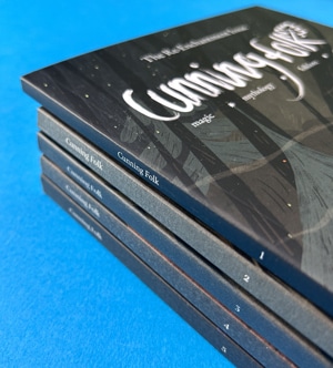
When designing a perfect bound zine, there are several key considerations to keep in mind. One of the most important is the page count. Perfect binding is best suited to zines with a minimum of 36 pages. This ensures that there is enough thickness in the text pages for the glue to hold effectively. Attempting to perfect bind a zine with fewer than 36 pages can result in the pages pulling out, as there is not enough glue to hold them in place.
Another crucial consideration is the cover weight. Because of the amount of glue used in perfect binding, the cover needs to be resilient. We recommend a minimum of 200gsm for the cover. Anything thinner, and the glue may seep through, compromising the binding’s effectiveness.
When you come to create your perfect bound zine cover file, check out our dedicated page with super helpful video and illustrated guides plus downloadable InDesign templates to save you some head-scratching.
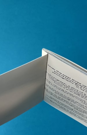
Finally, it’s important to allow for a 6-8mm hinge on the front and back cover. This ensures that the cover opens neatly and falls flat again. You’ll also need to allow for 6-8mm being lost on the inside front cover and the inside back cover, as well as the first 6-8mm on the spine side of your first and last text page. This area will be obscured by the glue, so it’s important to keep any important content at least 10-12mm away from this side of the page.
You can actually see on our example here that the text starts too close to the 6-8mm area and it is very nearly hidden.
Text pages onto 120gsm Uncoated
36pp to 44pp Text = 3mm spine
(ie: if you have 40 pages then you need a 3mm spine)
48pp to 60pp Text = 4mm spine
64pp to 72pp Text = 5mm spine
76pp to 88pp Text = 6mm spine
92pp to 100pp Text = 7mm spine
104pp to 116pp Text = 8mm spine
120pp to 132pp Text = 9mm spine
200pp Text = 14mm spine
Text pages onto 130gsm Silk
36pp to 40pp Text = 2mm spine
44pp to 56pp Text = 3mm spine
60pp to 76pp Text = 4mm spine
80pp to 92pp Text = 5mm spine
96pp to 112pp Text = 6mm spine
116pp to 128pp Text = 7mm spine
200pp Text = 11mm spine
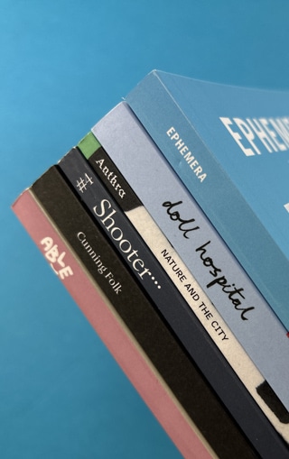
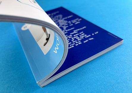
When you come to set up the inside pages, lets keep the key information at least 5mm from the trim edges of the page. On the spine side of the page, 2-3mm tends to be slightly obscured unless the reader really force the pages flat. This isn’t a user friendly way to read a book so best to start content on the spine side of the pages at least 8-10mm in. Our image here shows the spine gutter area and you can see the central section is tough to fully read.
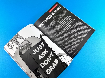
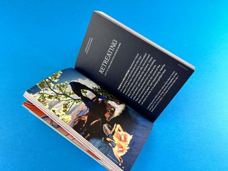
This is an example of a superb page layout for a perfect bound book. The text is neatly organised into columns which sit well within the constraints of the page’s parameters. The reader does not have to work hard to read the article and it is punctuated with awesome graphics and subtle page numbers in the bottom, outer corners.
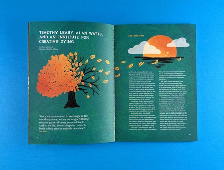
Perfect binding offers a world of possibilities for zine creators. This binding method allows for a wide range of designs and layouts, providing a canvas for your creativity and imagination. Whether you’re creating a personal zine or a professional publication, perfect binding can help bring your vision to life.
For more information on perfect binding and other binding options, check out our Perfect Binding Setup Guide and our Binding Options page on our website. These resources provide detailed instructions and illustrated guides to help you prepare your zine for perfect binding.
For a visual guide to perfect bound zines, check out our YouTube videos:
The best binding for a zine depends on several factors, including the page count, the aesthetic you’re aiming for, and your budget. Perfect binding is a great option for zines with a higher page count and a more professional aesthetic.
Perfect bound binding is a method that involves trimming the inside pages into a text block, roughening up the left-hand edges, applying glue, and then wrapping a continuous cover around the text block. The result is a neat, professional-looking zine with a flat spine.
You will upload your print ready pdfs to Ex Why Zed. One for the cover spreads and one for the inside pages. We will then give your artwork a preflight check and report back any issues to be ironed out. We strive for perfection in the artwork before we eve consider printing.
When it comes to binding zines, perfect binding emerges as the superior choice. This method bestows your publication with a polished, professional appearance that sets it apart from the rest. It not only accommodates a larger number of pages but also imparts a sturdy bind that stands up to the test of time and use. In contrast to other binding techniques, perfect binding presents a more refined, sophisticated aesthetic, elevating your zine to a higher level of professionalism.
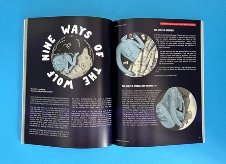
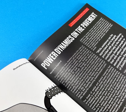
Perfect binding is characterised by its neat, flat spine, its resilience and its professional, high-end appearance. This method is also recognised for its capacity to hold a greater number of pages than alternative binding techniques.
Features of perfect binding include a flat spine, a continuous cover that wraps around the text block, and a 6-8mm hinge on the front and back cover. This binding method also requires a minimum of 40 pages and a cover weight of at least 170gsm.
The two main types of binding for a zine are wire stitching and perfect binding. Wire stitching, also known as stapling, is suitable for zines with up to 40 pages. Perfect binding, on the other hand, is best for zines with a higher page count.
Perfect binding offers a world of possibilities for zine creators, providing a canvas for your creativity and imagination. Whether you’re creating a personal zine or a professional publication, perfect binding can help bring your vision to life. With its neat, professional finish and ability to accommodate a higher page count, perfect binding is an excellent choice for your next zine project.
For more information on perfect binding and other zine printing options, don’t hesitate to contact us at Ex Why Zed. We’re always here to help you bring your creative projects to life.