Are you looking to print your very own newspaper in the UK? With today’s digital age, there’s something unique and special about holding a tangible entity that you can enjoy and engage with. In this blog, we will take you through everything you need to know about printing your own newspaper in the UK. From understanding the importance of newspaper printing in today’s world to designing your newspaper for optimal impact, we’ve got all bases covered. We’ll also share what newspapers can be used for – from promoting your brand to serving as a school leaver’s publication or an art catalogue. And if you’re wondering about sustainable printing, we’ve got that covered too! Our papers are FSC certified, and we use vegetable inks for printing 750 copies or more. So what are you waiting for? Let’s dive into the world of newspaper printing and explore different sizes, quantities, paper options, designs, costs and more!
Your work will be printed on our HP Indigo digital printing or Heidelberg Litho. The machine we will use depends on page count and quantity you choose. The distribution of news to a broad audience is possible through newspapers. Techniques are used to ensure clear text and images. Expertise and specialised equipment are required for the complex printing process.
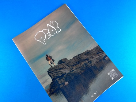
In the fast-paced digital age, the tangible charm of newspaper printing stands out by offering readers an immersive, uninterrupted experience. Unlike fleeting digital content that’s easily minimised or forgotten, newspapers command dedicated attention, transitioning from an immediate read to a cherished keepsake that’s folded and revisited multiple times. Amidst the digital deluge, the physicality of newspapers remains a poignant testament to the value of lasting engagement and the joy of tactile content consumption.
Experience the joy of reading a physical newspaper, evoking nostalgia and connection. Interact with unique articles, puzzles, and advertisements. Enjoy focused reading, reducing digital distractions, and collect historical artefacts.
Printing your own newspaper in the UK requires careful planning and preparation. Choosing the right size for your newspaper is crucial for layout and distribution purposes. Designing your newspaper with attention to visual appeal and readability is essential. Ordering your newspapers from Ex Why Zed ensures quality and timely delivery. Understanding the expected delivery time for newspaper printing helps with scheduling and distribution. To find our how much it costs to print with us, get an instant price with our newspaper price lists.
Selecting the perfect size for your newspaper depends on various factors. Consider the intended purpose and target audience to make an informed decision. The size of your newspaper impacts printing costs, readability, and aesthetic appeal. In the UK, standard options include broadsheet and tabloid formats. Larger sizes offer more content and visual impact, while smaller ones are more portable. Consult a professional printer to determine the best size for your specific needs.
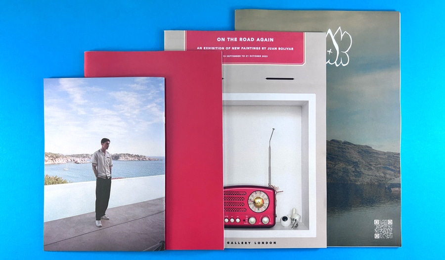
When creating your newspaper, it’s important to design it in a way that leaves a lasting impact. Engaging headlines, clear section divisions, and appealing visuals can captivate readers right from the start. Using colour strategically to highlight important articles or visuals can also draw attention to key elements of your newspaper. Organise your content in a logical and visually pleasing manner to improve readability and make it easy for readers to navigate through different sections. Paying attention to typography, font size, and spacing ensures that your newspaper is legible, while including eye-catching images and informative charts or graphs can further enhance the overall impact. So, keep these design elements in mind and create a newspaper that grabs attention in all the right places.
Newspapers can be used to promote your brand and reach a wider audience, create unique marketing campaigns, advertise events in a creative and memorable way, publish school leavers’ publications, and showcase artwork through an art catalogue format.
In the digital-dominated era, offering customers a tangible brand experience via a beautifully designed newspaper stands out as a novel and impactful marketing strategy. This sensory delight not only resonates with traditionalists who value the tactile feel of print but also provides ample space to weave the brand’s story, ethos, and offerings. By turning this unique promotional tool into a collectible monthly or quarterly release, brands can foster a loyal community eagerly awaiting each edition, ensuring sustained engagement and a memorable brand presence in a sea of fleeting digital ads.
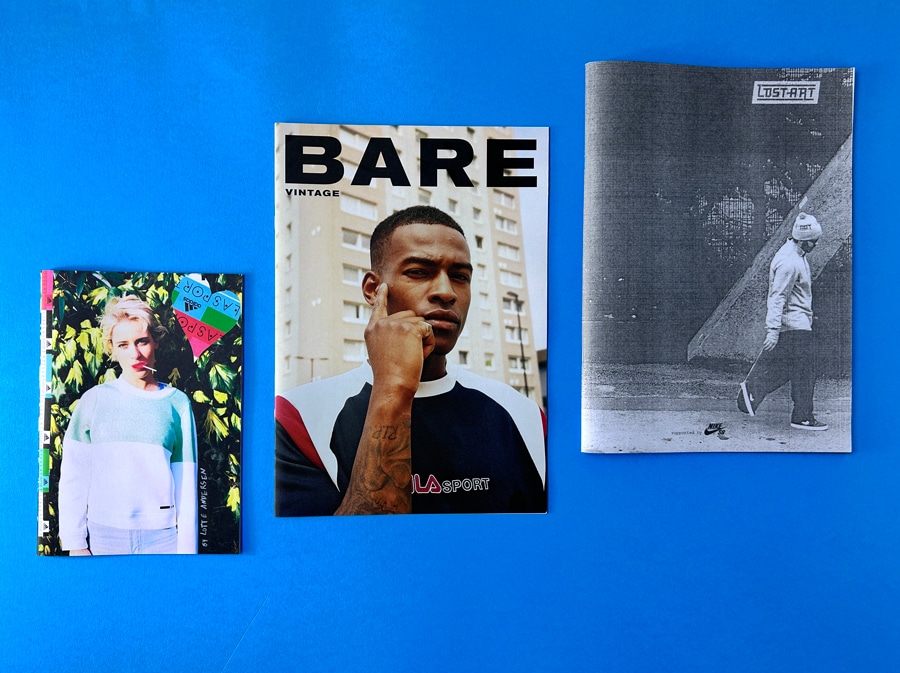
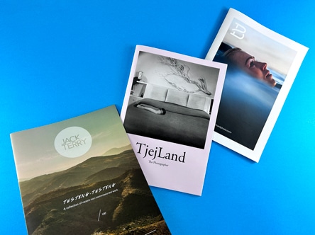
Create a visually appealing and memorable newspaper-style portfolio to showcase creativity.
Create a unique art catalogue, showcasing artwork with artist statements and contact information. Utilise newspaper printing to engage viewers and promote artwork effectively.
Create buzz for events with engaging newspapers, reaching a wider audience.
Creating a keepsake for UK school leavers with newspaper printing. Cherish memories with classmates and teachers, distribute during graduation or farewell events.
Ex Why Zed sets itself apart as a trusted newspaper printer through its exceptional quality, customisation options, and flexibility. With state-of-the-art printing technology, they deliver high-quality prints that captivate readers. Customers can choose from a range of sizes, paper stocks, and finishing options to create their unique and personalised newspapers. Ex Why Zed’s expertise in the industry ensures professional-looking results, backed by over 25 years of experience. Moreover, their commitment to sustainability makes them the right place for eco-conscious publishers.
Throughout the printing process, you’ll receive friendly and helpful assistance. Our customer service team is knowledgeable and ready to provide expert advice on newspaper printing options and requirements. Any questions you have will be promptly and professionally addressed, ensuring a positive and enjoyable customer experience. We want you to feel confident in the support you receive from our team, knowing that you’re in the right place for all your newspaper printing needs.
You can trust our experienced professionals to address your concerns and ensure that you receive the right guidance and advice. At Ex Why Zed, we believe in delivering exceptional service and accessibility to our customers.
Read why Ex Why Zed have received stacks of positive feedback on Trustpilot.
Choose eco-friendly paper, soy-based ink, digital printing to minimise waste. Embrace sustainable practices.
Looking to print your own newspaper in the UK? Explore different printing methods like inkjet and digital. Choose what suits your budget and requirements, and make an informed decision for high-quality newsprint. Consider the pros and cons of each method to ensure you’re in the right place for your printing needs.
Print your newspaper on FSC certified papers and demonstrate sustainable printing practices. Contribute to preserving forests and biodiversity while meeting the demand for environmentally friendly products. Enhance your brand image with FSC certified papers.
When it comes to newspaper printing, opting for recycled papers is the right choice. By choosing recycled materials, you can reduce your carbon footprint and support waste reduction efforts. Show your readers your commitment to sustainability and enjoy high-quality printing results with recycled papers.
For efficient production, determine your desired print quantity and choose environmentally-friendly vegetable inks. Achieve vibrant colours and sharp images while minimising harm to the environment. Reduce waste by printing the right number of copies.
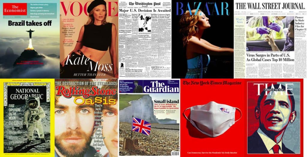
Explore a creative gallery of innovative newspaper mastheads, layouts, and award-winning designs. Stay updated with the latest trends in newspaper styles.
Step into a visually stunning showcase of newspapers from various industries, exploring creative designs, typography, and engaging storytelling.
Explore diverse typography and designs of mastheads from newspapers worldwide. Be inspired!
Consider the size, quantity, and paper type for your unique newspaper. Explore options for printing preferences and additional features that enhance its final look and feel.
Looking to make a big impact with your promotional materials or advertisements? The 420x297mm size is perfect. With ample space for detailed information and captivating visuals, this size can grab attention and make a bold statement. Whether it’s for outdoor display or eye-catching indoor signage, the 420x297mm is the right place for creating impactful promotional materials. So go ahead and print your own newspaper in the UK with this ideal size!
Looking for a versatile size that offers enough room for informative content and visuals? The 380x289mm is the right place for eye-catching brochures, event programs, small posters, and more. It allows you to display product catalogs or menus with impact.
Create pocket-sized booklets for travel guides, event invitations, newsletters, or product catalogs.
Ah, alas broadsheet is just to large for our machines. So save money, time and your arm muscles by choosing one of the smaller sizes listed above.
Choose software for a professional look, eye-catching graphics, engaging content, and customisable templates.
When it comes to creating a newspaper, there are several design software options available. Adobe InDesign is a popular choice among professionals for its advanced design features. Canva offers user-friendly templates and design tools. Microsoft Publisher provides easy-to-use features for designing newspapers. Scribus is a free and open-source software for layout. Lucidpress offers cloud-based newspaper design with collaboration features. Choose the software that suits your needs and design preferences.
Enhance your newspaper design with high-quality graphics, infographics, photographs, illustrations, and icons. Experiment creatively.
Craft attention-grabbing headlines, provide informative articles, use storytelling techniques, and include interactive elements.
Discover a range of newspaper templates, from traditional broadsheet to modern magazine-style options. Choose the right style for your newsprint creation.
When it comes to customising templates, the possibilities are endless. for different themes such as art, restaurant, wedding, and more. You can add art-related elements like paintbrushes and palettes for an art-themed newspaper. If you’re creating a restaurant-themed newspaper, incorporating food-related graphics and images will set the right tone. For a wedding-themed newspaper, you can experiment with design elements like rings and flowers to create a romantic atmosphere. And don’t forget to play with colour schemes and fonts to bring the whole theme together. Be creative and let your imagination run wild!
Converting a PDF into a printable newspaper format requires specific software. Ensure the PDF is properly formatted with the correct page size and orientation. Consider image quality and resolution for clear printing results. Use a reliable printing service that accepts PDF files. Consult online tutorials for step-by-step instructions.
When it comes to printing your own newspaper in the UK, there are several printing requirements to consider. Familiarise yourself with the appropriate paper size, weight, and finish. Select the right colour options and additional features like folding or stapling. And make sure your printing file meets the printer’s specifications. With these considerations in mind, you can bring your newsprint to life in the right place and with the perfect colour.
If you’ve designed your publication, then now comes the exciting part of the print journey – ordering your newspapers from Ex Why Zed. You’ll need to upload the files using WeTransfer.com (it’s super easy, you don’t need an account and it is free). In the comments box, remind us of the print spec you are going for, the number of copies and the best address for us to deliver to. That’s it!
We will then give your artwork a free preflight check to highlight any potential issues and will email any recommendations before going to production.
Delivery time for newspaper printing varies based on factors like workload and order complexity. It’s important to discuss turnaround times with the printer to align expectations. Factors such as shipping distance and method also affect delivery. Communicate any specific deadlines or time-sensitive events to ensure timely delivery, and consider adding buffer time for unforeseen delays.
The costs of newspaper making can vary depending on factors like printing, paper, distribution, and staffing. Budgeting carefully is crucial as digital newspapers may have lower costs without printing and distribution expenses. Consider all expenses before starting your own newspaper.
Unlocking the Hidden Expenses: Diving into the Economics of Newspaper Printing.
For a snapshot of how cheap it is to print your own newspaper, here are a few key prices.
Staple Bound and Ready to Distribute
Promote Your Brand to a New Audience
Ideal for University Student Hand Outs
In conclusion, printing your own newspaper in the UK offers a unique and tangible way to engage with your audience in today’s digital world. Whether you’re promoting your brand, hosting an event, creating a school publication, or showcasing artwork, a newspaper allows for creative and effective marketing. When choosing a newspaper printer, it’s important to consider factors such as friendly customer service, print expertise, and positive reviews. Opting for sustainable printing methods, such as using recycled papers and vegetable inks, helps minimise the environmental impact. With a wide range of sizes, quantities, and paper options, you can customise your newspaper to suit your needs. Designing engaging content with graphics and images is key to capturing your readers’ attention. To print a newspaper from a PDF file, follow a step-by-step guide and set up your printing press. Understanding the costs involved in newspaper making will help you plan your budget effectively. So, get creative, grab some humour, and start printing your own newspaper today!
Extra, Extra! Read all about it! The world of newspaper design is vast, and it can be challenging to know where to start. Whether you’re a seasoned designer or just starting with newspaper design, this blog post is for you. We will take you through the fundamentals of newspaper design, from creating a strong headline to exploring innovative layout ideas. You’ll also learn how to master the inner page layout and maintain consistency across pages. We’ll provide tips on dos and dont’s of newspaper design and share tried-and-tested strategies for success.
But that’s not all – we’ll also delve into the importance of creativity in newspaper printing and design. A unique and eye-catching layout is essential in today’s competitive market. So let’s get started on this journey to winning newspaper style ideas and inspiration!
When it comes to newspaper design, understanding the fundamentals is crucial. The grid layout serves as the backbone of a well-designed newspaper, organising content in a visually appealing and structured manner. Captivating headlines play a vital role in grabbing the reader’s attention and enticing them to delve further into the articles. Achieving a cohesive design involves striking a balance between editorial content and advertisements, ensuring a seamless reading experience. Subheads act as signposts, guiding readers through the main text and enhancing comprehension. Typography also plays a significant role in newspaper design, enhancing readability and setting the tone for the publication. By mastering these fundamentals, publishers can create visually appealing and engaging newspapers that captivate their readers.

Enhancing readability and page scanning is a breeze with well-crafted subheadings. These informative and engaging subheads break up content, creating a hierarchy of information that guides readers through the text. Subheads offer the perfect opportunity to tease upcoming sections, keeping readers engaged and intrigued. So, whether you’re publishing in The New York Times or a local newspaper, don’t underestimate the power of subheads in capturing and retaining your reader’s attention. They’re the secret sauce to winning newspaper styles.
Mastering the art and science of newspaper layout and flow involves understanding the psychological impact it has on reader engagement. By employing visual hierarchy, you can guide readers through the content, ensuring they don’t miss important information. Strategic use of white space creates a clean and organised layout, enhancing readability. Balancing text and imagery is crucial for an aesthetically pleasing design that captures the reader’s attention. So, whether you’re publishing in The New York Times or creating your own newspaper, mastering layout and flow is essential to capture and maintain your reader’s attention.
Staple Bound and Ready to Distribute
Promote Your Brand to a New Audience
Ideal for University Student Hand Outs
Dive into the rich tapestry of newspaper history and discover how design has evolved over the centuries. From the refined elegance of broadsheets to the punchy appeal of tabloids, every style tells a story.
At the heart of our ethos at Ex Why Zed lies the belief that every newspaper should be as unique as its creator. Let’s explore how you can harness the power of design to make your mark in the world of print.
The Telegraph (UK): Best At: In-depth analysis and authoritative commentary. Iconic Because: A British institution since the 19th century, The Telegraph has consistently delivered quality journalism, earning a reputation for reliability. Graphic Design Standout: Elegance meets functionality. Their design balances tradition with modern aesthetics, making the newspaper both visually appealing and easy to navigate.
La Repubblica (Italy): Best At: Dynamic reporting with a European touch. Iconic Because: Established in the 1970s, La Repubblica quickly became a staple for Italian readers, known for its fearless journalism and liberal stance. Graphic Design Standout: A lively blend of Italian flair and structured design. The newspaper seamlessly incorporates vibrant images with its fluid typography.
The Hindu (India): Best At: Comprehensive coverage with a South Asian perspective. Iconic Because: As one of India’s oldest newspapers, The Hindu is revered for its balanced reporting and insightful analysis. Graphic Design Standout: A classic design that places emphasis on content. The layout is organized, with clear sections and a harmonious colour palette.
El País (Spain): Best At: Reporting Spanish news with a global context. Iconic Because: Spain’s leading newspaper is known for its investigative journalism and its commitment to democratic values. Graphic Design Standout: A blend of modern European design with traditional elements. The use of imagery is particularly striking, often telling a story in its own right.
Sydney Morning Herald (Australia): Best At: Combining Australian news with global insights. Iconic Because: A staple for Australians, the SMH is renowned for its independent journalism and in-depth analyses. Graphic Design Standout: Fresh and vibrant. The design captures the Australian spirit, with bold headlines and a breezy layout.
When it comes to styling for print perfection, the cover design is key and there are several key elements to consider. First and foremost, the cover needs to be visually appealing in order to grab the reader’s attention. This can be achieved through the use of eye-catching colours, typography, and layout.
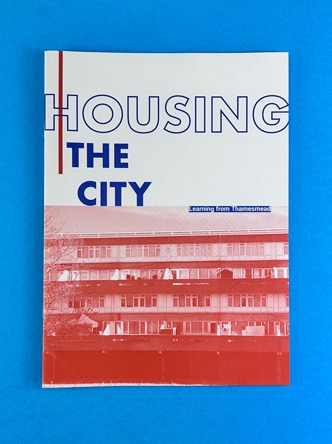
One of the most important aspects of a newspaper cover is the main headline. It should capture the essence of the front page story and entice readers to delve further into the publication. A compelling headline can make all the difference in attracting readers and piquing their curiosity.
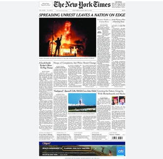
In addition to a strong headline, the use of compelling images or illustrations on the cover can greatly enhance its appeal. Visuals have the power to convey information quickly and effectively, drawing readers in and enticing them to explore the content further.
Furthermore, it is crucial to design a cover that reflects the tone and theme of the publication. A cohesive and consistent aesthetic helps to build brand recognition and loyalty among readers.
Lastly, incorporating NLP terms, can add an extra layer of engagement to the cover lines and teasers. These terms not only optimise the content for search engines but also demonstrate a deep knowledge of the industry.
Your font size plays a crucial role in capturing readers’ attention and ensuring readability. Different age groups have varying levels of visual acuity, so it’s important to choose font sizes that cater to their needs. Larger font sizes are ideal for headlines as they grab readers’ attention and entice them to read further. Experimenting with font sizes can create visual interest and hierarchy in the layout, making the content more engaging. Customising font sizes based on the target audience and publication style is essential for a cohesive design.
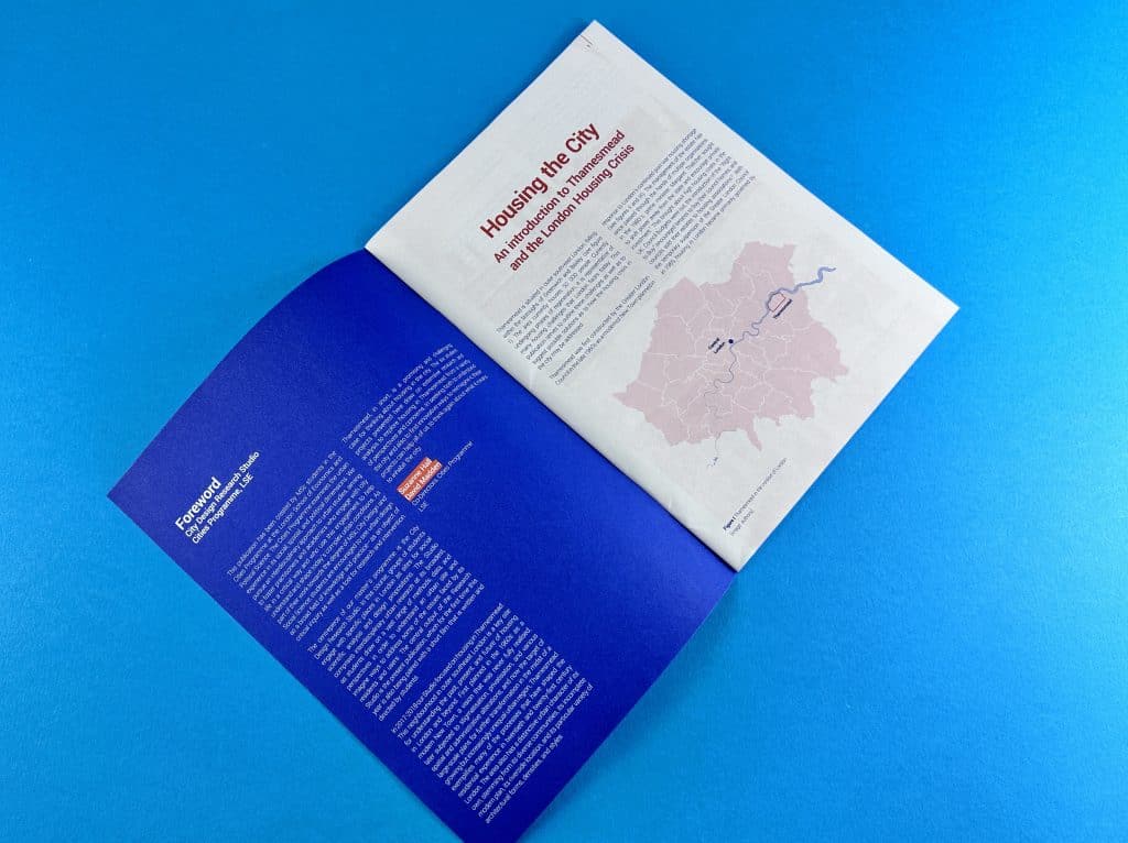
Designing newspaper for print relies on thinking outside the box and creating unique and visually stunning layouts. Embracing asymmetry and unconventional grids can give your newspaper a modern and dynamic look. To engage readers, consider incorporating interactive elements or multimedia into your layout. However, it’s important to strike a balance between creativity and usability to ensure a seamless reading experience. By pushing boundaries and exploring innovative layout ideas, you can create a newspaper that captures the reader’s attention and keeps them coming back for more.
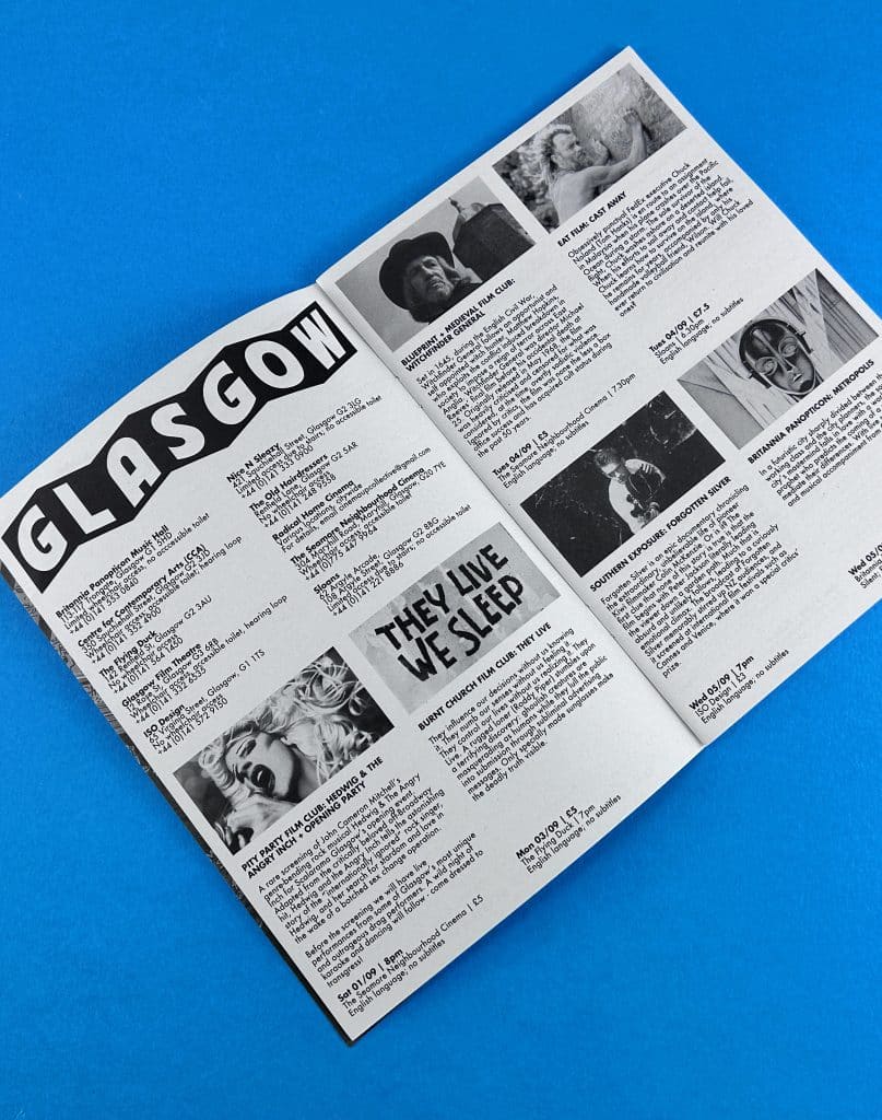
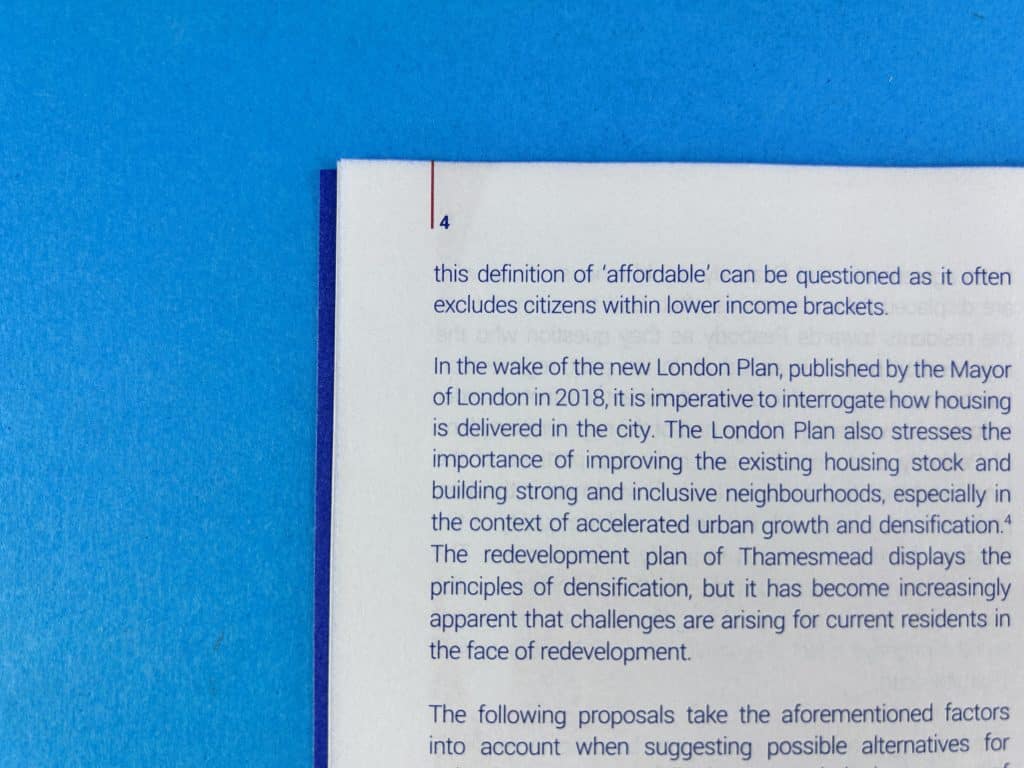
There are several strategies that can help create a seamless flow from the cover. Consistency is key, so maintaining the same typography, colour scheme, and overall style throughout the publication is important. Page numbers, like you see on the image here can guide the reader through the newspaper and also act as a vehicle for you to reference back to in a Contents page. Effective use of columns and alignment can help organise the content and make it more reader-friendly. Incorporating pull quotes and sidebars can highlight important information and grab the reader’s attention.
Finding the perfect equilibrium between text and visuals is crucial for captivating reader’s attention. High-quality images that complement and enhance the written content can elevate the overall visual appeal of the newspaper. Infographics and data visualisations are effective tools for presenting complex information in a digestible format. Experimenting with different image placement and sizing options adds visual impact and creates a dynamic reading experience. The balance between text and imagery is the key to creating an engaging and visually appealing newspaper layout.
Consistency is key when it comes to maintaining a cohesive visual identity throughout your newspaper publication. By utilising design elements that are consistent across pages, you can establish a strong and recognisable brand presence. One way to achieve this is through the use of style guides, which ensure uniformity in typography and colour palette. Additionally, applying consistent spacing, margins, and alignment throughout the publication creates a sense of coherence. Incorporating recurring design elements or motifs further enhances brand recognition.
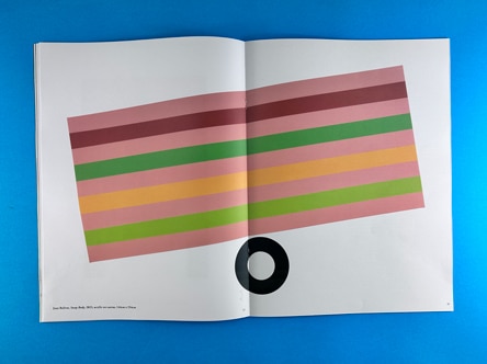
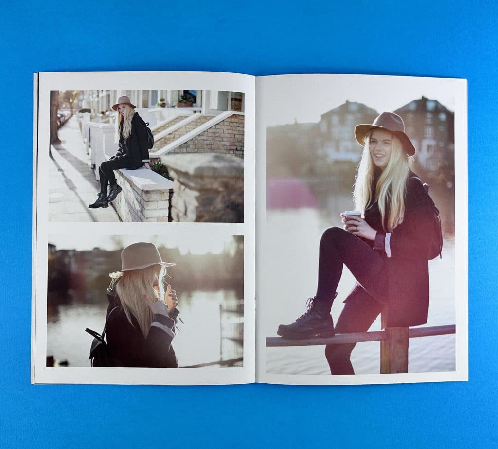
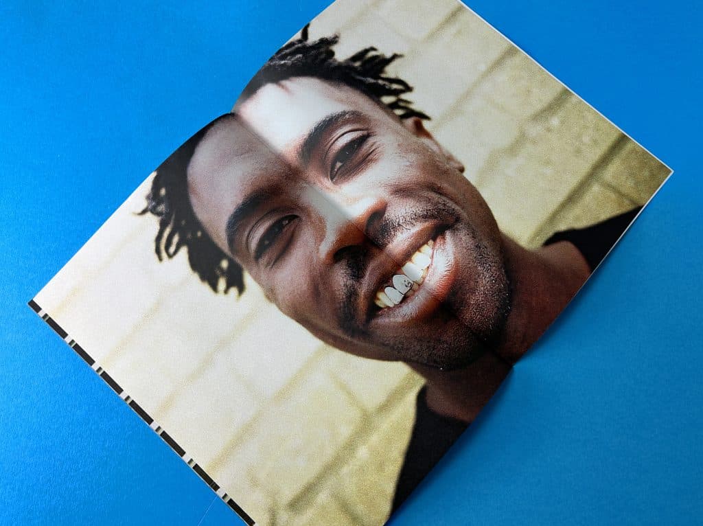
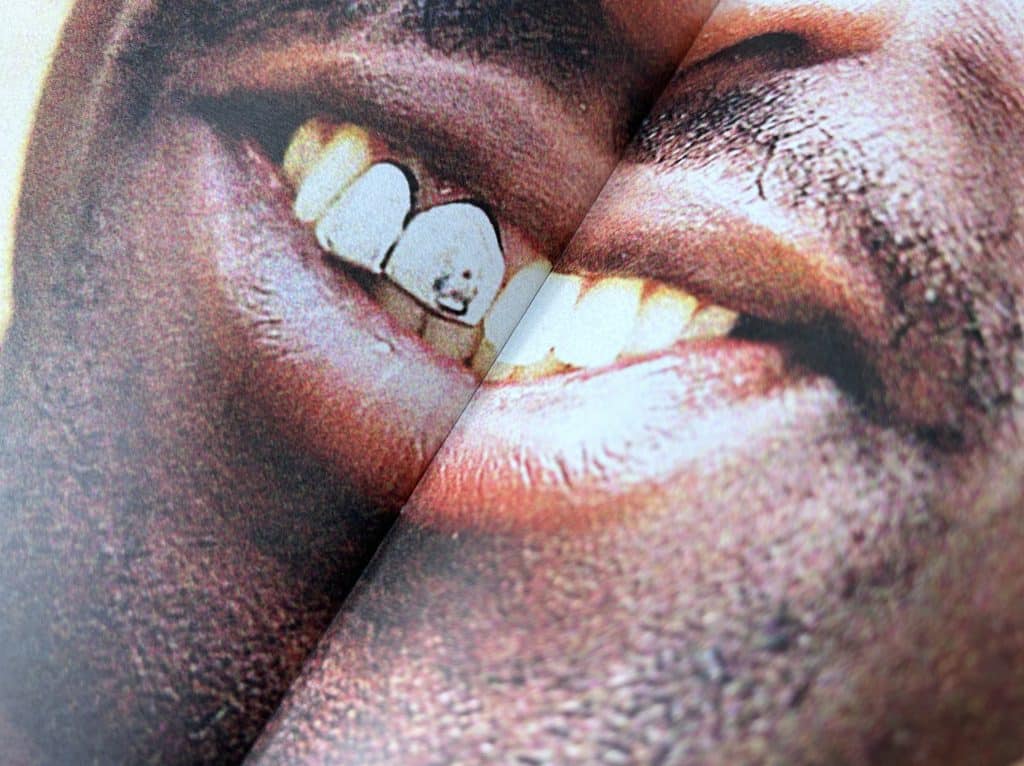
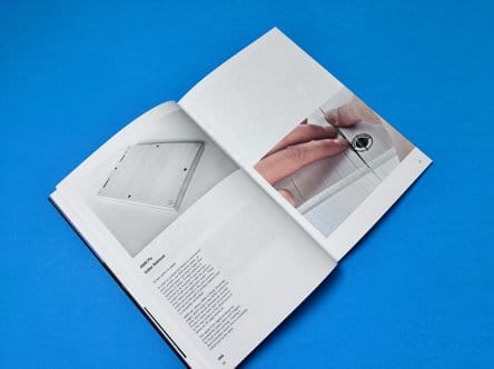
There is a small spine gutter on a stapled newspaper, where a fraction of the content is slightly obscured. This only tends to be around 1mm though. You can see on the image here there is a double page spread image and the mouth is right on the page join.
Simplicity in design is key to ensuring easy navigation for readers. Avoid cluttered layouts that overwhelm them, instead focusing on clean and organised designs. Proper use of white space enhances readability, allowing the eyes to rest and absorb information more easily. Consistent use of fonts and colours throughout the newspaper maintains visual harmony and helps establish a cohesive brand identity. Remember, a well-designed newspaper layout will engage readers and keep them coming back for more.
There are several common mistakes that should be avoided. One of the key mistakes is overcrowding the front page with too many elements. This can overwhelm readers and make it difficult for them to find the information they’re looking for. Another mistake to steer clear of is using too many different font styles. This can be distracting and make the design appear messy. It’s also important to have a clear hierarchy of information, ensuring that the most important stories or headlines are easily distinguishable. Additionally, long paragraphs should be avoided as they can make the content difficult to read. Breaking them into smaller chunks promotes better readability. Lastly, don’t forget to proofread for any spelling or grammatical errors. These mistakes can undermine the credibility of the publication. By avoiding these common pitfalls, newspaper designers can create more visually appealing and reader-friendly layouts.
To create winning newspaper styles, it’s essential to implement tried and tested strategies for success. One effective strategy is using grid systems to achieve an organised and structured layout. Grid systems help maintain consistency and make it easier for readers to navigate through the newspaper. Another strategy is incorporating visually appealing images that grab the reader’s attention and enhance engagement.
Balancing the placement of imagery and text is also crucial for a harmonious look. By following editorial guidelines, such as consistent formatting, newspapers can establish a professional and polished appearance. Finally, understanding your target audience and catering to their interests ensures that the content resonates with readers.
Creativity plays a significant role in newspaper design. Unique layouts, typography, and illustrations capture readers’ attention and enhance storytelling. Innovative colour schemes create a memorable reading experience, while thinking outside the box helps newspapers stand out from the competition.
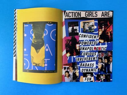
Creating a unique and eye-catching design for newspapers is essential for several reasons. Firstly, it helps establish the brand identity of the newspaper. Secondly, eye-catching designs attract more readers and increase circulation. Additionally, standout designs are more likely to be shared on social media, giving the newspaper more exposure. Lastly, unique designs differentiate newspapers from online sources and create a lasting impression on readers.
Newspaper design is an art that combines creativity, knowledge, and strategy to create engaging and visually appealing content. From the impactful headline to the layout and flow, every element plays a crucial role in capturing the reader’s attention. The cover design sets the tone for the entire newspaper, with font size and innovative layout ideas making a big impact. Inner page layout requires a balance between text and imagery, while maintaining consistency across pages. To ensure success, it’s important to avoid common mistakes and follow tried and tested strategies. Lastly, creativity is key in newspaper design, as it helps create a unique and eye-catching design that stands out from the crowd. So, let your imagination run wild and create winning newspaper designs that captivate readers.
Staple Bound and Ready to Distribute
Promote Your Brand to a New Audience
Ideal for University Student Hand Outs
Welcome to your Newspaper Design for Print Masterclass – a gateway to the exhilarating world of newspaper printing! Dive deep into the art and science of crafting compelling newspapers that captivate and inform. Whether you’re a budding designer or a seasoned pro, this masterclass will elevate your skills, transforming your ideas into print-ready masterpieces. Get ready to embark on a journey that melds creativity with technique, ensuring your newspaper printing projects stand out in a crowd. Let’s turn those design dreams into tangible realities!
When it comes to seeking inspiration, there are a few iconic names that immediately spring to mind. Let’s dive into the world of newspaper printing and uncover the magic behind these iconic newspapers:

The Guardian (UK):
The New York Times (US):


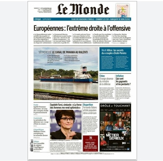
Le Monde (France):
Die Zeit (Germany):

The Times (UK):

Asahi Shimbun (Japan):

In a world awash with publications, these newspapers have carved a niche for themselves through a combination of journalistic prowess and design excellence. Their ability to evolve while staying true to their roots is a testament to their enduring appeal. And, as we craft content in the style of Ex Why Zed, we can draw inspiration from these giants, ensuring our work is not just read, but remembered.
Step aside, mainstream media, and make way for the unsung heroes of the print world! Dive into a realm where design meets storytelling in its most avant-garde form. These niche publications aren’t just magazines; they’re masterpieces, each page a canvas of creativity, innovation, and passion. As you embark on this journey, prepare to be enthralled by the genius of these under-the-radar gems. From the art of slow living to the intricacies of tech and humanity, you’re about to uncover tales that resonate, designs that captivate, and content that leaves an indelible mark. Ready to be inspired? Let’s turn the page!

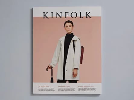
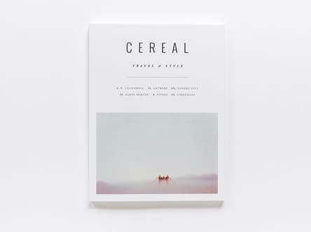

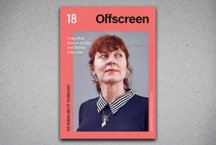
Each of these publications, in their own way, challenges the status quo. They’re not just magazines; they’re experiences.
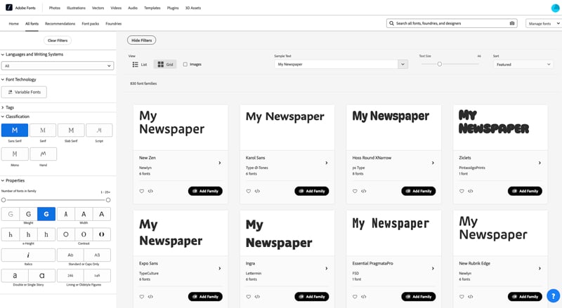
Looking for font inspiration? Look no further than these three websites, which are overflowing with creative ideas for masthead design and newspaper page layout. Each site offers a unique perspective on typography and can provide you with fresh concepts to incorporate into your own designs. Whether you’re looking for classic elegance or modern flair, these websites have something for everyone!

Each of these websites offers a unique perspective on typography and design, ensuring that you’re equipped with a plethora of ideas and inspiration as you embark on your newspaper design journey.
First up, what is a Masthead?
A masthead is a crucial element in the world of print and digital publishing. It refers to:
In essence, the masthead serves as a publication’s visual signature, helping readers instantly recognize and connect with the brand. Mastheads are the crowning glory of any publication, often becoming as iconic as the content they represent. They form a newspaper template for all future issues – nail it one issue 1 and it is synonymous going forward.

Each of these mastheads has stood the test of time, evolving with their respective publications while maintaining their iconic status.
Capturing the attention of readers is the cornerstone of crafting the best-designed newspapers. The first step? Choosing the perfect typeface that not only meets the specifications of a printed newspaper but also infuses it with a unique character. Will you opt for the timeless elegance of a classic Serif, or venture into the contemporary realm with a Modern Sans-serif? Perhaps the titles on each page demand a bolder, more dynamic font that instantly draws the eye. The art of typography is more than just letters on a page; it’s about creating a visual narrative that makes people pause, engage, and immerse themselves in the content. So, as you embark on this typographic journey, ask yourself: How will my choices ensure the newspaper doesn’t just inform but also captivates?
Serif Fonts:
Sans-serif Fonts:
Slab Serif Fonts:
Body Text:
Headings:
Break convention and make your headings as large as you feel they need to be. They will certainly be more attention grabbing if you made the masthead 100pt and the interior headings over 40pt.
Most of the fonts above can be found on legacy websites and are available for free download.
If you have a Creative Cloud Subscription, then full 20,000 choices in the Adobe Fonts library can be used for both personal and commercial projects.
Ultimately we need a high res PDF to make and print your newspaper. Most, if not all design programs from Microsoft Word to Adobe InDesign can Save as PDF or Export to PDF. Once your design is finished, you are just a couple of clicks from a print-ready PDF.
The key elements of good newspaper design for print include a clear and visually appealing layout, legible typography, proper use of headlines and subheadings, effective use of images and graphics, consistency in design elements, and attention to detail in spacing and alignment.
Remember, the journey to print your own newspaper is as much about absorbing inspiration as it is about execution. By immersing oneself in diverse sources of knowledge and creativity, one can ensure that their publication isn’t just another piece of print, but a testament to the power of design and storytelling.
Ah, the quest for creative inspiration! Before diving headfirst into the newspaper design and print journey, it’s essential to immerse oneself in a myriad of sources to truly grasp the art and science of it all. Here’s a curated list to fuel that creative fire:
Typography Workshops:
Typography is the backbone of any print publication. Engage in workshops or online courses to understand font pairings, hierarchy, and the nuances of type design.
Historical Archives:
Delve into the archives of renowned libraries or online platforms. Exploring vintage newspapers and magazines can offer a wealth of design inspiration and a lesson in evolution.
Design Books & Journals:
Publications like “Designing News” by Francesco Franchi or “The History of Graphic Design” can provide insights into the ever-evolving world of design.
Digital Design Platforms:
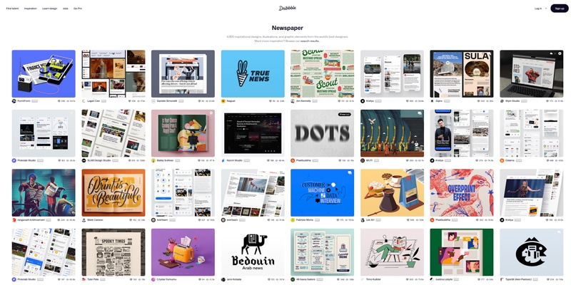
Websites like Behance, Dribbble, or Awwwards showcase cutting-edge design work from around the world, offering a fresh perspective and modern inspiration.
Art Galleries & Exhibitions:
Art movements have often influenced design trends. Exploring galleries can provide a broader understanding of colour, composition, and visual storytelling.
Cultural Immersion:
Attend local events, festivals, or even travel. Experiencing different cultures can offer unique design perspectives and storytelling techniques.
Feedback Sessions:
Engage with fellow designers or potential readers. Regular feedback can refine your design approach, ensuring it resonates with your target audience.
Sustainability in Print:
With a growing emphasis on eco-friendly practices, understanding sustainable printing methods and materials is crucial.
Digital Mockups & Prototyping:
Before going to print, use digital tools to prototype your newspaper. This allows for iterative design tweaks and ensures the final product aligns with your vision.
Navigating the world of self-publishing can be daunting, especially when it comes to design. A captivating book cover and well-laid-out pages are crucial for attracting readers. If you’re considering hiring a designer from Fiverr for your book design or illustration project, this guide will walk you through the process from start to finish.
We found over 16,000 book designer options when search on Fiverr – plenty for every type of style and budget. Do also take a look at our guide to finding a designer on PeoplePerHour and our article on Top Book Design Solutions.

Begin your journey on Fiverr’s book design search page. Here, you’ll find a plethora of designers offering their services. Use filters like ‘Budget’, ‘Delivery Time’, and ‘Seller Level’ to narrow down your options.
Before approaching a designer, review their portfolio. This will give you an insight into their style, quality of work, and whether they align with your vision. Look for designers who have experience in your specific genre or type of book.
Fiverr provides a rating system and reviews from previous clients. This feedback can be invaluable in understanding the designer’s professionalism, communication skills, and reliability.
Once you’ve shortlisted a few designers based on their portfolios and reviews, it’s time to approach them for what can be considered a virtual interview. Given the global nature of platforms like Fiverr, your chosen designer could be anywhere in the world. This geographical diversity is one of the platform’s strengths, but it also means you need to be thorough in your initial interactions to ensure a smooth working relationship.

Additional Considerations:
Remember, this initial interaction is not just about assessing the designer’s skills but also about gauging their communication style, responsiveness, and professionalism. It’s essential to establish a rapport and ensure you’re both on the same page before embarking on the design journey together.
When you’re ready to proceed, provide the designer with a comprehensive brief. This should include:
We have written some solid design briefs which you can copy and paste into an initial message to the designers you have identified as possibilities:
Before finalising the project, discuss the budget and timeline. Ensure you’re clear about any additional costs, such as revisions or add-ons. Set milestones for the project, especially if it’s a larger or more complex design task.
Once the project is underway:
Once you’re satisfied with the design, the designer will provide you with the final files. Ensure you receive all necessary formats for both print and digital use.
After the project’s completion, leave a review on the designer’s Fiverr profile. This helps future clients and also acknowledges the designer’s efforts.
Finding and managing a book design project on Fiverr can be a smooth process with the right approach. By being clear in your communication, setting expectations, and actively participating in the design process, you can ensure your book resonates with your target audience and stands out in the crowded marketplace.
Remember, a well-designed book not only attracts readers but also enhances the reading experience. So, invest the time and effort to get it right!
In the digital age, the allure of books remains undiminished. They are timeless vessels of knowledge, ideas, and stories. With the rise of self-publishing, more authors are taking the reins, not just of their narratives but also of their book’s design. If you’re an aspiring self-published author, this guide will walk you through the nuances of the art of book design, ensuring your creation and your book covers stands out on the shelves of your favourite independent book shop.
Books have been the primary medium for sharing knowledge for centuries. While there are myriad ways to disseminate information today, books have a unique charm and permanence. As an aspiring self-published author, you’re not just sharing a story; you’re contributing to this rich tapestry of human knowledge.
Designing a book might seem daunting, but it’s an opportunity to infuse your personal touch.
Remember, it’s your creation. While guidelines and tips can steer you in the right direction, the final decisions lie with you. Embrace the process, trust your instincts, and create a book and layout design that you’re proud of.
Ok, We’ve got your covered here at Ex Why Zed with a huge wealth of resources to help your self-publishing process. Enjoy identify a style and getting inspired by what other self-publishing companies have achieved. We have a video collection that takes a deep dive into elements that make for winning book designs. Read through articles about design artwork for digital printing, about preparing artwork for perfect bound book printing or wire stitched booklet printing. We’ve done our best to curate a set of resources that will prove an invaluable guide on your print journey with Ex Why Zed. And if you do get stuck, give us a shout, we are here to help on email, phone and live chat.
The art of book design is a crucial element for any self-publishing author. Book designers and graphic designers are responsible for creating the overall look and feel of the book, from layout, fonts, and images to formatting and cover design. Book cover designers are especially important in making sure that your book has an eye-catching appearance that will draw readers in.
Book cover designs should be tailored to the content and genre of the book, as well as to the target audience. It’s essential to have creative control over the look and feel of your book, so it’s important to find a professional book cover designer who understands your vision and can deliver on your desired results.
As a future self-published author you are not bound by the constraints of a traditional publisher or the crazy long timelines associated with the Publishing Industry (at Ex Why Zed you can get your book delivered in 5-7 working days!) Your book title, cover art, book editing, graphic design, illustration style and income streams are all set by you, the indie author. Other options like Kindle Direct Publishing, Blurb or a publishing company have a lengthy process and we get regularly that the quality and price are not what people expect and won’t generate book sales.
Before we move onto some strong design inspiration, if you are feeling a bit intimidated by the whole process of designing your entire book, check out our article on the Top Book Design Solutions for 4 top recommendations for companies who will help out. If you budget doesn’t stretch that far then our guides to finding a designer on Fiverr or finding a designer on PeoplePerHour will provide valuable assistance. We have a pack of pre-written design briefs you can copy and paste in, amend for your project then send off to potential book designers you are considering working with.
What we’re going to do is give a very strong play as you embark on designing your book. In the vast universe of book design, there are a few constellations that shine brighter than the rest. Two such luminaries in the world of design are Pentagram and Phaidon. For novice designers and first-time authors, these platforms offer a treasure trove of inspiration, showcasing the pinnacle of creativity in book design that will wow potential readers, friends and family alike. Let’s drill down on these design icons and discover how you can harness their brilliance for your own masterpiece.
Embarking on the journey of book design can be overwhelming, but with the right inspiration and guidance, it becomes an exhilarating adventure. Let the design philosophies of industry giants like Pentagram and Phaidon guide you. Here’s a visually stimulating representation of the ten golden tips to elevate your book design:
With these tips in your arsenal, you’re all set to craft a book design that’s both captivating and uniquely yours. Dive in and let your creativity soar! ??
Pentagram stands as a colossus in the design landscape, with its innovative approaches and groundbreaking designs. Their work in book design, in particular, is a testament to their commitment to pushing boundaries and setting new standards. Let’s delve deeper into the magic that Pentagram weaves in the realm of book design.
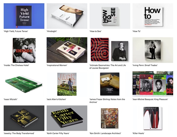
Their portfolio is a kaleidoscope of genres. From art and architecture to history and science, their design versatility shines through. This range showcases their ability to adapt and innovate, ensuring that the design complements the content, irrespective of the subject matter.
Beyond mere aesthetics, the designs narrate a story. Each book is a journey where design elements guide the reader, adding layers to the narrative. The interplay of text and visuals, the choice of colour palettes, and even the texture of the paper – every detail contributes to the storytelling.
Pentagram is unafraid to make bold typographic statements. They understand the power of fonts in setting the tone and mood. Whether it’s a vintage typeface for a historical narrative or a sleek, modern font for a contemporary topic, their choices resonate with the content’s essence.
Pentagram’s prowess in integrating images with text is unparalleled. They don’t just place images; they weave them into the narrative. This seamless integration ensures that visuals don’t just support the text but elevate it, making each page a holistic experience.
One of Pentagram’s hallmarks is their ability to break the mold when it comes to layouts. They play with asymmetry, use unconventional structures, and aren’t afraid to challenge traditional design norms. This innovative approach ensures that each book is not just a read but a visual adventure.
It’s often said that the devil is in the details. From the choice of paper to the intricacies of cover design, no detail is too small. This meticulous attention ensures that every book is a masterpiece, both in content and design.
Their design process is deeply collaborative. They work closely with authors, understanding their vision, and translating it into design. This synergy ensures that the final product is a perfect amalgamation of content and design.
Pentagram’s work in book design is a masterclass in innovation, creativity, and excellence. They don’t just design books; they craft experiences. For budding designers and authors, Pentagram’s portfolio is a goldmine of inspiration, offering lessons in creativity, innovation, and the sheer power of design.
Phaidon is more than just a publisher; it’s a curator of aesthetic excellence. Renowned for its impeccable design sensibilities, Phaidon’s books are not just literary treasures but also visual masterpieces. Let’s delve into their iconic house style and layouts that make the books stand out in a league of their own.
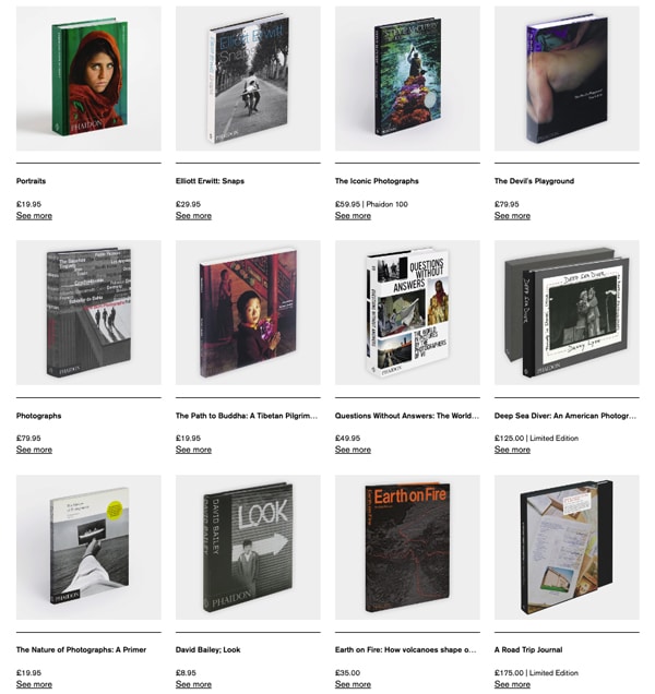
Phaidon’s rich history in the world of art and design publishing has cemented its reputation as a purveyor of beauty. Each book is a testament to their commitment to aesthetic brilliance, reflecting a legacy that spans decades.
One of the defining characteristics of Phaidon’s design approach is its embrace of minimalism. Their layouts, while seemingly simple, are the result of meticulous design choices. This minimalistic approach ensures that the content remains the hero, with design elements enhancing rather than overshadowing it.
Phaidon’s layouts are a masterclass in harmony. Every element, from typography to imagery, is carefully curated to create a cohesive visual narrative. This harmonious approach ensures that each page is a balanced composition, offering readers a seamless visual journey.
Phaidon understands the power of visuals. Their books, especially in the art genre, are replete with iconic images that are not just complementary to the content but integral to it. The choice of imagery, its placement, and its integration with text showcase Phaidon’s commitment to visual storytelling.
Typography is a crucial element in book design. The choice of fonts, the spacing, and the layout are always in sync with the book’s theme. Whether it’s a bold, statement font for a contemporary art book or a classic typeface for a historical narrative, the typographic choices are always on point.
Beyond visual appeal, Phaidon’s books offer a tactile experience. The choice of paper, the texture of the cover, and even the weight of the book are carefully considered. This attention to the tactile aspect ensures that reading a Phaidon book is a multi-sensory experience.
While their portfolio spans a diverse range of topics, there’s a consistent design language that runs through all their books. This consistency, coupled with the ability to adapt to different genres, showcases Phaidon’s versatility and commitment to design excellence.
Phaidon’s approach to book design is a blend of tradition and innovation. Their books are timeless treasures that offer readers not just insightful content but also a visual feast. For budding designers and authors, Phaidon’s work serves as a beacon, illuminating the path to design excellence.
As you embark on your own design journey, let Phaidon and Pentagram’s iconic style inspire you. Absorb, learn, and create. Remember, great design is not just about aesthetics; it’s about crafting an experience. Let your work resonate with readers, both visually and emotionally.
Self-publishing is a journey of creativity, determination, and self-expression. With the right design choices, your book can shine in its full glory, captivating readers and leaving an indelible mark. At Ex Why Zed, we champion the spirit of self-publishing authors and are here to support you at every step. Dive into the world of book design with confidence and let your story unfold beautifully on every page.
A: Self-publishing a book gives you full control over your book’s design and interior, pricing, and marketing. It allows you to make a book your way and also receive more profits from book distribution than traditional publishing.
A: Book cover design can significantly impact the success of a book in the book market. A captivating front cover and back cover can effectively attract and engage potential readers. It’s an important component of marketing your book.
A: No, we have tried to give you all the information, ideas and inspiration to be able to design your book yourself.
To save time and head-scratching though, a professional book cover designer has the expertise in graphic design and knowledge of the book market to develop a custom book cover that could greatly enhance your book’s attractiveness and saleability.
A: There are many online platforms that offer professional book design services. They can assist in designing your book including the cover and interior design, ensuring your book complements the digital book and print books markets standards.
A: Check our Book Promotion Social Media Packs where we provide a series of strong content to help get your new book from day one.
Use social media, book reviews, author websites to promote your book. Understand the publishing journey and know your book and audience well to market effectively.
A: Consider your target readers, book content, and distribution channels when you choose the book format. Different book formats could influence not only the designing process but also price your book to sell.
A: The process includes writing the manuscript, editing, designing your book cover and interior, formatting for different book formats, setting a price, and choosing a book distribution platform. Then, marketing your book is the next step after you publish your book.
A: After the manuscript is written, it needs editing and proofreading. Design work for your book’s cover and interior is necessary. The book should be formatted correctly according to the needs of print books and/or a digital book. Consider a top book cover to make your book enticing in the book market.
A: The pricing depends on multiple factors. Production cost, book format, the market price for similar books, your publishing goals, and the perceived value of your book should all be considered when you price your book.
A: Yes, in fact, it’s recommended to publish both formats to reach different reader preferences. Both formats have their unique advantages, offering them simultaneously can maximise your book’s exposure and opportunities to sell your book. Once you have designed a book for print, then export it to a web quality PDF and you can allow customers to buy and download an online version too – the revenue streams for the price of one 🙂
In the digital age, the allure of books remains undiminished. They are timeless vessels of knowledge, ideas, and stories. With the rise of self-publishing, more authors are taking the reins, not just of their narratives but also of their book’s design. If you’re an aspiring self-publishing author, this guide, inspired by the video “Book Design Tips for DIY Self-Publishing Authors,” will walk you through the nuances of book design, ensuring your creation stands out on the shelves of ExWhyZed and beyond.
Books have been the primary medium for sharing knowledge for centuries. While there are myriad ways to disseminate information today, books have a unique charm and permanence. As an author, you’re not just sharing a story; you’re contributing to this rich tapestry of human knowledge.
Designing a book might seem daunting, but it’s an opportunity to infuse your personal touch.
Remember, it’s your creation. While guidelines and tips can steer you in the right direction, the final decisions lie with you. Embrace the process, trust your instincts, and create a book that you’re proud of.
In the vast universe of book design, there are a few constellations that shine brighter than the rest. Two such luminaries in the world of design are Pentagram and Phaidon. For novice designers and first-time authors, these platforms offer a treasure trove of inspiration, showcasing the pinnacle of creativity in book design. Let’s embark on a journey through these design galaxies and discover how you can harness their brilliance for your own masterpiece.
? Top Ten Tips for Book Design: Drawing Inspiration from the Best ?
Embarking on the journey of book design can be overwhelming, but with the right inspiration and guidance, it becomes an exhilarating adventure. Let the design philosophies of industry giants like Pentagram and Phaidon guide you. Here’s a visually stimulating representation of the ten golden tips to elevate your book design:
With these tips in your arsenal, you’re all set to craft a book design that’s both captivating and uniquely yours. Dive in and let your creativity soar! ??
Pentagram stands as a colossus in the design landscape, with its innovative approaches and groundbreaking designs. Their work in book design, in particular, is a testament to their commitment to pushing boundaries and setting new standards. Let’s delve deeper into the magic that Pentagram weaves in the realm of book design.

Their portfolio is a kaleidoscope of genres. From art and architecture to history and science, their design versatility shines through. This range showcases their ability to adapt and innovate, ensuring that the design complements the content, irrespective of the subject matter.
Beyond mere aesthetics, the designs narrate a story. Each book is a journey where design elements guide the reader, adding layers to the narrative. The interplay of text and visuals, the choice of colour palettes, and even the texture of the paper – every detail contributes to the storytelling.
Pentagram is unafraid to make bold typographic statements. They understand the power of fonts in setting the tone and mood. Whether it’s a vintage typeface for a historical narrative or a sleek, modern font for a contemporary topic, their choices resonate with the content’s essence.
Pentagram’s prowess in integrating images with text is unparalleled. They don’t just place images; they weave them into the narrative. This seamless integration ensures that visuals don’t just support the text but elevate it, making each page a holistic experience.
One of Pentagram’s hallmarks is their ability to break the mold when it comes to layouts. They play with asymmetry, use unconventional structures, and aren’t afraid to challenge traditional design norms. This innovative approach ensures that each book is not just a read but a visual adventure.
It’s often said that the devil is in the details. From the choice of paper to the intricacies of cover design, no detail is too small. This meticulous attention ensures that every book is a masterpiece, both in content and design.
Their design process is deeply collaborative. They work closely with authors, understanding their vision, and translating it into design. This synergy ensures that the final product is a perfect amalgamation of content and design.
Pentagram’s work in book design is a masterclass in innovation, creativity, and excellence. They don’t just design books; they craft experiences. For budding designers and authors, Pentagram’s portfolio is a goldmine of inspiration, offering lessons in creativity, innovation, and the sheer power of design.
Phaidon is more than just a publisher; it’s a curator of aesthetic excellence. Renowned for its impeccable design sensibilities, Phaidon’s books are not just literary treasures but also visual masterpieces. Let’s delve into their iconic house style and layouts that make the books stand out in a league of their own.

Phaidon’s rich history in the world of art and design publishing has cemented its reputation as a purveyor of beauty. Each book is a testament to their commitment to aesthetic brilliance, reflecting a legacy that spans decades.
One of the defining characteristics of Phaidon’s design approach is its embrace of minimalism. Their layouts, while seemingly simple, are the result of meticulous design choices. This minimalistic approach ensures that the content remains the hero, with design elements enhancing rather than overshadowing it.
Phaidon’s layouts are a masterclass in harmony. Every element, from typography to imagery, is carefully curated to create a cohesive visual narrative. This harmonious approach ensures that each page is a balanced composition, offering readers a seamless visual journey.
Phaidon understands the power of visuals. Their books, especially in the art genre, are replete with iconic images that are not just complementary to the content but integral to it. The choice of imagery, its placement, and its integration with text showcase Phaidon’s commitment to visual storytelling.
Typography is a crucial element in book design. The choice of fonts, the spacing, and the layout are always in sync with the book’s theme. Whether it’s a bold, statement font for a contemporary art book or a classic typeface for a historical narrative, the typographic choices are always on point.
Beyond visual appeal, Phaidon’s books offer a tactile experience. The choice of paper, the texture of the cover, and even the weight of the book are carefully considered. This attention to the tactile aspect ensures that reading a Phaidon book is a multi-sensory experience.
While their portfolio spans a diverse range of topics, there’s a consistent design language that runs through all their books. This consistency, coupled with the ability to adapt to different genres, showcases Phaidon’s versatility and commitment to design excellence.
Phaidon’s approach to book design is a blend of tradition and innovation. Their books are timeless treasures that offer readers not just insightful content but also a visual feast. For budding designers and authors, Phaidon’s work serves as a beacon, illuminating the path to design excellence.
As you embark on your own design journey, let Phaidon and Pentagram’s iconic style inspire you. Absorb, learn, and create. Remember, great design is not just about aesthetics; it’s about crafting an experience. Let your work resonate with readers, both visually and emotionally.
Self-publishing is a journey of creativity, determination, and self-expression. With the right design choices, your book can shine in its full glory, captivating readers and leaving an indelible mark. At Ex Why Zed, we champion the spirit of self-publishing authors and are here to support you at every step. Dive into the world of book design with confidence and let your story unfold beautifully on every page.
We understand and appreciate the urgency so we deal with work in the order it arrives in our inbox. Lots of books are needed for Christmas markets, online sales and all self-publishers are keen to get their work on the shelves to secure big orders whilst buyers are active and looking for great presents.
Small to Medium Run Wire Stitched Booklets (1-500 copies)
3-4 Working Days
Small to Medium Run Perfect Bound Book (1-500 copies)
5 Working Days
Long Run Wire Stitched Booklets (1000 copies +) 6 Working Days
Long Run Perfect Bound Books (1000 copies + )
7/8 Working Days
Long Run, litho printed Hardback Books (750 copies+ or section-sewn inside pages)
As of 3rd October, we are currently booking in for delivery EARLY DECEMBER.
Our machinery for this type of work gets extremely busy. If you are planning 1000 copies or more of a case bound, hardback book and need it this year, best to book it in now. Thank you.
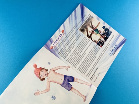
• Send us a work in progress file a few days before the job goes live. We can preflight it and let you know issues to fix.
So, if you have a project going ahead in the next few months there are a few things we can do to make the job run more smoothly:
• Give us a heads up in advance that the artwork is coming.
Allow more time for production
> an extra couple of days on digitally printed
> an extra 2-3 days on litho work
> Allow a lot longer for litho printed hardback books (750 copies or more, or those with section sewing).
We will work as quick and efficiently as we always do, but the volume of work does build. There is no harm in your work arriving well before the deadline rather than on it.
• If you are going for a Premium paper or foiling then we can order the material and dies before the artwork arrives if you book the job in.
• Couriers get overwhelmed too in the run up to Christmas and especially around Black Friday 24th November.
Any questions, do give us a shout, we are here to help on email, phone and live chat. We don’t bite, our customer service team are accessible, friendly and knowledgeable.
Allow more time and your important job will be a calm, fun project rather than a last minute scramble.
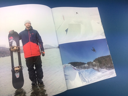
Are you a self-publisher who has just printed a fantastic book with us? Or perhaps you’re someone who’s looking to make a splash in the self-publishing world? Either way, we have an exciting announcement that’s going to take your book promotion to the next level!
Introducing Ex Why Zed’s Book Promotion Social Media Pack – a packed set of resources which allows you to start promoting your book immediately across multiple channels, and without you having to do the heavy lifting. Simply copy them into your Posts, Feed, Stories and Blogs and let the world see what you have created.
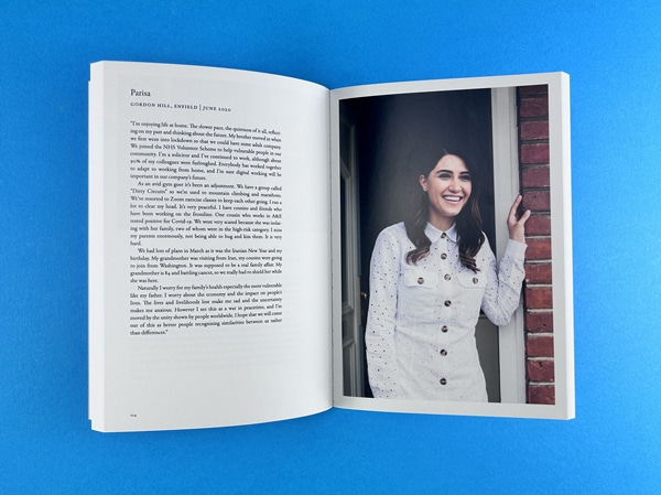
Our Social Media Pack is a comprehensive toolkit designed to kickstart your book promotion. It includes:
We will supply all of this, within 3 working days, for £250. If you print the book with us too, there is a £50 discount.
We’ve noticed that some of our clients aren’t quite sure what to do next after printing their books. Nobody wants a living room full of boxes for months so if you are wondering how to promote your book on social media, we have created this turnkey solution to help you hit the ground running.
Here are just a few benefits of our Social Media Pack:
Don’t let your book sit on the shelf. Give it the promotion it deserves with Ex Why Zed’s Social Media Packs for Book Promotion. It’s time to let your book shine!
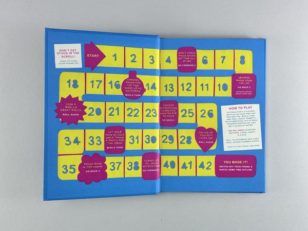
If you purchase the Social Media Pack along with your print order, we’ll print a few extra copies of your book which will be used in our studio for the photography and video content. If you have any specific content or messages about the book that you’d like us to include, feel free to share those with us. However, don’t worry if you don’t have anything prepared – our skilled writers can create engaging content based on the PDF file of your book.
If you’ve already had your book printed (hopefully with Ex Why Zed, although we do acknowledge that other printers exist… but let’s be honest, they’re not as good as us ????), all you need to do is send us a copy of your publication. We’ll take care of the rest! We’ll photograph your book, create video content, and produce a wealth of social media content by immersing ourselves in your book, your website, and your existing social media channels.
It really is that easy! With Ex Why Zed’s Social Media Pack for Book Promotion, promoting your book is a breeze. Let us do the hard work for you, so you can focus on what you do best – creating amazing content for your readers.
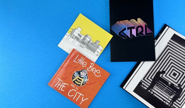
Choosing our Social Media Pack for Book Promotion over going through a traditional publisher has several significant advantages:
The question of how to promote your book as a self-publisher can by energy sapping and quite overwhelming. Choosing our Book Promotion Social Media Pack, you’re choosing a cost-effective, efficient, and effective solution to promote your book. You’re choosing to take control of your book’s promotion, tailoring your strategy to your audience, and leveraging the power of multi-channel promotion. And with our quick turnaround, you’ll have everything you need to start promoting your book in no time.
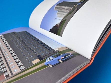
Don’t let your book be a well-kept secret! It’s time to let it shine in the spotlight it deserves. With Ex Why Zed, not only will you see your work beautifully printed, but you’ll also witness it making waves across the social media landscape.
Imagine the thrill of flipping through your professionally printed book, then watching as your story unfolds across Facebook, Instagram, Threads, X (Twitter), TikTok, LinkedIn, Pinterest, YouTube, and blogs. It’s not just about creating a book; it’s about creating a buzz, a conversation, a community around your work.
So, are you ready to turn the page to the next exciting chapter of your publishing journey? Let’s bring your book to life in print and online with Ex Why Zed’s Book Promotion Social Media Pack. The world is waiting to hear your story. Let’s not keep them waiting any longer.
Print with Ex Why Zed. Promote with Ex Why Zed. Start your journey today!
Email us on hello@exwhyzed.fixed-staging.co.uk or call on 01206 766647.
You are about to enjoy and digest the following insight:
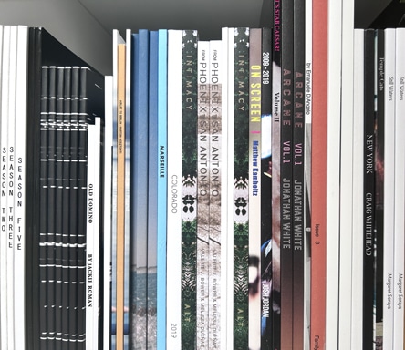
In the dynamic world of zine production, one factor always remains the same – the longing for a publication that seamlessly amalgamates quality, creativity, and affordability. As one of the leading UK print companies, Ex Why Zed has transformed this desire into reality, bringing to life an array of winning perfect bound zines over the years. This article will take you behind the scenes of our print production, showcasing some of our star performers that are not just high quality and cost-effective, but also adored by readers around the world.
A zine is more than just a medium of communication – it’s a representation of the creator’s artistic vision and identity. Let’s dive into our assembly line and see the champions that have made a difference.
Showcase 1: The Professional Portfolio
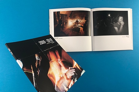
When you are looking for a professional-looking zine at a good unit price, ideal for a self-promo portfolio, our A5 Perfect Bound Books rise to the occasion. With a 4pp cover printed onto 300gsm uncoated and matt lamination on the outside, this model adds an air of professionalism to your portfolio. The 60pp text onto 115gsm uncoated and the four-colour print throughout ensure high-quality content delivery. The cost per copy decreases significantly with higher print runs, making it a cost-effective option.
Showcase 2: The Versatile Square Format Zine
A versatile and impressive square format zine is perfect for an annual report or a photo set from a recent foreign trip. Our 210x210mm Perfect Bound Books are printed on a 4pp cover onto 300gsm uncoated, with matt lamination on the outer surface for a sleek finish. The 76pp text printed onto 170gsm silk offers a quality tactile experience, and the four-colour print throughout ensures vibrant image reproduction.
Showcase 3: The Weighty Photography Zine
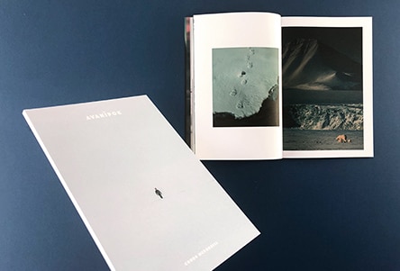
The exquisite weighty photography zine, ‘Intimacy’ by Ashton Thorp, is a perfect example of Ex Why Zed’s craftsmanship. The 4pp cover printed onto 300gsm uncoated and matt laminated to the outer, housing 160 inside pages printed onto 130gsm Silk, this four-colour printed zine not only captures Ashton’s photo sets from the last decade but also provides a substantial photo journal experience to the reader. The 9mm spine and an impressive landscape photo that wraps around the cover add a distinctive design appeal to this model.
If any of these champions fit your project bill, get a personalised quote from us. We are just an email away at hello@exwhyzed.fixed-staging.co.uk. In the world of zines, you pick, and we deliver!
Now that we have looked at some of the standard specifications, let’s delve into some other exceptional showcases.
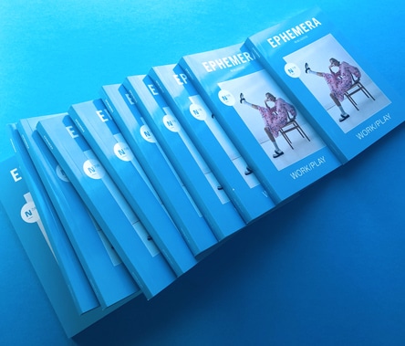
Showcase 4: The Evocative Ephemera Magazine Issue 7 & 8
An engrossing blend of art, photography, and insightful articles, Ephemera Magazine Issue 7 & 8 is a reader’s delight. With its perfect binding and unique design aesthetic, it is a model example of what Ex Why Zed can deliver.
Showcase 5: The Captivating MOOF Magazine Issue 6
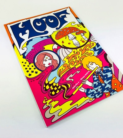
MOOF Magazine Issue 6 takes the reader on a psychedelic journey through music and art, bound together with Ex Why Zed’s perfect binding. The magazine’s eclectic content combined with our quality print production makes for a winning combo.
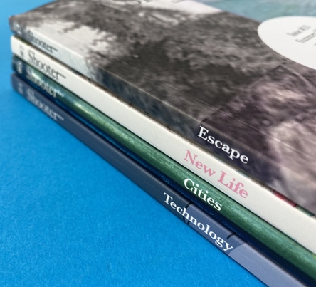
Showcase 6: The Engaging Shooter Literary Magazine
With its riveting collection of short fiction, non-fiction, and poetry, Shooter Literary Magazine is a testament to our perfect binding technique’s versatility.
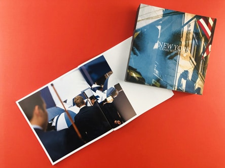
Showcase 7: The Vibrant New York by Sixstreetunder
This zine brings the city’s vibrance to life with its stunning photographs, perfectly bound to make each page a window to the city’s soul.
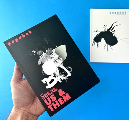
Showcase 8: The Enthralling Popshot Magazine
Popshot Magazine, with its captivating illustrations and engaging content, shines as a sterling example of our perfect binding prowess.
As we move further, we delve into the nuances of perfect bound book design. Mastering these aspects will ensure your zine not only looks good on a shelf or a coffee table but also creates an immersive reading experience. In this section, we’ll provide professional tips, including insights from our guide to perfect binding set-up, to help you steer clear of common pitfalls and ensure your project achieves the aesthetic it deserves.
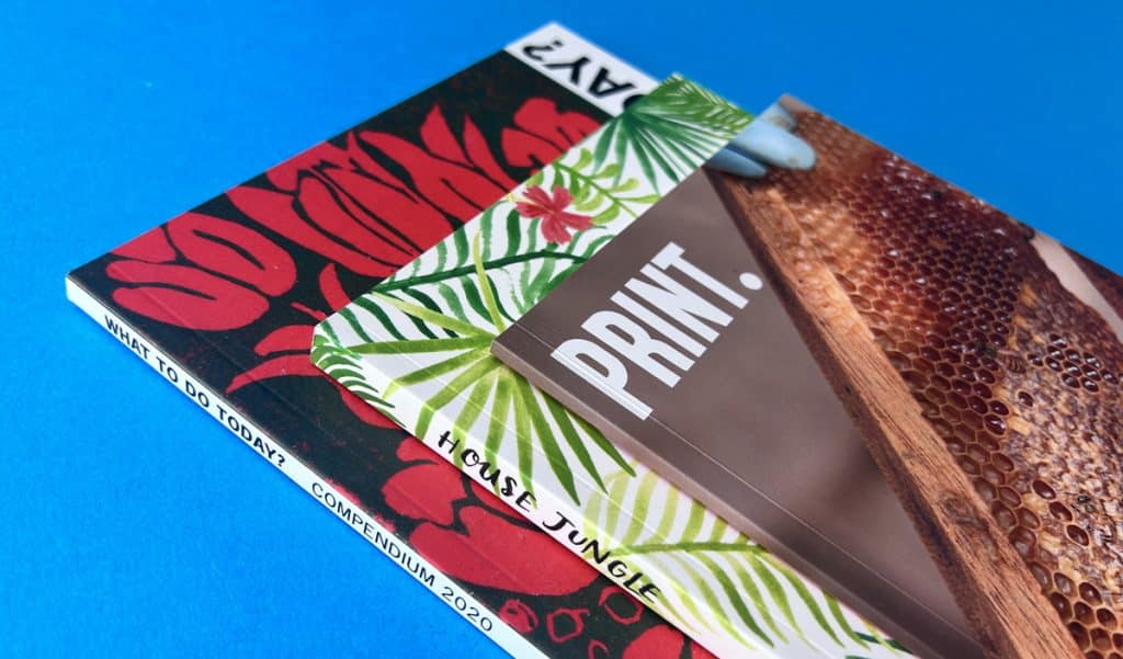
Designing a zine isn’t just about the cover; it’s about every page. Placing important content in the centre gutter can result in it being lost when the book is bound. To avoid this, we recommend using white borders or displaying one image per page. This approach ensures all content is easy to see, and your readers don’t have to strain their eyes or miss out on anything important.
When it comes to designing perfect bound books, one of the key challenges is the narrow spine and the effect it can have on content visibility in the gutter. To counter this issue, it’s crucial to keep any content out of the seven-millimetre area of the cover hinge, ideally 12 millimetres plus from the side of the four affected pages. This ensures that your content remains visible, and nothing important disappears into the centre gutter.
While perfect binding offers a professional and polished look, other methods like stapling or wire stitching can sometimes be more suitable depending on the nature of your project. For instance, wire stitching can be an excellent alternative for thinner publications.
Adding unique features to your zine can take it to the next level. Let’s look at some ideas using examples from our portfolio.
This zine showcases the power of a powerful cover design and uncoated paper, offering a unique feel that enhances the reading experience.
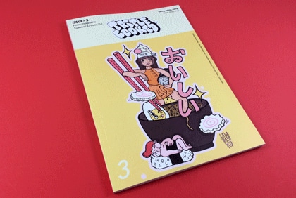
This issue of Triple Cooked exemplifies the effective use of vibrant colours and a balance of text and images for a captivating aesthetic.
Loyle Life
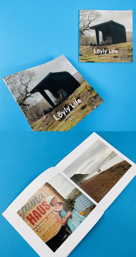
Expanding the lens of our showcase to bring you an inspiring piece of art that marries passion, culture, and craftsmanship, we bring you the ‘Loyle Life’ by the talented George Cory. This acclaimed photographer is known for his stark yet captivating compositions and a keen eye for detail. His work isn’t just photography; it’s storytelling at its most immersive, a characteristic that’s perfectly embodied in ‘Loyle Life’.
The ‘Loyle Life’ project is an exhilarating odyssey into the vibrant, pulsating heart of the British sauna culture. Through a series of evocative monochrome visuals, Cory deftly captures the unique camaraderie, warmth, and soulful rhythm that define this communal activity. Our Instagram post encapsulates the aesthetic brilliance of this project. From the perfectly timed shutter clicks to the meticulous arrangement of the elements, ‘Loyle Life’ exemplifies the power of print in telling compelling stories. With its visual brilliance and rich narrative, this project underlines why perfect bound zines are the preferred choice for photographers seeking to present their work in an aesthetically pleasing, high-quality format.
Now that you’ve got the basics down and explored design possibilities, it’s time to launch your zine into the world and consider cost-saving amendments to make your project even more economical. In this section, we’ll illustrate with a case study and provide tips to refine your print specs without compromising the zine’s appeal.
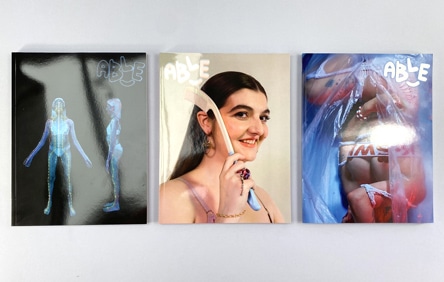
Launching a new zine can be exhilarating and daunting in equal measure. To inspire you, let’s take a look at Able Zine, a zine exploring the theme of the environment through the lens of disability and perspectives of the wider disabled community. The printed version offers a choice of five covers by various creatives, each packed with over 180 pages of content, images, and interviews. The glossy cover and carefully curated inside pages offer an engaging read while also emulating the look of high-fashion magazines.
A critical aspect of creating a winning zine is striking a balance between cost and quality. Here are some potential cost-saving amendments that can add value to your zine print specifications without breaking the bank:
Crafting a winning perfect bound publication requires patience, creativity, and a keen eye for detail. At Ex Why Zed, we are passionate about providing our customers with the support they need to make their dream zines a reality. Whether you’re a seasoned pro or a budding zinester, we hope this guide has given you valuable insights and inspiration. Remember, the journey to crafting ‘winning perfect bound zines’ is a process of continuous learning and creativity – so, let’s embark on it together!
In the world of self-publishing, zines have emerged as a powerful platform for illustrators to showcase their creativity. These small, self-made publications offer a unique canvas for visual storytelling, allowing artists to share their work in a tangible format that can be easily distributed and enjoyed. In this guide, we’ll explore the essential tools for zine publishing for illustrators, offering tips and insights to help you transform your artwork into print.
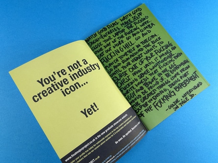
Wire-stitched zines, also known as stapled zines, are a popular choice among DIY creatives. They offer a unique blend of versatility, ease of assembly, and the ability to accommodate various content types. Whether you’re looking to showcase your photography, illustrations, or written works, wire-stitched zines provide a flexible and cost-effective solution.
At Ex Why Zed, we’ve had the privilege of printing a wide array of wire-stitched zines, each with its unique design and aesthetic. In this guide, we’ll delve into some of our past projects, highlighting the design elements, paper choices, and printing techniques that made each zine a standout piece.
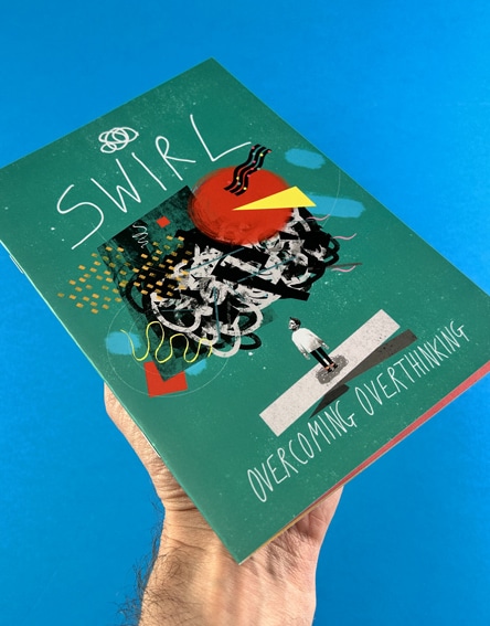
These two feature 300gsm uncoated zine covers with matt lamination on both sides, giving them a substantial and premium feel. The inside pages are printed onto 115gsm uncoated paper, providing a bright white finish that beautifully showcases the vibrant colours and illustrations. Despite the thicker cover, these zines still retain a certain charm, with the cover naturally trying to flatten itself out when opened.
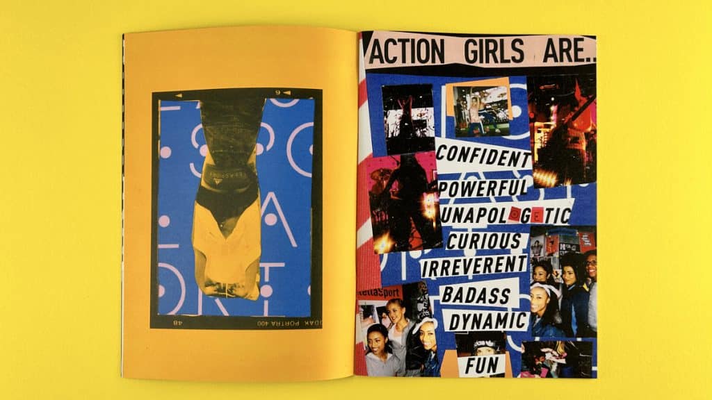
This zine is printed entirely onto 100gsm uncoated paper, giving it a slightly more flexible feel. Despite having 40 pages in total, the zine retains a certain charm, with a slight curl in the middle adding to its collectible appeal.
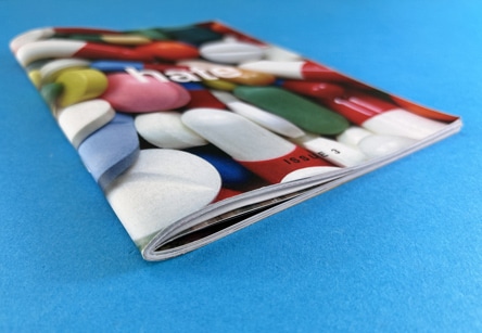
Pushing the boundaries of wire-stitched zines, Hate features a whopping 76 pages printed onto 100gsm Evolution Uncoated paper. Despite the large number of pages, the zine maintains its integrity, with a big curl on the spine and a lot of bounce adding to its unique appeal.
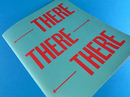
These four zines showcase the flexibility of wire-stitched zines in terms of size. Ranging from A5 to A4, these zines demonstrate that any bespoke size larger than A5 up to and including A4 can be achieved at the same price point. Whether you’re looking to create a compact A5 zine or a larger A4 publication, we’ve got you covered.
The best paper for zine printing depends on your specific needs and preferences. For a more premium feel, a 300gsm uncoated cover is a great choice. For the inside pages, a 115gsm uncoated paper offers a bright white finish that beautifully showcases your images. If you’re looking for an eco-friendly paper options, our 100% recycled Evolution Uncoated paper is a great choice. For more insights on paper choices, check out our guide on choosing the right paper for zine printing.
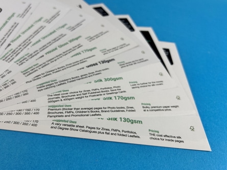
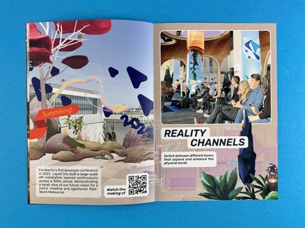
Formatting a zine for printing involves several steps, including setting up the correct page size, creating a layout that suits your content, and ensuring your images are high-resolution. You can find a detailed guide on how to format a zine for printing on our comprehensive guide for zine binding.
Zines can be printed on a variety of paper types, including uncoated, silk, and gloss paper. The choice of paper can greatly influence the look and feel of your zine, so it’s important to consider your options carefully. Check out our blog exploring lamination for zine covers for more insights.
Wire stitching, also known as stapling, is a popular binding method for zines. It’s cost-effective, easy to assemble, and can accommodate a variety of content types. However, the best binding for your zine will depend on your specific needs and preferences. For more insights, check out our comprehensive guide for zine binding.

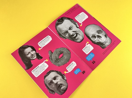
Creating a zine design involves several steps, including brainstorming ideas, creating a layout, selecting images or illustrations, and choosing typography and colours. It’s important to consider your target audience and the message you want to convey when designing your zine. For more insights, check out our YouTube video on zine design.
The cost of printing a zine can vary depending on several factors, including the size of the zine, the number of pages, the type of paper used, and the printing method. At Ex Why Zed, we offer competitive pricing for zine printing. You can get a quote for your project on our Printed Project Builder.
A good zine is one that effectively communicates its message and engages its audience. This can be achieved through a combination of compelling content, eye-catching design, and high-quality printing. For more insights, check out our YouTube video on what makes a good zine.
Zines can cover a wide range of topics and come in various types, including fanzines (focused on a particular band, celebrity, or TV show), per zines (personal zines that serve as a form of self-expression), art zines (featuring artwork or illustrations), and many more. For more insights, check out our YouTube video on different types of zines.
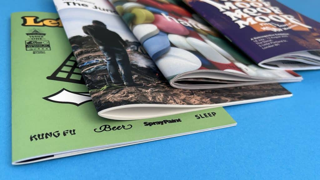
Creating a wire-stitched zine is a creative endeavour that allows you to express your ideas and share your work in a tangible format. With the right design elements, paper choices, and printing techniques, you can create a standout publication that truly reflects your vision.
At Ex Why Zed, we’re committed to providing high-quality zine printing services that elevate your visual storytelling. Whether you’re looking to print a photography zine, an art zine, or any other type of zine, we’re here to help. Get in touch with us today to start your zine printing journey.
Remember, the best zine printers are those who understand your creative rigour and can provide the definitive operational strategy to bring your vision to life. At Ex Why Zed, we’re proud to be a trusted partner to many superstar creatives, helping them relax and focus on their craft while we take care of the printing. So why wait?
Start exploring the world of zine printing with us today.
In the world of visual storytelling, the medium is as important as the message. At Ex Why Zed, we understand this better than anyone. Our photographic zine printing services are designed to elevate your visual storytelling, transforming your photography into flawless zines that captivate and inspire.
Photographic zines have emerged as a powerful platform for photographers to showcase their work. These compact, self-published booklets offer a canvas for creativity, allowing photographers to curate their images in a tangible format that can be shared and appreciated by others.
At Ex Why Zed, we are proud to offer high-quality photographic zine printing services that bring your visual narratives to life. From the choice of paper to the print quality, every detail is meticulously handled to ensure your zines look as stunning as the images they contain.
We have had the privilege of printing a diverse range of photographic zines, each one a testament to the creativity and vision of the photographers we work with. Here are a few examples that caught our eye:
Optimism is a standard A5 zine that showcases spectacular photography interspersed with illustrations. The layout is designed to give the images room to breathe, with white space used strategically to enhance the visual impact. The zine is wire-stitched with two staples on the spine, making it easy to flip through and admire the content.
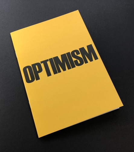
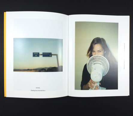
In ‘How to be Fun’, the images are the star of the show. The zine features a combination of full-bleed images and varying white borders around the pages, creating a very loose layout style. The cover, printed on Colorplan Factory Yellow paper with black text, adds a pop of colour that immediately draws the eye.
We take a look at a self-cover A5 photography zine. A pair of them in fact, because this photographer has chosen his ‘house’ style and prints all his zines to match each other. We call it self-cover because all of the pages including the covers are printed onto the same weight of paper, in this instance 170gsm Uncoated. A5 is a neat size and gives you A4 wide double-page spreads to show your work. You can see looking at the side view that there is always a bit of a curl in the zines (they don’t sit completely flat) but this is less apparent on self-cover ones than it would be if you chose a rigid 300/350gsm cover. A thicker cover won’t sit flat once opened and will likely stick directly out once opened. The uncoated finish means the ink soaks in slightly and has a softer appearance but is nice to touch. Design your own masthead for the cover and individual styling and we can print a great set of photography publications that will grow over time.
The winning print spec here is:
A5 Booklets
40pp Self Cover onto 170gsm Uncoated
Four colour print throughout
Trimmed, collated and wire stitched
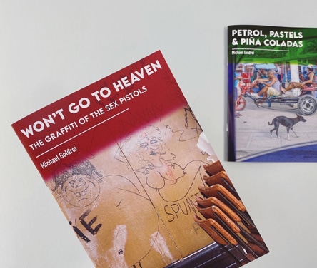
For photographers looking to create a more formidable and book-like publication, perfect-bound zines are an excellent option. These zines are bound with glue along the spine, giving them a professional and polished look. They are ideal for longer content, allowing photographers to include as many images as they want without compromising on the quality of the print.
Gloriously styled, head-space creating, surf-orientated photography of Yannick Schultz @bonjouryannick
The winning print spec is:
A5 Books
4pp Cover onto 300gsm Uncoated
Matt laminated to the outer
58 inside pages onto 170gsm Uncoated
Four colour print throughout
Trimmed, collated and perfect bound
An A5 photography zine with 58 pages of skies, terrain and images that just make you want to get in a VW Camper and leave the city behind. The 170gsm inside pages are more substantial, the max we can actually go to whilst ensuring the glue holds them in. There is a crispness and weight when the reader flicks through. Ahh, check out Yannick’s superb photography. There is a nice flow without adhering to a specific grid layout. We love his smiley face love on the first text page. So cool. The front cover on this particular version does seem to be onto a card lighter than the 300gsm that the final print run was produced onto. It could be 170gsm too with matt lamination which actually makes it easier to lift and open. Both would work. Wrapping the front cover image round onto the spine is one of our favourite design tricks. Going further, and wrapping it around to the back cover too is a superb technique! A top-class photo zine and you’d do well to copy the styling of this for a winning publication.
We enjoy Phoenix to San Antonio, the latest photography journal from the awesome @valeriej.bower and @melisduenas
203x152mm Zines 4pp Cover onto 240gsm Uncoated Matt laminated to the outer 120 inside pages onto 100gsm Uncoated Four colour print throughout Trimmed, collated and perfect bound
We pick up the story as they photographically depict their trip from Arizona to Texas capturing all manner of one-off moments on film. Enjoy classic American cars, a healthy dose of signage and the coolest dressed dude you’ve ever seen, all bookended by poetry and creative writing. We really like the choice of a 240gsm Uncoated cover. It creates a neat spine block and hinges that fall back to the text block easier than a more rigid 300gsm would. Yes, it’s thinner but the more of these snippets we do, the more we’re realising 240/250gsm is a better solution for zines and photobooks.
The 120 inside pages are printed onto 100gsm uncoated which again is slightly lighter than the standard weight which would be 115gsm. However, 100gsm is cheaper to print and each page features full bleed reportage photography documenting their trip across the States.
This is a winning print spec, we like it a lot.
#005 New York is the latest in a set of personal photography journals by @bizzitakingphotos. Just small print runs for personal consumption but each one focuses on a different destination and the sets are formatted and laid out in a polished fashion.
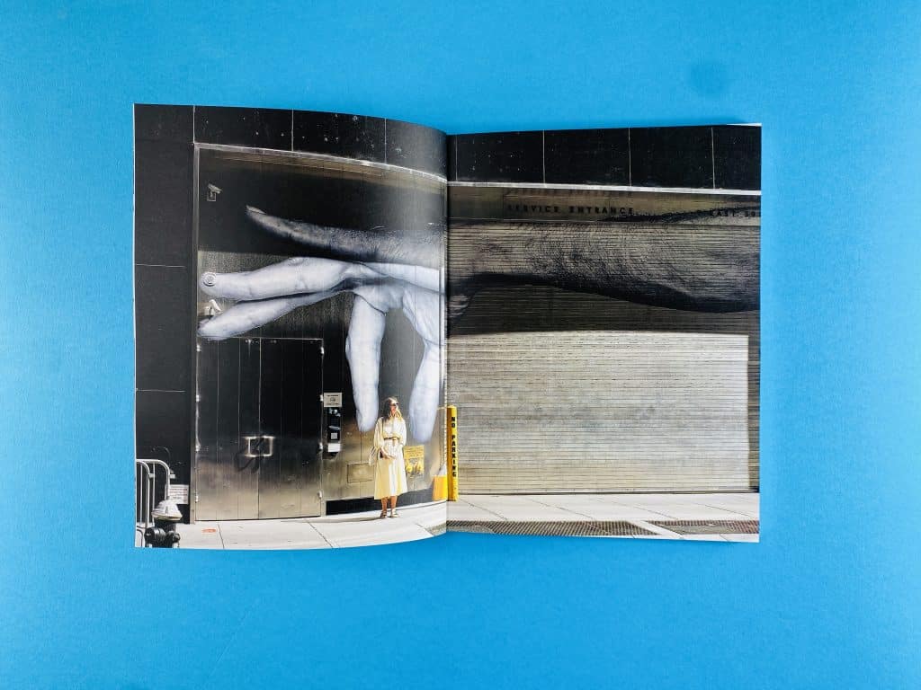
These publications are just a tiny drop in the ocean of the superb photographic zines printed at Ex Why Zed. Just a teaser to whet your appetite about what can be achieved in print. Check out our YouTube channel Ex Why Zed Videos and website portfolio Ex Why Zed Portfolio for more inspiration. Our YouTube is regularly updated with showcase snippets of recent work and super helpful guides on file set-up. Get in touch when yours is ready to go ahead, we can’t wait to see your artwork.
At Ex Why Zed, we believe in the power of personalisation. That’s why we offer customised zine printing services that cater to your unique needs and preferences. Our zine video guide showcases all these options.. Whether you want a specific size, a particular type of paper, or a unique binding method, we can make it happen. Our team of experts will work closely with you to understand your vision and deliver a product that exceeds your expectations.
In the showcase snippet video above we take a look at the three different binding choices when we come to print your children’s book at Ex Why Zed. The key thing to remember is that the binding method you choose is dictated by the number of pages your publication has.
Let’s get started! First up is wire stitching or stapling if you prefer less print jargon. The printed sheets are produced as spreads then folded in half and stapled twice on the spine to keep them together. Simple, cheap and effective for up to around 40 pages. It might be visually as high end as our next two options but the advantage is that the reader can press the pages completely flat which is a BIG advantage for kids books and bedtime reading. You need to settle on a multiple of four pages for wire stitching so 20,24,28 for example…in case you don’t have a calculator handy 🙂
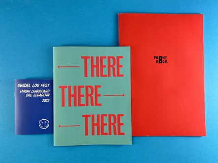
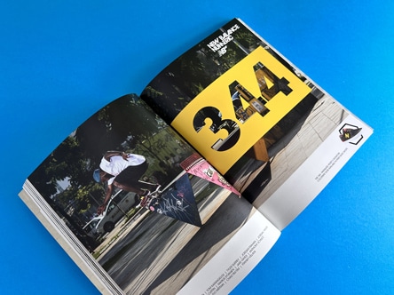
Next up is perfect binding where we print the cover as a spread with a separate text block. The text block is trimmed to the size of your finished book, roughened up on the left hand edge, a layer of glue applied and the cover is wrapped around and glued on with a 7mm hinge to the text block. Your books will have a neat spine if you have a minimum of 32 pages. A lot of books in the children’s sector are exactly 32 pages so choose 170gsm silk, gloss or uncoated for the inside pages and that will just about get us to the 3mm thickness we need to glue the spine. Under 170gsm will be too thin. You can see that it is slightly harder to press the pages down, more so the nearer to 32 pages you are because the spine is tighter. So, don’t rule out staple binding completely if it’s super important that the reader sees the whole of the double-page spread.
The finish of your zine can greatly enhance its overall look and feel. At Ex Why Zed, we offer a range of professional print finishes that can add a touch of elegance to your photographic zines. From matte and gloss to textured finishes, we have options to suit every style and preference. Our team can guide you through the selection process, helping you choose the perfect finish for your zine.
Creating a photographic zine can be a complex process, but you don’t have to do it alone. At Ex Why Zed, we offer expert assistance every step of the way. From choosing the right paper and print quality to designing the layout and selecting the binding method, our team is here to help. We are committed to making the process as smooth and enjoyable as possible, so you can focus on what you do best: capturing stunning images.
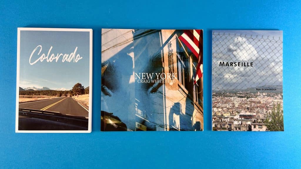
Yes, people still buy zines. In fact, zines have seen a resurgence in popularity in recent years. They offer a unique and tangible way to consume content, which many people find appealing in our increasingly digital world.
Zines are important because they offer a platform for self-expression and creativity. They allow individuals and groups to share their ideas, perspectives, and artwork in a format that is accessible and affordable.
Historically, zines were printed using DIY methods such as photocopying and hand-stitching. Today, professional printing services like Ex Why Zed offer high-quality zine printing with a range of options for paper, size, and binding.
Zines can be displayed in a variety of ways. Some people like to showcase them on coffee tables or bookshelves, while others prefer to hang them on walls or display them in glass cases. The choice is entirely up to you and depends on your personal style and space.
Zines became popular as a form of counterculture in the 1970s and 80s. They were a way for individuals to express their views and share their artwork outside of mainstream media. Today, they continue to be popular for their unique and personal nature.
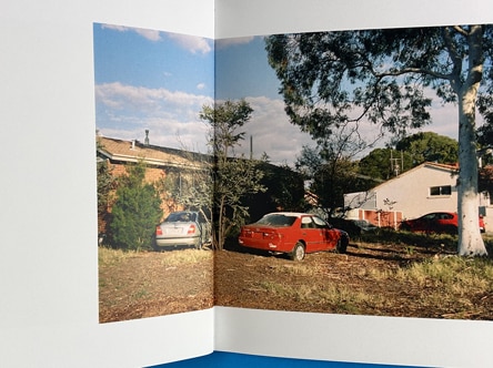
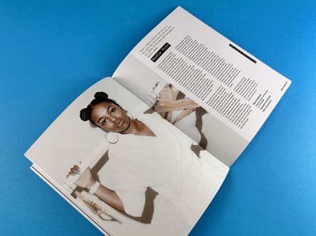
Zines became popular through word of mouth and distribution at events like concerts, art shows, and political rallies. Today, they are often sold online or at independent bookstores, and their popularity continues to grow thanks to social media and a renewed interest in physical media.
At Ex Why Zed, we are passionate about bringing your photographic vision to life. Our expert photographic zine printing services are designed to deliver high-quality prints that do justice to your images. Whether you’re a professional photographer looking to showcase your work or a hobbyist wanting to share your images with the world, we are here to help. Get in touch with us today to start your photography zine printing journey.
Skateboarding is more than a sport; it’s a culture, a lifestyle, and a form of self-expression. One of the most vibrant aspects of this culture is the world of skate zines. These DIY publications, often created by skaters themselves, capture the spirit, creativity, and community of skateboarding in a way that mainstream media can’t. In this comprehensive review, we’ll dive into the world of skate zines, exploring some of the most influential publications like Lines, Lost Art, and Same Old Zine, and their impact on the skateboarding community.
Skate zines embody the DIY ethos that is at the heart of skateboarding culture. Just as skaters transform urban landscapes into their playgrounds, they turn their experiences, stories, and artwork into zines that reflect their unique perspectives. These zines are often hand-drawn, photocopied, and distributed within the community, making each one a labor of love and a testament to the skater’s passion for the sport.
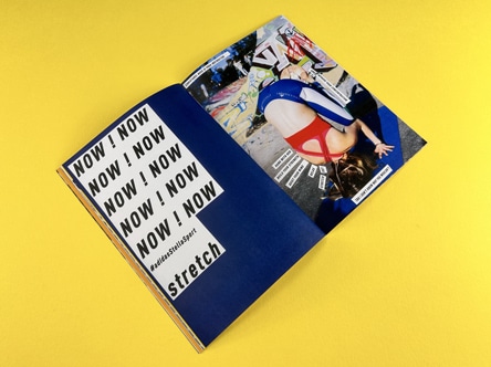
Creating a skate zine is not just about showcasing one’s skateboarding skills or knowledge. It’s also about contributing to the community, sparking conversations, and inspiring others. Whether it’s a zine featuring trick tutorials, skatepark reviews, or skater profiles, each publication adds to the rich tapestry of skateboarding culture.
Skate Pal ‘Lines’ is a prime example of a skate zine that has made a significant impact on the skateboarding community. This A5 zine, with its 300 GSM front cover and 115gsm inside pages, is a visual and textual exploration of skateboarding in Palestine. The zine features a mix of editorial content, illustrations, and skate photography, all presented with great typography and ample white space to let the content breathe. Lines is more than just a collection of skateboarding images and stories. It’s a platform for highlighting the skateboarding scene in Palestine, a region that is often overlooked in mainstream skateboarding media. By showcasing the talent and passion of Palestinian skaters, Lines is not just a zine; it’s a statement, a testament to the power of skateboarding to transcend borders and unite people.
Lost Art is another influential skate zine that deserves mention. This zine is a collaboration with Nike Skateboarding, and it’s a visual feast for the eyes. The full-bleed, punchy, faded black and white images throughout the zine are a testament to the artistry and creativity inherent in skateboarding.
Lost Art goes beyond traditional page layouts, mixing and matching multiple images on a page and overlaying text on images. This Ray Gun-esque approach to design gives the zine a dynamic, energetic feel that mirrors the excitement of skateboarding itself.
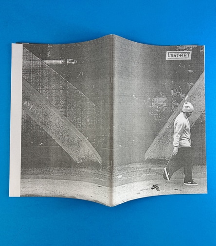
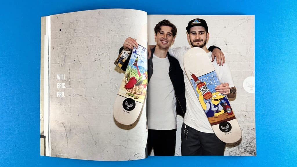
Same Old Zine takes the concept of a skate zine to another level. This skateboarding magazine book features over 100 pages of carefully curated content, including stunning illustrations, engaging text, and breathtaking photography. The zine is perfect bound with matt lamination on the cover, giving it a professional and polished look.
Same Old Zine is a celebration of skateboarding in all its forms. Whether it’s showcasing gnarly tricks, highlighting underground skate spots, or profiling emerging skaters, the zine captures the essence of skateboarding culture in a way that is both authentic and engaging.
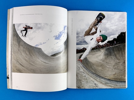
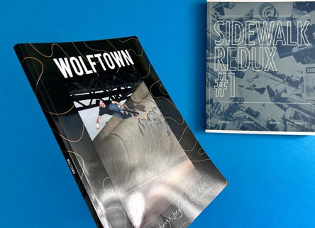
Two other notable skate publications that deserve mention are Wolftown and Sidewalk Mag Redux. Both are perfect bound publications that feature almost 200 pages of content, making them more akin to books than traditional zines.
Wolftown, a product of Wolftown Skateboards, is a testament to the skateboarding scene in Wolverhampton, UK. The zine is a collection of montage artwork, free-flowing page layouts, and gnarly graphics that capture the essence of the local skateboarding community. It’s a celebration of the city’s skateboarding culture, showcasing the talent and passion of its skaters. You can check out their latest issue here.
Sidewalk Mag Redux, on the other hand, is an iconic publication in the skateboarding world. It’s a comprehensive archive of skateboarding history, featuring interviews, profiles, and stunning photography. The zine is a must-read for anyone interested in the evolution of skateboarding culture and its impact on society. You can delve deeper into their content here.
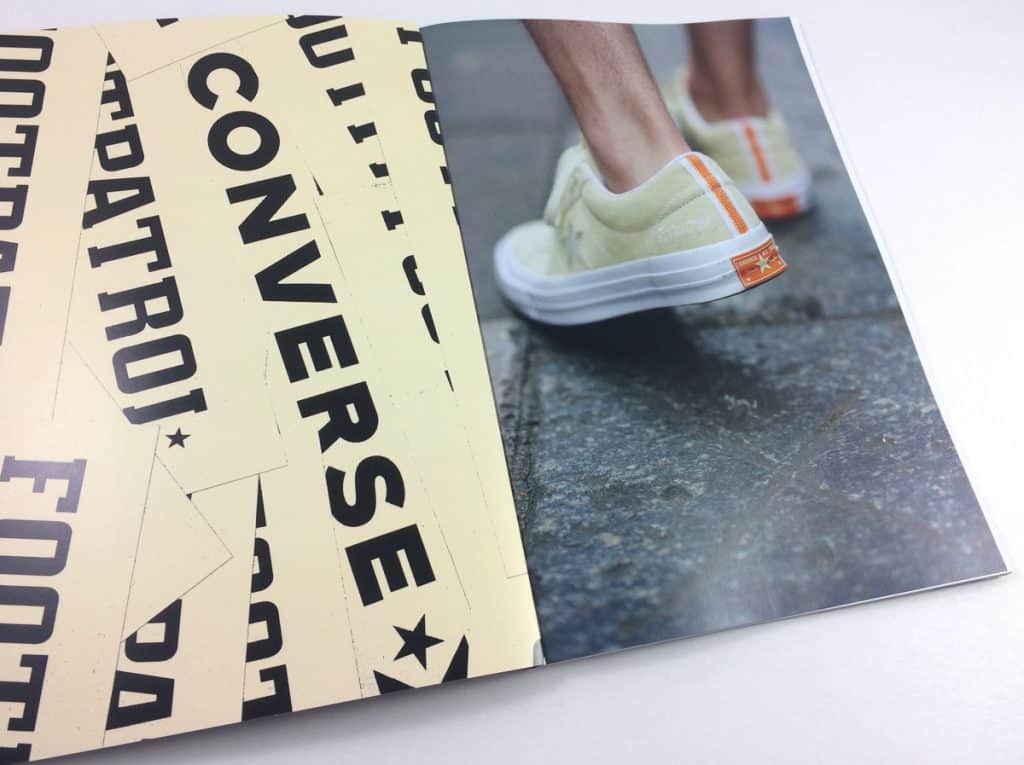
Converse and Footpatrol, a premier London sneaker boutique, unveil a modern spin on the iconic One Star silhouette. Drawing inspiration from Footpatrol’s birthplace, Berwick Street Market in Soho, the collaboration embodies the cultural richness of this lively neighbourhood.
The Footpatrol x Converse One Star, available in classic black or pristine white, marries aesthetic appeal with high-quality materials. Signature logos on the outer and inner sides represent the union of these brand identities.
To accompany his collab we printed an A5 lookbook with a silk finish. Explore our portfolio for more on this exciting skateboard print case study. The Footpatrol x Converse One Star collection is now available at select Converse and Footpatrol stores.
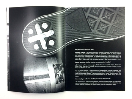
Skate zines play a crucial role in fostering connection and creativity within the skateboarding community. They provide a platform for skaters to share their experiences, showcase their skills, and express their views on various aspects of skateboarding culture. By doing so, they contribute to the diversity and vibrancy of the skateboarding scene.
Moreover, skate zines also serve as a historical record of skateboarding culture. They capture the evolution of the sport, the rise of different skateboarding styles and trends, and the stories of skaters who have shaped the scene. In this sense, skate zines are not just publications; they are time capsules that preserve the legacy of skateboarding for future generations.
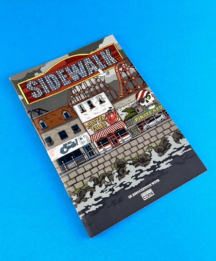
Wrapping this up, skate zines are a vital part of skateboarding culture. They embody the DIY ethos of the sport, provide a platform for skaters to share their stories, and contribute to the richness and diversity of the skateboarding community. Whether you’re a seasoned skater or a newbie, exploring skate zines like Lines, Lost Art, and Same Old Zine is a great way to immerse yourself in the world of skateboarding. So when you take the board out tomorrow, get your mate to find some great angles to shoot you from!
In the ever-evolving landscape of modern culture, zines have carved out a unique niche. These self-published, often handcrafted booklets have their roots in the counterculture movements of the 20th century, but today, they’re not just the domain of artists, activists, and indie publishers. Increasingly, corporations, agencies, and studios are harnessing the power of zines to promote themselves or their clients. At Ex Why Zed, we’re at the forefront of this trend, providing top-notch zine printing services to a diverse range of clients. In this post, we’ll showcase some of the most innovative and engaging zines we’ve had the pleasure of printing.
The London Short Film Festival Programme for 2020 took the format of a self-cover zine, allowing the pages to open easily for attendees. The layout is legible and straightforward, with the name of the film at the top and some text underneath, forming a really neat publication. The 60 pages are wire-stitched down the side, making it a practical and stylish guide for festival-goers.
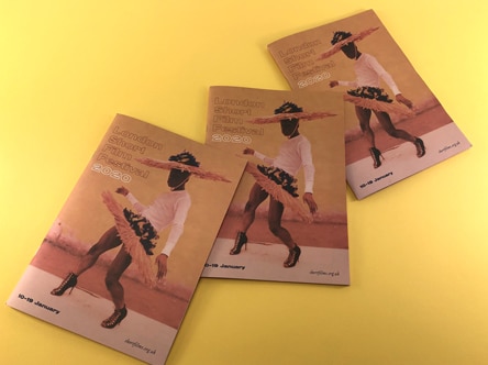
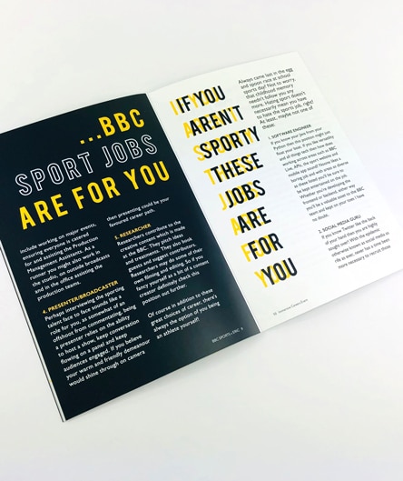
BBC Sport approached us to print a zine for their new intake of interns. Generally, they are in their early 20s, so printing an introductory handbook in zine form was a good fit for the target market. It has a slightly thicker 250gsm front cover and 130gsm silk all the way through. This neat zine format effectively promotes the creative work they’re doing at BBC Sport.
‘We Make London’ is a cool little zine we’ve just printed recently in conjunction with the design agency Raw Ground Arts. This zine was created for a Science Museum exhibition. They wanted a zine format to appeal directly to the demographic of children and youths that they’ve been working with on this project. So, they opted for a 300gsm front cover plus matt lamination, resulting in a solid and engaging solution.
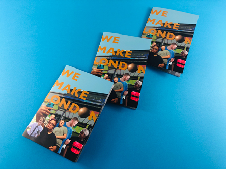
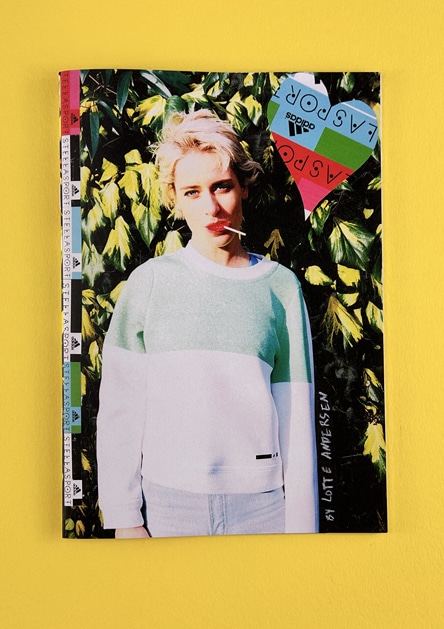
Next up is the Adidas x Stella Sport zine lookbook for their recent collection. They went for an A4 format with all the pages onto the same 100gsm paperweight. The pages are nice and flimsy, easily opening all the way through. Two staples down the spine bind it together. The zine features glorious full-colour images all the way through and punchy typography. This was a big hit at the launch party at Topshop on Oxford Street, where a large number of industry types enjoyed consuming the content in zine form.
Trailblazer Mag is a superb new interactive magazine from @arianacreates_ for kids aged 6-13. This zine offers 24 pages of engaging, bright design, colouring pages, cut and keep content, and features a spotlight on the brilliant @rubyst and @180.studios @storyseedspod @whowhenwowpod. Trailblazer Mag aims to introduce new and exciting art topics to kids each month while also exercising their creativity.
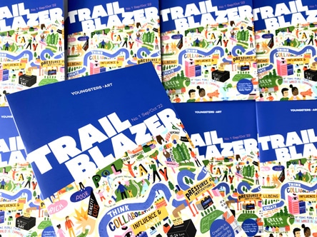
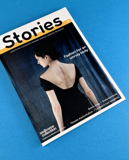
For longer content business zines, perfect binding is a great option, as demonstrated by the Wellcome Collection with their ‘Stories’. This zine explores intersections of society that we often consider to be separate but change our understanding when they collide.
Ex Why Zed was incredibly proud to work with cutting-edge music video host, Vevo, on its first ever print publication which championed their 20 artists to watch out for in 2017. The finished magazine arrived in New York just after Thanksgiving weekend and were swiftly distributed across the US while the London copies were given out by street teams.
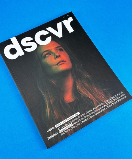
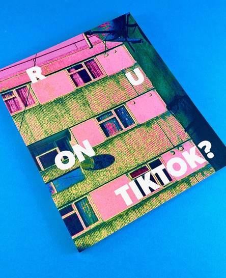
An insightful book by Ok Cool captures Londoners in their natural environment, London, and asking them whether they are on TikTok. Vivid bright green Pantone printing, translucent divider sheets and slick graphic design contribute to make this an engaging zine. A gloriously curated, magnificently designed, boundary-pushing @okcool zine featuring 6 colour printing, magic-revealing translucent sheets, a bespoke size and the simple question; RU ON TIKTOK? Sixteen Londoners were asked the question and the pages are filled with their responses and photography as we transcend the digital hyper-reality of @tiktok_uk into a printed artefact. You see, everyone still loves a physical piece as much as they love scrolling through the latest dance trend!
Increasingly, we are seeing shrewd brands printing zines with us to target a younger audience demographic. Keen to lure them away from screens, a printed zine is a tangible and captivating alternative which, if designed and styled correctly, can engage attention to deliver a message.
Yes, people still buy zines. Despite the digital age, there’s a unique appeal to holding a physical copy of a zine. It’s a tangible piece of art that you can touch, feel, and even smell. Plus, zines often cover niche topics that might not be widely available in mainstream media.
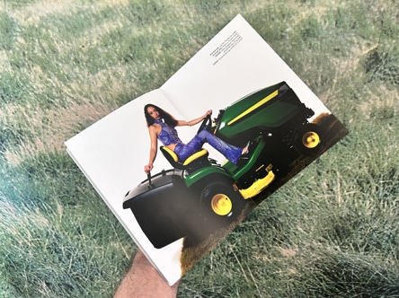
Zines are important because they offer a platform for self-expression and creativity. They allow individuals and groups to share their thoughts, ideas, and art with the world. In the corporate world, zines can serve as a unique marketing tool, helping to promote a brand or product in a creative and engaging way.
Traditionally, zines were printed using DIY methods like photocopiers. Today, professional printing services like Ex Why Zed offer high-quality zine printing, allowing for a wide range of sizes, paper types, and binding options.
Zines can be displayed in a variety of ways. Some people like to showcase them on bookshelves or coffee tables, while others prefer to hang them on walls
or create dedicated zine racks. In a corporate setting, zines can be displayed in waiting areas, reception desks, or even distributed at events and trade shows.
Zines became popular as a form of counterculture communication in the 20th century, allowing individuals and groups to share their views and art outside of mainstream media. Today, their popularity continues due to their unique charm, DIY ethos, and the creative freedom they offer.
Zines became popular through word of mouth, distribution at events, and through underground networks. Today, the internet has also played a significant role in the popularity of zines, allowing creators to reach a global audience.
Zines are a powerful tool in the modern corporate and agency world, offering a unique way to engage with audiences, promote brands, and showcase creativity. At Ex Why Zed, we’re proud to be part of this exciting evolution, providing top-quality zine printing services to our clients. Whether you’re a corporation, an agency, or an individual, we’re here to help you bring your zine vision to life.
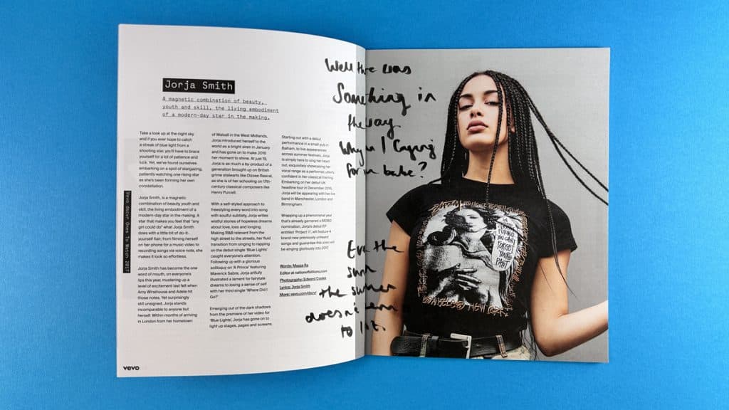
Coming up with an idea for a poetry zine can be an exciting journey. Here are some steps to help you get started:
Poetry is a deeply personal form of expression, and the best ideas often come from your own experiences, emotions, and observations. Reflect on what moves you, whether it’s love, nature, social issues, or personal growth.
A theme can provide a unifying thread for your poetry zine. It could be as broad as “love and loss” or as specific as “the changing seasons in my hometown.” A theme can help guide your writing and give your zine a cohesive feel.
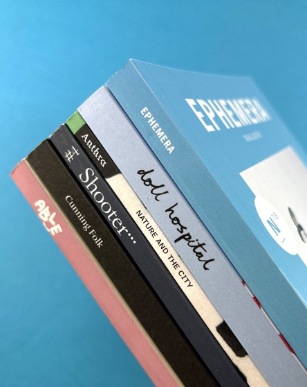
Think about who you’re writing for. Are you aiming to connect with other poets, or do you want to reach a broader audience? Understanding your audience can help shape your content and style.
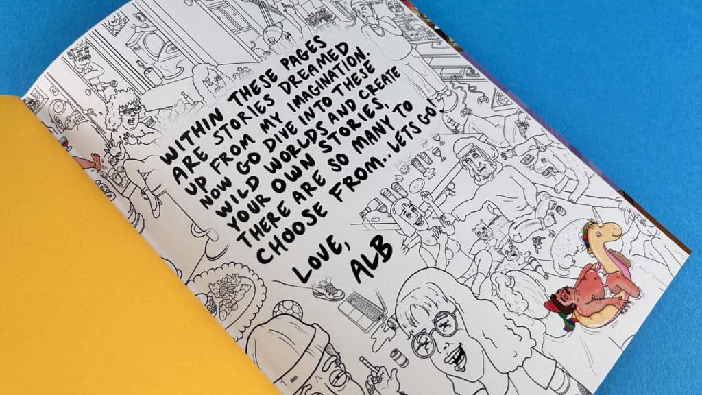
Poetry comes in many forms, from traditional sonnets and haikus to free verse and experimental styles. Don’t be afraid to play around with different forms to see what resonates with you.
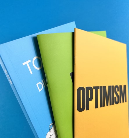

A mood board can be a great way to visualize your ideas and inspirations. You can include images, colours, words, and anything else that captures the vibe you want for your zine.
Remember, there’s no right or wrong way to create a poetry zine. It’s all about expressing your unique voice and perspective. So let your creativity flow and enjoy the process!
Popshot, a renowned platform for poets and illustrators, began their print journey with Ex Why Zed. Recognised for being zine printing experts, we at Ex Why Zed were thrilled to assist Popshot in bringing their creative vision to life. From the initial stages of design to the final print, we worked closely with Popshot to ensure their zine was a true reflection of their unique brand. Today, Popshot continues to inspire and engage audiences with their beautifully crafted zines, and we’re proud to have played a part in their journey.
For more tips and guidance on creating your own zine, check out our Definitive Zine Printing Guide.
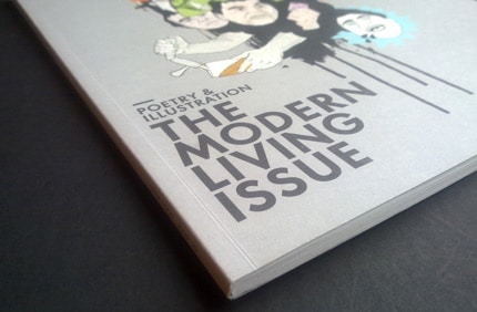
Hey there, creative superstar! Are you ready to dive into the world of indie poetry zines? These little gems are a hotbed of creativity, showcasing the talents of poets and artists alike. They’re a testament to the power of self-publishing, proving that you don’t need a big publishing house to make your voice heard. So, let’s take a closer look at these indie poetry zines that are making waves in the literary world.
First up, we’ve got The Chapess, a zine that’s all about showcasing the work of women writers. It’s a brilliant platform for female voices, offering a space for them to share their unique perspectives. The Chapess is a testament to the power of indie publishing, proving that you don’t need a big budget to create something truly impactful.
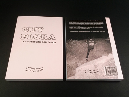
Next, we have OOMK, a zine that’s all about celebrating creativity and spirituality. It’s a beautiful blend of art, culture, and faith, offering a fresh perspective on what it means to be a creative individual in today’s world. OOMK is a perfect example of how zines can be a platform for exploring complex themes and ideas.
The Happy Reader is a zine that’s all about celebrating the joy of reading. Each issue features a deep dive into a classic book, along with interviews with notable figures in the literary world. It’s a must-read for any book lover, offering a fresh and engaging take on the world of literature.
Synchronise Witches is a zine that’s all about showcasing the work of female and non-binary writers. It’s a space for these voices to be heard, offering a platform for them to share their unique perspectives and experiences. Synchronise Witches is a testament to the power of indie publishing, proving that you don’t need a big budget to create something truly impactful.
Last but certainly not least, we have The Poetry Review, a zine that’s all about celebrating the best in contemporary poetry. Each issue features a selection of poems from both established and emerging poets, offering a snapshot of the current poetry landscape. The Poetry Review is a must-read for any poetry book lover, offering a fresh and engaging take on the world of poetry.
So there you have it, folks! These indie creative writing books are a testament to the power of self-publishing, proving that you don’t need a big budget to create something truly impactful. So why not give them a read, or better yet, start your own zine? With Ex Why Zed by your side, you’ll have all the support you need to bring your creative vision to life. Happy reading, and happy creating!
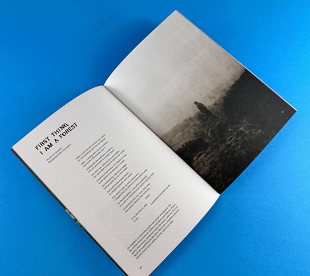
In the world of music, zines have long been a platform for independent voices, a space where underground scenes can flourish, and a medium for artists to connect directly with their fans. From punk rock to hip-hop, from indie to electronica, every genre has found a home in the DIY ethos of zine culture. Today, we’re going to dive into the world and art of music zine printing, exploring their impact, their evolution, and their future.
The first music magazine can be traced back to 1984 when Billboard first appeared. Founded in Cincinnati by William H. Donaldson and James Hennegan.
In 1926 followed Melody Maker in the UK, NME joined the roster of people’s weekly musical consumption in 1952 and Stateside Rolling Stone arrived in 1967.
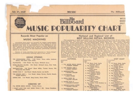
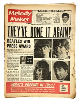
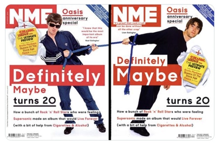
Zines! A Retro Rollercoaster
Our journey begins on the evolution of music zines in their current form in the disco-laden ’70s. Amidst the rise and fall of bell-bottoms, zines were born, humbly handcrafted and handed over at gigs. They quickly became the heartbeats of underground music scenes, whispering untold stories of punk, rock, and indie music. The raw, unfiltered emotions echoing from these pages introduced us to a new kind of musical dialogue, a raw lexicon of rebellion.
Power Chords of Zines: Rebooting the Mainstream Mixtape
Ever wondered what it feels like to turn the volume knob on mainstream narratives? Zines did exactly that! They provided a platform for the unheard, the unseen, those grooving to a different tune, far from the shiny limelight of commercial success. Zines are the VIP backstage passes, revealing a world of authenticity beyond what the audience sees from the mosh pit.
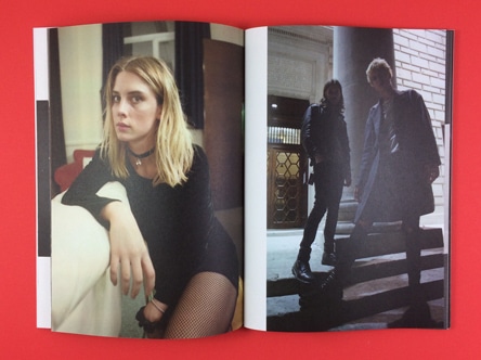
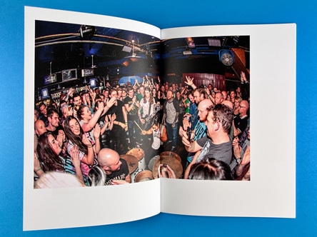
Zines: Spinning the Record on Music Consumption
Zines didn’t just remix our playlists; they transformed our relationship with music. They made us question the simple ‘like’ and ‘dislike’ toggles, challenging us to dive deeper into the harmonious waters of music. Zines nudged us to consider the artist’s soulful intent, the socio-political backdrop, the poetry in lyrics, and the texture of sound. They made us active listeners, tuning our ears to the nuances of musical composition.
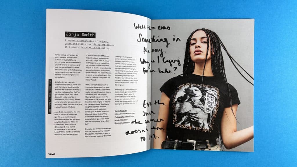
Zines and The Internet: An Encore in Cyberspace
The arrival of the digital era didn’t silence the music of zines; instead, it amplified their rhythm to a wider audience. Blogs, vlogs, online communities – they’ve all struck a chord with the ethos of zines, echoing their messages of dissent, dialogue, and diversity. Zines haven’t faded into the vinyl archives; they’ve simply found a new stage.
Zines Now: Conducting the Symphony of Musical Democracy
Zines remain the steadfast conductors of our music orchestra, waving their batons to the beat of inclusivity and exploration. They democratise music consumption, making us all members of the global music committee. Today, zines stand as tangible anthems of people’s power, their pages humming with the democratisation of musical discourse.
Zines: Future Hit Singles
Zines aren’t slowing their tempo; they’re evolving, turning up the volume on more than just music. They’ve become a global sensation, a catalyst for change, and a sonic reflection of society. Their impact on the music landscape is as apparent as a high note at a soprano’s concert. Buckle up, folks; the zine express is hurtling towards an electrifying future!
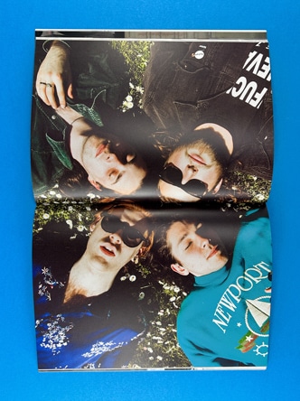
Coda: The Everlasting Echo of Zines
So, there we have it – the zine chronicle! These feisty self-published maestros have rewritten our music scores, inviting us into the jam sessions of punk, the indie rehearsals, and the digital concerts. They’ve stirred a sense of unity, building a global mosh pit for music aficionados. Thanks to the transformative power of zines, we’ve become explorers, not just listeners, in the musicverse.
As the tune of this narrative fades, remember: the spirit of zines lives on, in every artist’s story, every fan’s critique, and every concert goer’s photography.
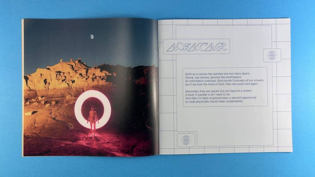
In the showcase snippet video below, we are looking at an A5 zine printed on uncoated paper. The cover has an engaging image which wraps around and is printed onto 200gsm. With 24 pages the zine is wire stitched…or stapled. We can just about get away without laminating 200gsm and the ink won’t crack when it is folded. It is a nice flexible weight that isn’t too rigid. Yes, this zine was for George Ezra. You’ll have seen him on the telly box and at Glastonbury. This was a zine to accompany his latest number one album, Gold Rush Kid. The inside pages are printed onto 115gsm Uncoated. Printing onto uncoated always gives a softer feel to the colours. The lack of a coating means the ink soaks into the paper but there is a tactility when the reader flicks through. This is the decision you need to make. If you want nice bright colours that are true to the screen, choose silk or gloss instead.
Independent music zines have played a crucial role in shaping music culture over the decades. They’ve been the breeding ground for new ideas, the platform for emerging artists, and the catalyst for music movements. They’ve challenged mainstream narratives, championed underrepresented voices, and fostered a sense of community among music lovers.
Over the years, many independent music zines have left their mark on the music scene. One such zine is ‘These could be the best days of our lives’. This children’s zine features stunning full-colour illustrations, charmingly arranged on the page with a little bit of text opposite to guide the reader through the narrative. The gloss laminated cover instantly draws the reader in, adding a touch of professionalism to the DIY aesthetic.
Another influential zine is Shell Suit Zombie, a zine for the creative market designed to help creatives decide what they’re going to do after they finish university. The zine features high-end illustrations on uncoated paper, which means they sit flatter and softer on the matt surface. It’s an A5 perfect bound zine, demonstrating the versatility of zine formats.
When the time comes to print your own photography zine, there are a few key considerations to keep in mind. The first is the paper choice. Some styles definitely work better on uncoated paper to soften the images and lines. You might consider uncoated if the original drawings were in pencil or crayon. Alternatively, for sharp, crisp images then a silk finish would be the winning choice. If in doubt, request a paper sample pack from Ex Why Zed to help you decide.
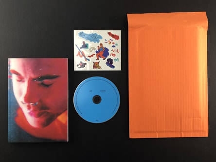
The example here, was limited edition promotional printing for the release of the CRI Juvenile album in October 2020. Printed, collated and assembled at Ex Why Zed in the UK.
The pack included:
• Limited edition perfect-bound zine book
• ‘Juvenile’ album CD insert
• exclusive ‘Juvenile’ temporary tattoo sheet
All lovingly packaged in an orange bubble envelope.
Despite the rise of digital media, independent music zines are far from dead. In fact, they’re experiencing a resurgence, fuelled by a renewed interest in tangible, physical media and a desire for authentic, unfiltered content. As we move forward, it’s clear that independent music zines will continue to play a vital role in the music landscape, providing a platform for artists to express themselves, fostering a sense of community among fans, and challenging the mainstream music industry.
Independent music zines are more than just DIY publications – they’re a testament to the power of music, the importance of independent voices, and the enduring appeal of tangible, physical media. Whether you’re an artist looking to share your music, a fan seeking out new sounds, or a music enthusiast interested in the culture and history of# The Art of Music Zines: Diving into the World of DIY and Independent Music Publications.
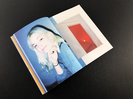
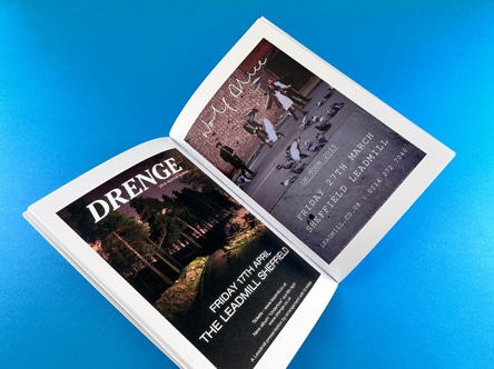
Zines have always been a platform for self-expression, a space where creators can let their imagination run wild. Whether it’s a literary magazine like Shooter, a typographic marvel like No Cold Callers, or a poetry zine, each one is a unique piece of art. In this post, we’ll take a closer look at these three distinct types of zines, each showcasing a different facet of creativity and individuality.
Shooter literary magazine is a testament to the diversity of topics that can be explored in zines. Each issue is centred around a different theme, providing a platform for a multitude of voices to be heard. For instance, the ‘Cities’ issue features neatly arranged text following a grid format, showcasing the poetry and creative writing of various writers. The text is intertwined with full-colour pages, acting as a backdrop to the creative writing.
The Shooter zines are perfect bound, with a neat spine that comfortably accommodates the title and the name of the magazine. This binding style not only gives the zine a professional look but also ensures durability.
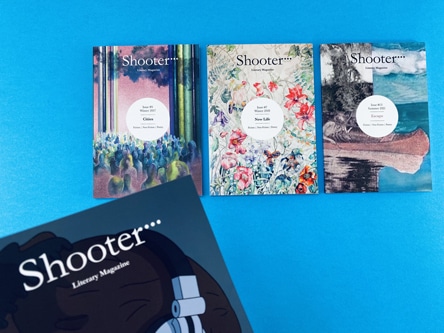
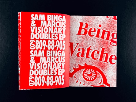
No Cold Callers is a zine that truly embodies the phrase “no rules for zines”. It’s a typographic feast, with layers upon layers of type stacked over each other. The inside pages are printed on 190gsm paper, showcasing what can be achieved with type.
The zine’s design is reminiscent of the iconic work of David Carson and Ray Gun, with its engaging one-colour print and consistent colours per page. The mix of images, photography, and a 70s style typeface creates a visually captivating experience. This compact, A6 wire stitch zine is a testament to the limitless possibilities of zine design.
Poetry zines offer a canvas for expressive words, a space where poets can share their thoughts and emotions. One such zine is an A5 perfect bound zine with 40 inside pages printed onto 90gsm uncoated paper. The cover is a 300gsm silk card with matt lamination on the outside, providing a professional appearance and added durability.
This zine, along with others like it, showcases the unique ways of creating a typographic zine. Each page is designed to attract the reader and grab their attention, with careful consideration given to the size of the font to ensure legibility.
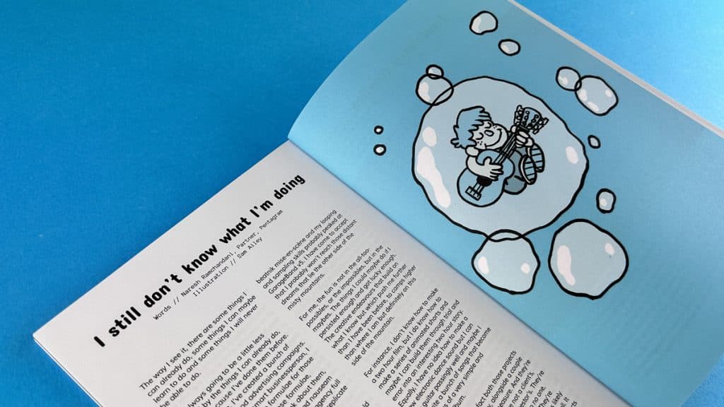
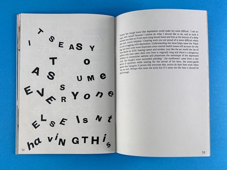
When it comes to styling your typographic zine, there are a few key considerations to keep in mind. The type on each page should be designed to attract the reader and grab their attention. The size of the font plays a crucial role in making your content legible. Check out our Definitive Zine Printing Guide for styling and aesthetic ideas.
For instance, you might want to consider using a larger font size for headers to make them stand out. For body text, a smaller font size would be more appropriate. Splash text, which is used to highlight important information or quotes, can be set in a larger font size and a different typeface to draw attention.
For more information on zine creation and printing, check out these resources:
Creative writing is a broad field that encompasses various forms, each with its unique characteristics and purposes. The four primary forms of creative writing are:
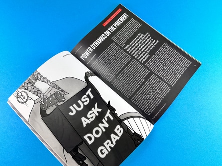
Creative writing is a vast field with numerous types and sub-genres. Here are nine types of creative writing that you might explore:
The five basic forms of creative writing are:
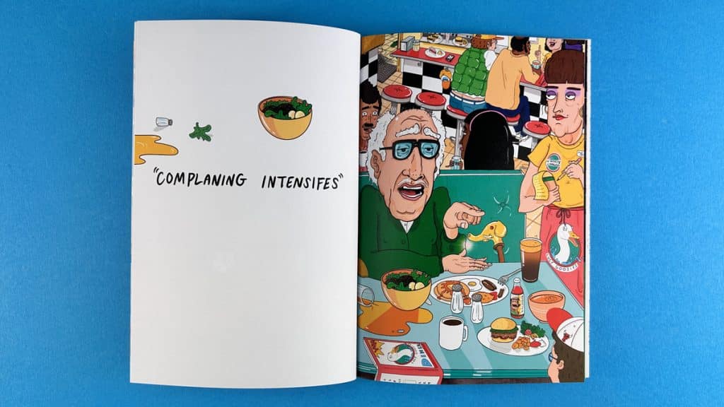
The three key elements of creative writing are:
The seven key elements of creative writing are:
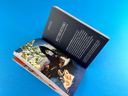
The six traits of creative writing are:
While creative writing is an art form that encourages freedom of expression, there are some general guidelines that can help you improve your craft:

The seven styles of writing are:
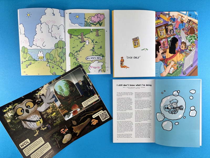
Ever wondered what keeps the pages of your favourite zine beautifully intact? It’s the magic of binding, a vital aspect that often goes unnoticed. A well-bound zine not only looks visually appealing but also offers an enriched reading experience. Learn more about Zine Printing.
It’s more than just gluing or stitching together the pages; it’s about maintaining the aesthetic integrity of your zine. A neat and strong binding ensures that your zine withstands the test of time and frequent handling. Now, doesn’t that sound important?
Just as there are many zines, there are multiple ways to bind them. From saddle stitching to wire binding, spiral binding to perfect binding – there’s a whole world of techniques out there! But hey, ever heard of perfect binding? Well, it’s something quite special!
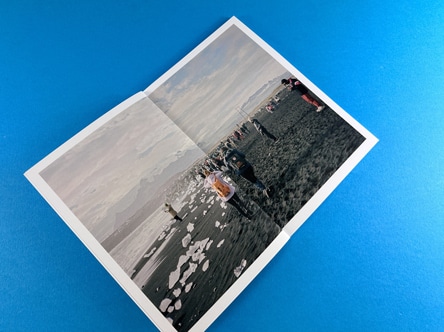
Perfect binding is like the hidden gem in the world of zine binding techniques. It’s packed with advantages that give it an edge over the others. Intrigued yet? Let’s dive in!
Contextual Impact on Zine Aesthetics.
You know, perfect binding is like the sleek, black suit of zine binding. It lends your zine a high-end, sophisticated vibe that other binding methods might find hard to match. If you’re looking to create a zine that’s professional or just want it to be super polished, perfect binding could be your perfect match.
Comparison with Wire Stitching.
Perfect binding is like the marathon runner of zine bindings. Where wire stitching breathes heavy at 40 pages, perfect binding keeps going, all the way up to 300-400 pages! If you’re dreaming of a thick zine or a bookazine, perfect binding can make it come true.
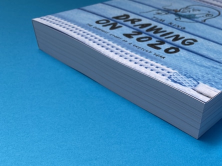
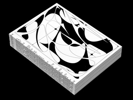
Tackling Bounce and Curling: Perfect Binding vs. Wire Stitching.
There’s nothing more annoying than when the pages of your zine start curling, right? Luckily, perfect binding swoops in like a superhero here! It ensures a neat bind, reduces bounce and curling, making the read more enjoyable and hassle-free. It’s like enjoying a sunny day in the park without the pesky flies.
This example here looks super cool with the huge width of the spine acting as a vehicle to wrap text around.
Perfect binding seems to be ticking all the right boxes, doesn’t it? From a professional appearance to accommodating more pages and improving reader’s experience, it’s all here!
Perfect binding is not just about looks, but it’s also about practicality. This technique uses less space, which means more information can be packed into your zine. You know what they say – the more, the merrier!
Whether you’re creating a comic zine, a literary journal, or a fanzine, perfect binding is your go-to technique. It’s like the all-rounder of your cricket team, always ready to play its part!
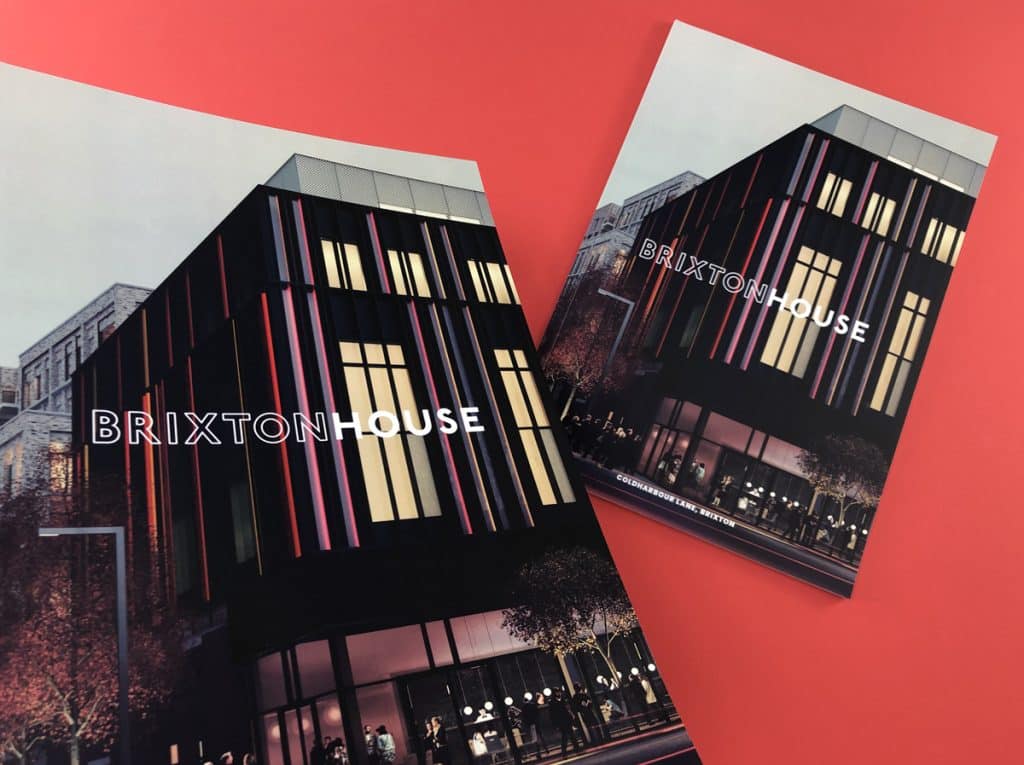
At the end of the day, the binding choice depends on your zine’s content, purpose, and your personal preference. But if you’re looking for a technique that offers a sleek appearance, accommodates more pages, and enhances the reader’s experience, perfect binding is worth considering. Remember, the right binding can make your zine perfectly delightful!
What is perfect binding?
Perfect binding is a technique that involves gluing the pages together at the spine to create a flat edge, often seen in paperback books.
What is the main advantage of perfect binding?
Perfect binding gives a zine a professional look, allows for a higher page count, and provides a neat bind that enhances the reader’s experience.
Is perfect binding suitable for all zines?
While perfect binding has many advantages, its suitability depends on the zine’s purpose, content, and the creator’s preferences.
How does perfect binding compare to wire stitching?
Perfect binding can accommodate more pages and offers a cleaner bind with less bounce and curling compared to wire stitching.
With perfect binding, you do lose 2-3mm on the spine side of the pages unless you force the pages down. On the example here you can see the spine gutter has ‘swallowed’ some text and made the word ‘Brixton’ hard to read.
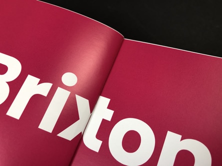
Does perfect binding affect the zine’s longevity?
Yes, a perfectly bound zine can withstand frequent handling and lasts longer than many other binding methods. The PUR glue we use is super strong.
Discover more about our projects here: ExWhyZed Portfolio
Our perfect binding set-up guide can be found here: ExWhyZed Perfect Binding Guide
The cover of your zine is the first thing that people see. It’s your chance to make a bold, attention-grabbing statement. One of the most effective ways to do this is through the use of colour. But not just any colour – we’re talking about CMYK colours. CMYK stands for Cyan, Magenta, Yellow, and Key (Black), the four inks used in the traditional method of printing hard copies.
While coloured paper can certainly add a unique touch to your zine cover, it comes with its own set of challenges. For one, there are only a limited number of colours available. And even if you find the perfect shade, the cost can be prohibitive, especially for indie presses.
Instead of using coloured paper, we recommend printing a flat colour as a background. This technique allows you to achieve the same visual appearance as coloured paper, but with more flexibility and at a lower cost. You can choose from millions of colours, and you can even print different graphics on the reverse side of the page.
Here is a quick video to Printing a coloured cover as a cost-saving alternative to using a premium coloured card.
• The best black to use for text is 0/0/0/100. This is 0% cyan, 0% magenta, 0% yellow and 100% black.
• For a dynamic jet black background colour, go for 30/30/30/100.
• If you want to print a right colourful red in CMYK then select your content to 0/100/100/10.
• A bright CMYK is 100/40/0/0, a medium blue is 100/80/10/0 and navy is 100/70/0/70.
• Royal Blue is very hard to print in CMYK.
• Bright yellow you can stick to 0/0/100/0 – easy!
• Gold is not easy to replace because CMYK inks are not metallic so don’t have the shine.
• A mid tone, grass green would be 50/0/80/0 and for a dark, Racing Green use 90/0/100/70.
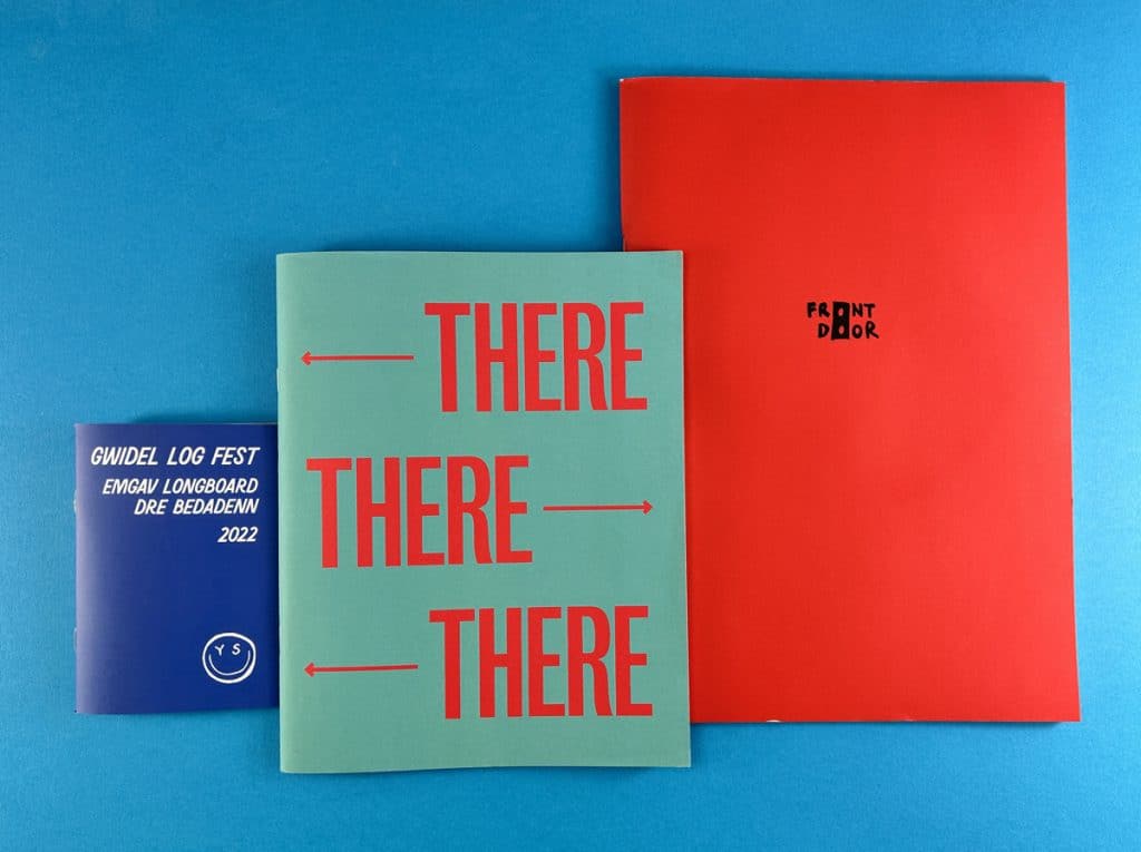
When it comes to printing a flat colour, uncoated paper is the way to go. The matte finish and slight grain of uncoated paper lend themselves well to overall background colours. It gives the impression that the paper itself is the actual colour, which is the effect we’re trying to achieve.
If you’re using a cover weight of 170gsm or thicker, we recommend applying a matt lamination to the front cover. This thin layer of film protects the fibres of the paper, allowing us to fold it without any issues of cracking.
Below is a cover with a solid red background colour and you can see when we folded the sheet, the fibres of the card have opened up. Lamination prevents against this happening.
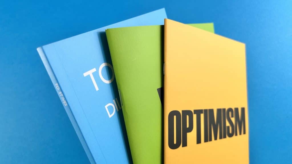
If you’re looking for a way to give your zine cover a premium feel without the premium price tag, we have a hack for you. You can download high-resolution close-ups of papers from the G. F Smith website and use them as the background on your InDesign artwork. This gives the appearance of coloured, textured paper or card.
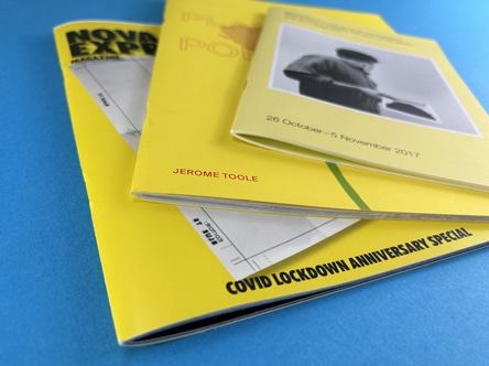
What is a CMYK colour guide for printing?
CMYK stands for Cyan, Magenta, Yellow, and Key (Black). These are the four inks used in the traditional method of printing. All printers use CMYK ink.
• The best black to use for text is 0/0/0/100. This is 0% cyan, 0% magenta, 0% yellow and 100% black.
• For a dynamic jet black background colour, go for 30/30/30/100.
• If you want to print a bright colourful red in CMYK then select your content to 0/100/100/10.
• A bright CMYK blue is 100/40/0/0, a medium blue is 100/80/10/0 and navy is 100/70/0/70.
• Royal Blue is very hard to print in CMYK.
• For Bright Yellow you can stick to 0/0/100/0 – easy!
• Again, gold is not easy to replace because CMYK inks are not metallic so don’t have the shine. We can print metallic gold on our litho press but this process is more effective for 500 copies or more (the set-up costs are higher on that machine).
Which colours print well in CMYK?
Most colours print well in CMYK, but it’s important to note that CMYK cannot reproduce all the colours that you can see on your computer screen in RGB (Red, Green, Blue) mode.
Our free paper sample swatches come with an alphabet on the reverse. Each letter is printed with a different CMYK setting to help you choose which will work best. The front card has a key of CMYK% of each letter so note that down and drop it in on your artwork. Easy!
To print vibrant colours in CMYK, it is best to convert any images in Photoshop then adjust the color balance, brightness and levels to boost them up after conversion.
In your design software, you can usually find the option to set your artwork in CMYK in the colour settings or preferences.
Bright colours, fluorescents, neons, metallics and royal blues tend to look more muted in CMYK ink.
Creating a standout zine cover is an exciting process that allows your imagination to run wild. By understanding the nuances of CMYK printing, you can create vibrant, attention-grabbing covers that truly represent your unique vision. So go ahead, experiment with different colours, textures, and finishes. The world of zine printing is your oyster!
When it comes to creating a zine, one of the most crucial aspects to consider is the cover. It’s the first thing that your readers will see, and it can significantly impact their first impression of your work. One way to ensure that your zine cover stands out and remains durable is through lamination. In this post, we’ll delve into the world of lamination for zine covers, discussing its benefits and the options available to you.
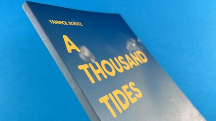
Lamination is a process that involves applying a thin layer of film to the cover of your zine. This film doesn’t alter the colour of your printing underneath but serves to protect the fibres of the paper, allowing us to fold it without any issues of cracking. If you’ve got ink coverage where the sheets are folded, the paper, made of fibres, doesn’t like being folded. So when they are folded, if there’s ink on that area, the ink and the paper tend to crack. Lamination prevents this, ensuring that your zine cover remains neat and professional. Choosing to go without lamination could result in the cover cracking, which can make it look scruffy and a bit of a mistake. It’s especially important to laminate the front cover of your publication if you go for a cover weight of 170gsm or thicker.
You can immediately see cracking on the cover of this wire stitched zine, below. When the cover card has been folded, the ink has cracked and this has opened up the fibres of the sheet to leave a series of scuffed marks down the spine. You shouldn’t judge a book by its cover, but when it looks like this….
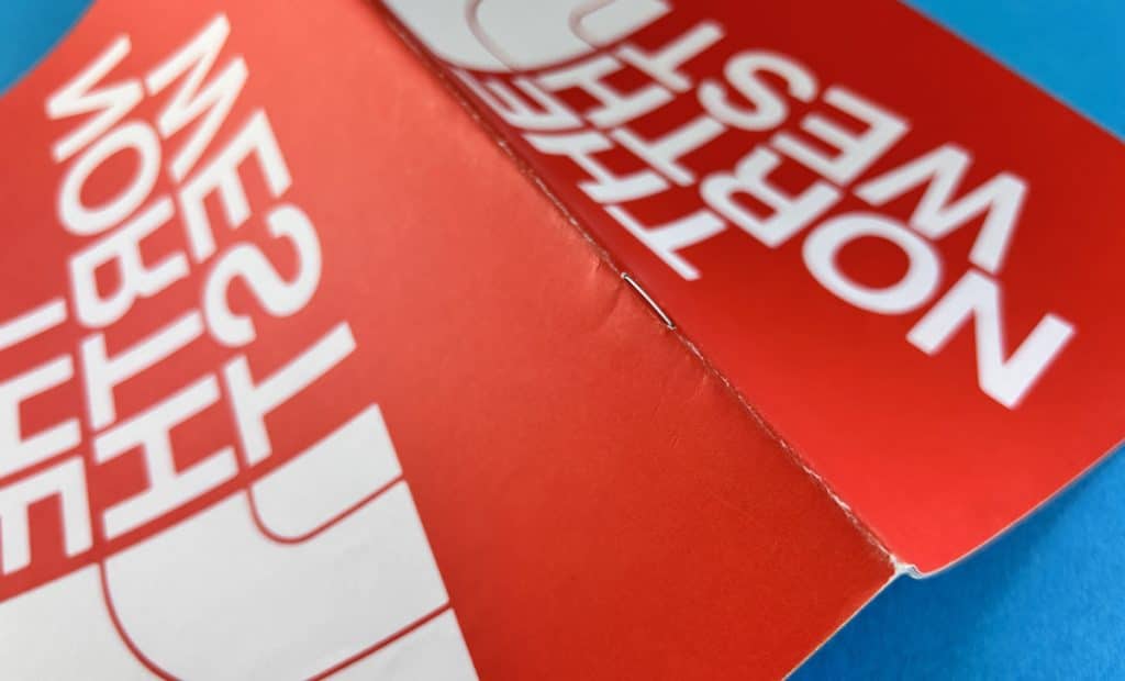
There are four choices for the lamination finish. Each option offers a different aesthetic appeal and texture, allowing you to customise your zine cover to your liking.
Matt Lamination
Matt lamination is the most common type of lamination used for zine covers. It offers a smooth and non-shiny finish, which can give your zine a sophisticated and professional look. Matt lamination is a solid accompaniment for uncoated or silk – not much of a sheen and it just feels professional.
Gloss Lamination
Gloss lamination, on the other hand, provides a shiny and reflective finish. This type of lamination can make your illustrations and colours really jump through, making it an excellent choice for comics or graphic novels.
In the image below we have gloss lamination on ‘Able’ on the left and matt lamination on Cunning Folk in the foreground. The gloss lamination has more shine and really jumps towards the reader but arguably makes the content harder to see when tilted towards the light. The matt lamination is more subtle and you wouldn’t really know it is there.
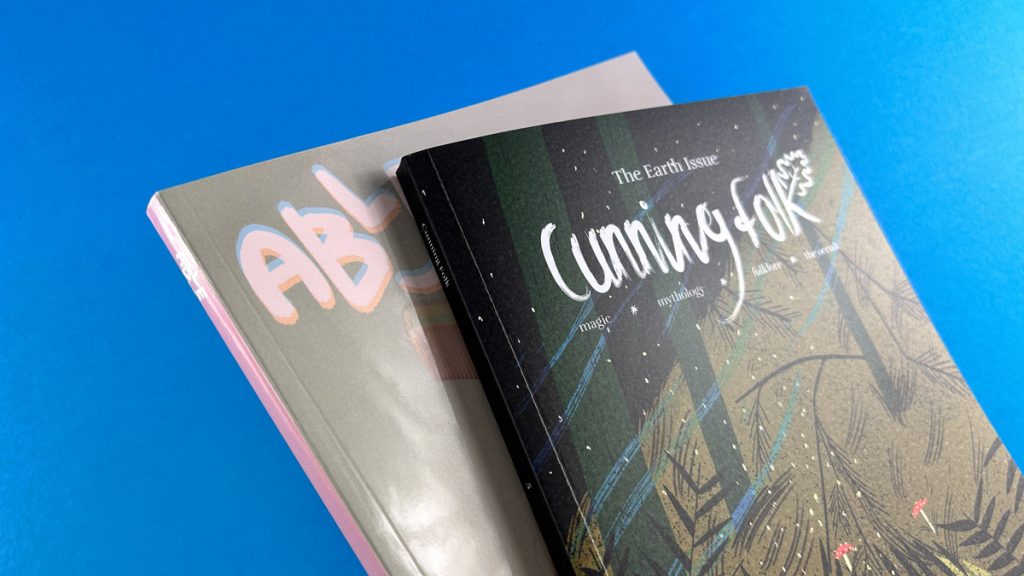
Soft Touch Lamination
Soft touch lamination provides a velvet feel to the cover, offering a unique and professional aesthetic. However, this type of lamination is arguably not suited to zines, as old school Zines would not have even entertained the idea of using Soft Touch lamination.
Anti-Scuff Lamination
Anti-scuff lamination is a less common option, chosen probably once a year. Despite its name, it doesn’t really stop scuffing. It is an option, but we would advisee you to opt for matt lamination instead.
What is the best paper for zine covers?
The best paper for zine covers depends on your personal preference and the aesthetic you’re aiming for. However, if you’re planning to laminate your cover, we recommend going for a cover weight of 170gsm or thicker.
What is the difference between matt lamination and velvet lamination?
Matte lamination provides a smooth and non-shiny finish, while velvet (or soft touch) lamination gives a soft, velvet-like feel to the cover.
In the photo below, Ephemera has gloss lamination and Cunning Folk is noticeably softer when compared against it.
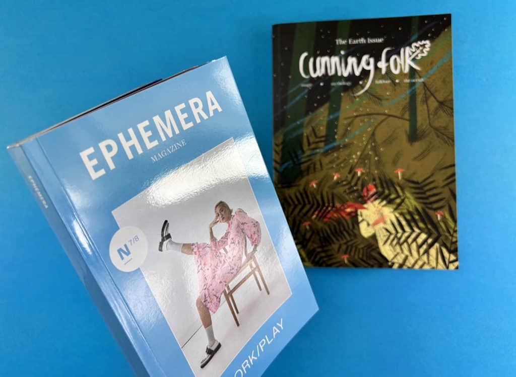
What does lamination do for printing?
Lamination adds a protective layer to the printed material, preventing it from cracking when folded. It also enhances the aesthetic appeal of the printed material, giving it a professional and high-quality finish.
What is velvet lamination?
Velvet lamination, also known as soft touch lamination, provides a soft, velvet-like feel to the cover. It offers a unique and professional aesthetic
When it comes to zine production, the binding method you choose can significantly impact the final product’s look and feel. One popular method for binding zines, particularly those with a higher page count, is perfect binding. This method offers a neat, professional finish that can elevate your zine’s aesthetic which can command a higher cover price and allow you scope for more content within. In this post, we’ll delve into the world of perfect bound zines, exploring the design considerations, binding process, and technical tips you need to know.
Perfect binding is a method commonly used in Bookazine printing and for zines with 36 pages or more. This method involves trimming the inside pages into a text block, roughening up the left-hand edges, applying glue, and then wrapping a continuous cover around the text block. The result is a neat, professional-looking zine with a flat spine.
Perfect binding offers several advantages that make it an appealing choice for zine creators. You’ve all seen Little White Lies, Shooter and Moof, they are all perfect bound. Firstly, it provides a more high-end, professional look compared to other binding methods. This can be particularly beneficial if you’re creating a zine for a professional context or if you’re aiming for a more polished aesthetic.
Secondly, perfect binding allows for more illustrations, photography and poetry self-publishing and creative writing to be packed in. While wire stitching is suitable for zines with up to 40 pages, perfect binding can accommodate monster zines with up to 300-400 pages. This makes it an excellent choice for more substantial zines or Bookazines.
Finally, perfect binding creates a neat bind, with less bounce and curling on the inside pages compared to wire stitching. This can enhance the reader’s experience, making your zine easier and more enjoyable to read. If your spine is 4mm or thicker there’s even room to add your title, issue number and attention grabbing call to action.
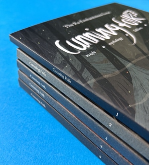
When designing a perfect bound zine, there are several key considerations to keep in mind. One of the most important is the page count. Perfect binding is best suited to zines with a minimum of 36 pages. This ensures that there is enough thickness in the text pages for the glue to hold effectively. Attempting to perfect bind a zine with fewer than 36 pages can result in the pages pulling out, as there is not enough glue to hold them in place.
Another crucial consideration is the cover weight. Because of the amount of glue used in perfect binding, the cover needs to be resilient. We recommend a minimum of 200gsm for the cover. Anything thinner, and the glue may seep through, compromising the binding’s effectiveness.
When you come to create your perfect bound zine cover file, check out our dedicated page with super helpful video and illustrated guides plus downloadable InDesign templates to save you some head-scratching.
Finally, it’s important to allow for a 6-8mm hinge on the front and back cover. This ensures that the cover opens neatly and falls flat again. You’ll also need to allow for 6-8mm being lost on the inside front cover and the inside back cover, as well as the first 6-8mm on the spine side of your first and last text page. This area will be obscured by the glue, so it’s important to keep any important content at least 10-12mm away from this side of the page.
You can actually see on our example here that the text starts too close to the 6-8mm area and it is very nearly hidden.
Text pages onto 120gsm Uncoated
36pp to 44pp Text = 3mm spine
(ie: if you have 40 pages then you need a 3mm spine)
48pp to 60pp Text = 4mm spine
64pp to 72pp Text = 5mm spine
76pp to 88pp Text = 6mm spine
92pp to 100pp Text = 7mm spine
104pp to 116pp Text = 8mm spine
120pp to 132pp Text = 9mm spine
200pp Text = 14mm spine
Text pages onto 130gsm Silk
36pp to 40pp Text = 2mm spine
44pp to 56pp Text = 3mm spine
60pp to 76pp Text = 4mm spine
80pp to 92pp Text = 5mm spine
96pp to 112pp Text = 6mm spine
116pp to 128pp Text = 7mm spine
200pp Text = 11mm spine
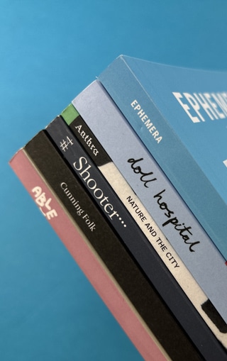
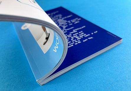
When you come to set up the inside pages, lets keep the key information at least 5mm from the trim edges of the page. On the spine side of the page, 2-3mm tends to be slightly obscured unless the reader really force the pages flat. This isn’t a user friendly way to read a book so best to start content on the spine side of the pages at least 8-10mm in. Our image here shows the spine gutter area and you can see the central section is tough to fully read.
This is an example of a superb page layout for a perfect bound book. The text is neatly organised into columns which sit well within the constraints of the page’s parameters. The reader does not have to work hard to read the article and it is punctuated with awesome graphics and subtle page numbers in the bottom, outer corners.
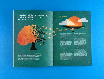
Perfect binding offers a world of possibilities for zine creators. This binding method allows for a wide range of designs and layouts, providing a canvas for your creativity and imagination. Whether you’re creating a personal zine or a professional publication, perfect binding can help bring your vision to life.
For more information on perfect binding and other binding options, check out our Perfect Binding Setup Guide and our Binding Options page on our website. These resources provide detailed instructions and illustrated guides to help you prepare your zine for perfect binding.
For a visual guide to perfect bound zines, check out our YouTube videos:
The best binding for a zine depends on several factors, including the page count, the aesthetic you’re aiming for, and your budget. Perfect binding is a great option for zines with a higher page count and a more professional aesthetic.
Perfect bound binding is a method that involves trimming the inside pages into a text block, roughening up the left-hand edges, applying glue, and then wrapping a continuous cover around the text block. The result is a neat, professional-looking zine with a flat spine.
You will upload your print ready pdfs to Ex Why Zed. One for the cover spreads and one for the inside pages. We will then give your artwork a preflight check and report back any issues to be ironed out. We strive for perfection in the artwork before we eve consider printing.
When it comes to binding zines, perfect binding emerges as the superior choice. This method bestows your publication with a polished, professional appearance that sets it apart from the rest. It not only accommodates a larger number of pages but also imparts a sturdy bind that stands up to the test of time and use. In contrast to other binding techniques, perfect binding presents a more refined, sophisticated aesthetic, elevating your zine to a higher level of professionalism.
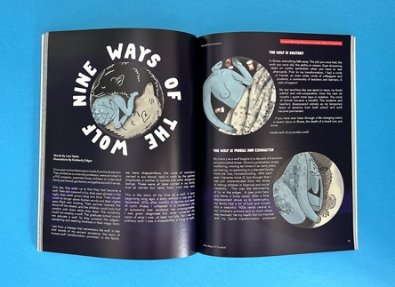
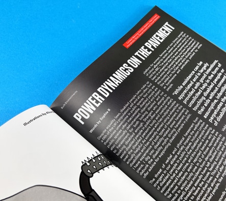
Perfect binding is characterised by its neat, flat spine, its resilience and its professional, high-end appearance. This method is also recognised for its capacity to hold a greater number of pages than alternative binding techniques.
Features of perfect binding include a flat spine, a continuous cover that wraps around the text block, and a 6-8mm hinge on the front and back cover. This binding method also requires a minimum of 40 pages and a cover weight of at least 170gsm.
The two main types of binding for a zine are wire stitching and perfect binding. Wire stitching, also known as stapling, is suitable for zines with up to 40 pages. Perfect binding, on the other hand, is best for zines with a higher page count.
Perfect binding offers a world of possibilities for zine creators, providing a canvas for your creativity and imagination. Whether you’re creating a personal zine or a professional publication, perfect binding can help bring your vision to life. With its neat, professional finish and ability to accommodate a higher page count, perfect binding is an excellent choice for your next zine project.
For more information on perfect binding and other zine printing options, don’t hesitate to contact us at Ex Why Zed. We’re always here to help you bring your creative projects to life.
Engaging, interactive, and effective phonics teaching can seem like a mountainous task. It doesn’t have to be! By understanding common challenges and finding creative solutions through printed phonics books, we can elevate the learning experience.
Diverse learning styles, the complexity of phonics itself and struggling readers are among the notable challenges in phonics instruction. However, the right approach, coupled with tailored classroom resources, can help unravel the phonetic code in an exciting and learner-friendly manner.
The first hurdle in phonics is associating sounds with their corresponding letters. For some learners, this can be a tricky business. Link to school book printing Phonics books, with their variety of content, make this transition seamless. They offer a mix of activities that cater to different learning styles, making the phonics journey enjoyable.
Another significant challenge is addressing learners who struggle with phonics-based reading. One approach is to integrate phonics instruction when reading a book. In this way, learners can connect phonics rules to real-world examples, which will make their learning more meaningful.
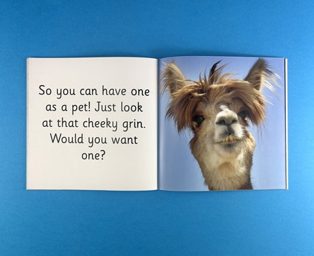
Printed phonics books, specifically tailored to suit your learners’ needs, can be a game-changer. They allow learners to practice and apply their phonics skills in a safe, controlled environment, while also providing teachers with a valuable assessment tool.
Developing a rich phonics curriculum is another challenge that teachers often face. With Link to school book printing and Link to educational publishing, this process can become a breeze. Customised phonics books offer a platform to implement a variety of activities that suit individual learners’ needs.
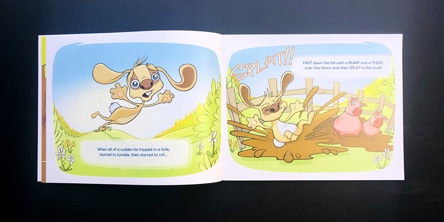
Teachers can use a multi-sensory approach to integrating phonics instruction during reading. This may include pointing to words while reading aloud, asking students to identify sounds or letters, or using phonics books to introduce and practice new sounds.
The main challenges in teaching phonics include catering to different learning styles, dealing with struggling readers, and developing a rich phonics curriculum. However, these challenges can be addressed with the right strategies and resources.
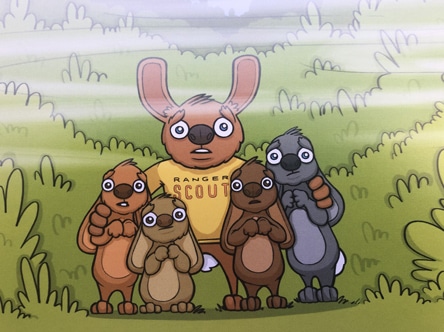
For struggling readers, explicit and systematic phonics instruction can be helpful. This can be achieved using phonics books that provide structured and progressive activities, focusing on individual sounds, blending, and segmenting.
The best approach varies based on individual students’ needs. However, an integrated approach using phonics books, alongside other teaching methods, often proves to be effective.
Teaching phonics doesn’t need to be a daunting task. With the right resources, a humanistic approach, and a splash of creativity, you can turn the challenges into opportunities for learning and growth.
????????????????
Get in touch with us on Live Chat, 01206 766647 or hello@exwhyzed.fixed-staging.co.uk for a print quote and to discuss your upcoming project. Or jump on our Project Builder now to send us your print spec.
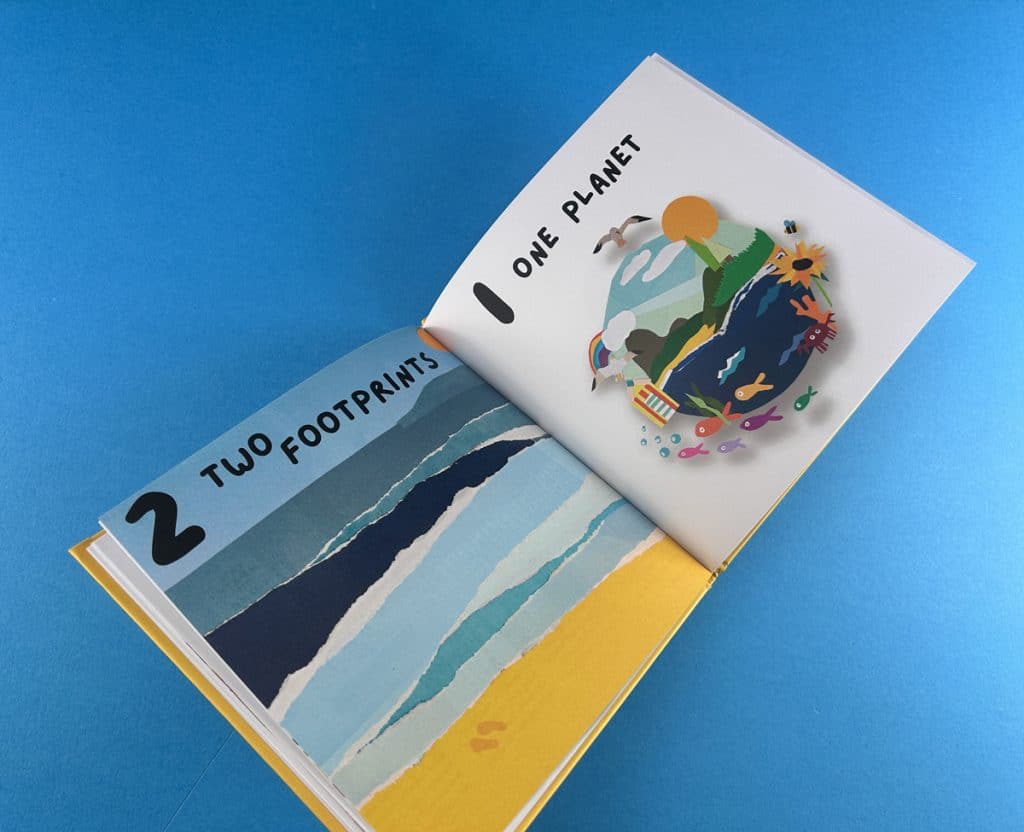
Sales of fantasy, science fiction, romance, crime novels, and personal development titles increased by 5 per cent compared to 2020, owing to strong demand. The sales totalled £1.82 billion, a 3 per cent increase over 2020, and, for the first time, sales have surpassed £1.8 billion. Short run hardback book printing was in high demand as people were looking to get their books published and sold. For hardback book printing and other services, you can rely on Ex Why Zed.
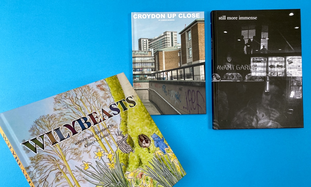
Despite the lockdowns, book sales increased in 2021, with more than 212 million print books sold – the highest figure in the last decade.
At the start of 2021, bookshops all over the UK were closed for more than three months. The data was collected from around 3,000 customers buying books each month in 2021.
In comparison to the previous year, fiction was up 20 per cent. Crime and thrillers saw a 19 per cent increase in volume, romance saw a 49 per cent increase, while science fiction and fantasy increased by 23 per cent.
The year’s bestselling title was The Thursday Murder Club, while the fourth bestselling title of the year was The Man Who Died Twice. These were Richard Osman’s first two novels. The category of non-fiction that grew the most was the mind, body, and spirit genre, which increased by 50 per cent to hit £18.7 million.
Charlie Mackesy’s “book of hope”, The Boy, the Mole, the Fox, and the Horse continued to be the best-selling title in its second year. It is closely followed by The Midnight Library by Matt Haig, a story about Nora and her depression. Douglas Stuart’s Shuggie Bain and Maggie O’Farrell’s Hamnet were strong competitors as well.
Adult fiction has been a strong runner in the top 20 books of 2021, having nine on the board. The book They Both Die at the End by Adam Silvera was the first young adult novel to be part of the year’s top books since 2015.
According to the researchers, the social media create conversations about old and new books and give new authors with great platforms to showcase novels. Therefore, book buyers who were seeking comfort found escapism, familiarity, laughter, and perhaps a sense of community in the year’s bestsellers. The increase in sales was proof that books are not a fad and have a good effect on people.
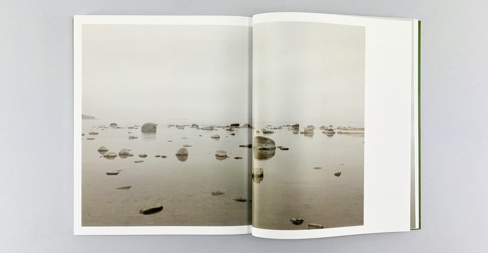
As British readers continue to support the embattled country, books by Ukrainian authors fly off the shelves. The sales of classic Russian literature have also increased dramatically.
Sales of works by respected Ukrainian writer Andrey Kurkov, best known for Death and the Penguin, have increased by 848 per cent. As a result, authors are prompted to acquire short run hardback book printing and other types of printing services to publish their books. Marina Lewycka, a British-Ukrainian author whose book A Short History of Tractors in Ukrainian was a UK bestseller in 2005, has seen her sales increase by 441 per cent in February. According to Nielsen BookData, sales of books by renowned Russian author Mikhail Bulgakov – author of The Master and Margarita – increased by nearly 50 per cent last week compared to pre-invasion levels.
This trend provided companies that offer short run hardback book printing with more work because of the heightened demand.
Books by Nobel Laureate Aleksandr Solzhenitsyn, author of One Day in the Life of Ivan Denisovich, sold nearly 30 per cent more than before the war. Dostoevsky’s classic works have increased by 123 per cent year over the year, while Tolstoy’s works, including War and Peace, have increased by 30 per cent. In comparison, total book sales in the first week of March were down 7 per cent from the same period last year.
The public’s turning to literature to support Ukraine and learn more about Russia’s often complex past, according to Tom Tivnan of The Bookseller, “makes perfect sense”. People want to help Ukraine, and they’re starting to focus on an area that they’ve never thought about or read about before. They are astute enough to separate the Putin regime and the oligarchs from the Russian people and their great literature.
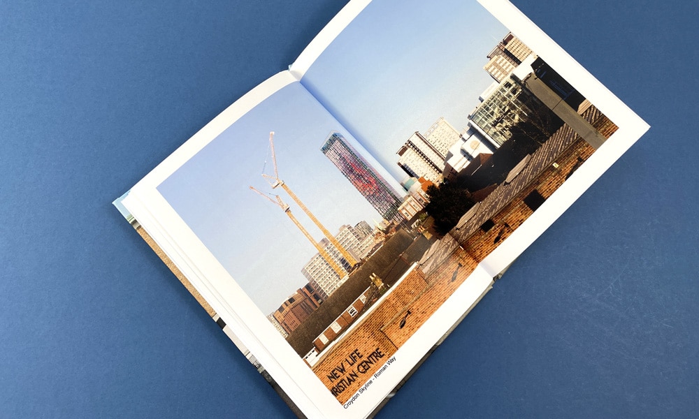
In 2021, the French government implemented a number of programmes to help booksellers. This included a reading campaign and the creation of the Culture Pass, which gave 18-year-olds across the country €300 to spend on cultural products, including books, as long as they weren’t bought online. A total of 426,000 books were sold at nearly 3,000 participating bookstores. By 2022, the pass will be extended to all 15-to 17-year-olds, potentially boosting the industry.
Sales revenue in France increased by 20 per cent in 2020 and 19 per cent in 2019 compared to the previous year, though no specific sales figures were provided. The Syndicat de la Librairie Française (SLF) confirmed these figures, stating that sales at member stores increased by 20.4 per cent in 2021 compared to 2020 and by 24.3 per cent compared to 2019, as reported by Anne Martell, president of the SLF and co-director of the Martelle family bookshop in Amiens, France.
Sales in Germany, Austria, and Switzerland increased by about 3 per cent overall in 2021 compared to 2020 and by 1 per cent compared to 2019. A large part of this was due to a modest increase in the number of books sold combined with higher prices. Lockdowns hurt book sales at brick-and-mortar stores, which fell 11 per cent from the pre-pandemic year of 2019.
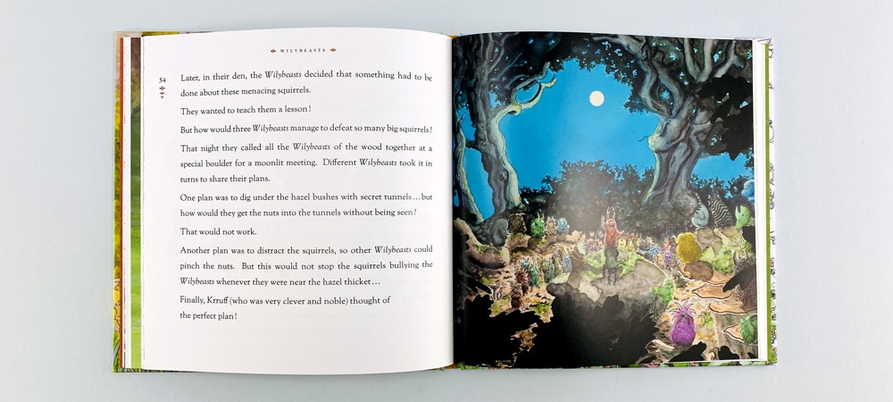
With the ease of restrictions on shopping, sales of books continue. So, if you have used the downtime during the pandemic to write a novel, or your workplace is looking for a printer for a hardback book printing of your company’s portfolio, Ex Why Zed can provide you with these services!
We provide high-quality prints on different types of paper. We also have a fast turnaround time so that you can have a physical copy in no time. Our rates are competitive so that you don’t have to look far for your options. Visit our website exwhyzed.fixed-staging.co.uk for more information on the services we provide.
The book markets in the UK, Europe and the USA, along with many others worldwide, experienced a strong year in 2021. That’s reassuring as the bounce back took place against the backdrop of emerging COVID-19 variants and the pressures on supply, staffing, and pricing that resulted. In China, though, book sales have yet to recover after the significant drop in sales in 2020, making the country an exception to the rule. Granted, in the current climate, custom hardcover book printing has been subject to the same pressures, but with the expected recovery, prices and availability of hardback book printing look set to recover along with the rest of the market.
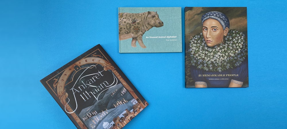
Changes to the landscape within the book industry continue, with publishing firms consolidating through mergers and acquisitions. Every market has seen notable takeovers, and it’s the largest publishers that have experienced the biggest increases in their share.
Other trends divined from observation of multiple markets include record book sales in Spain and the United Kingdom. There has been a flattening in the growth of sales of eBooks and a cooling in the nonfiction sales area. Ecommerce continues to grow, as does the threat of Amazon on booksellers, and there has been a boom in sales of manga publications in Germany, Italy, Spain, and the United Kingdom. In fact, in the UK, Manga sales have increased over twice fold, in terms of both value and volume, increasing by 157 per cent to £18.3 million.
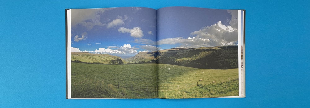
Bricks-and-mortar stores worldwide have emerged as the clear losers in many markets after two years of Covid-19 lockdowns and other pandemic measures.
However, in the UK overall, record sales have been announced, even with the ongoing supply chain issues, of which Brexit was the frontrunner.
The strongest performers in terms of sales were fiction and children’s books. In the final 42 weeks of 2021, fiction sales increased by 21% over the same period in 2019 and accounted for 23.8 per cent of the overall market, the highest share since 2012. Children’s book sales increased 15% in the final 42 weeks of the year compared to the same period last year, while nonfiction sales increased by 3%. Overall, the average selling price of a book increased for the ninth consecutive year to £8.84.
Following a ‘bonanza’ year in 2020, eBook sales were expected to decline in 2021, in line with other markets. According to data from the UK’s top six trade publishers, eBook sales fell by around 13% year on year to 47.5 million copies.
This is good news, indicating increased interest in physical books over digital, and suggesting that custom hardcover book printing is well worth considering if you are looking to distribute copies of your latest work.
While the trend for sales in bricks-and-mortar retailers went downwards globally, those businesses, including independents, are still doing well in the UK. The Booksellers Association now has 1,027 indie members, the highest number since 2013. Around 60% of respondents to the trading survey said their sales were up from the previous year.
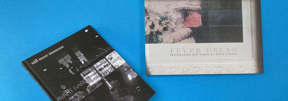
In the US, data shows that sales of printed books went up by 8.9 per cent in 2021. According to NPD BookScan data, 825.7 million print books were sold in the United States in 2018, up from 757.9 million in 2020. The most significant increase was in the Young Adult (YA) segment, which increased by 30.7 per cent. Adult fiction sales increased by 25.5 per cent, while children’s fiction sales increased by 9.6 per cent. Adult nonfiction sales increased by 4.4 per cent.
Sales totalled US$15.4 billion last year, up from US$13.7 billion in 2020, according to the Association of American Publishers, which tracks sales from 1,369 publishers. A rebound in sales in the K–12 instructional materials category, as well as a strong year for trade segments, drove the increase.
The German-language market saw growth in online sales as bookstores were closed for much of 2021. Germany, Austria, and Switzerland all saw steady sales last year, while sales of print books and book-related physical media increased by 3% in 2020. Revenue is stable compared to last year, but this is due solely to a higher average selling price, as unit sales are still down.
In 2021, book market revenue in Germany increased by 3.2 per cent, with more books sold (+1.6%) at a higher average selling price (+1.6%). In comparison to the previous ‘normal’ year, 2019, turnover was slightly higher (+0.8%) due to a significantly higher average selling price (+4.8%); however, volumes of book sales have decreased significantly during this time.
Repeated lockdowns hit sales in bricks-and-mortar stores, as they did to many other markets. Following an 8.7% drop in sales in 2020, physical stores saw another 3% drop in 2021, bringing the total loss to 11.5 per cent since 2019.
In Italy, sales have also bounced back. Book sales increased 16.9% over the previous year, more than making up for the market’s 14.6 per cent decline in 2020. Turnover was up 10.4%, a rebound from the 9% drop in 2020, with books selling for an average of €14.78, a slight decrease on 2020 figures.
Book sales in China suffered because of the increase in online sales. Although physical bookstore sales were up 4.1 per cent and online sales only increased by 1 per cent from 2020, this represents a significant slowdown in the growth of a developing market that was regularly posting double-digit year-on-year growth before the pandemic hit. Sales fell 5.1 per cent in 2020, marking the first year of negative growth since OpenBook began tracking the book market, and the year ended a five-year streak of annual growth of 10% or more.
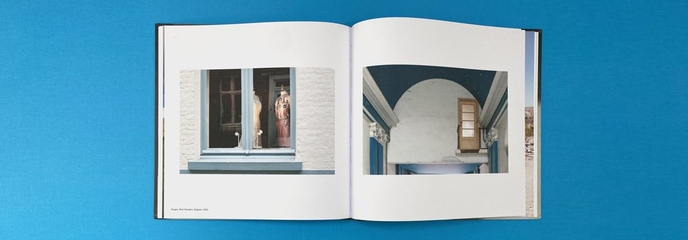
If you have a manuscript, a product catalogue, a coffee table book or any other work you want printed to share with the world, a good hardback book printing company is critical. The content is certainly vitally important, but the physical book and its production should also be of high quality. If the printing materials and print quality are anything less than acceptable, you are missing out on a chance to share the fruits of your labour with the world.
At Ex Why Zed, we can help transform your ideas into print in various ways, whether you need short run hardback book printing, booklet printing, and many more! We can print magazines, artists’ catalogues, children’s books, self-published novels, photography collections and much more.
Our prints have an award-winning quality. Browse exwhyzed.fixed-staging.co.uk to see our services, or send us a message to request a paper sample pack to see which type of printing you want your masterpiece to be immortalised in.
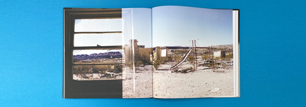
Social Media
Google My Business – With physical books making a comeback in popularity, now is the perfect time to invest in hardcover book printing. Learn more about the state of the book market here.
Facebook – As the world increasingly digitises, there is a growing trend of people yearning for physical products that they can hold and touch. This is especially true when it comes to books. Read about the performance of the book market in 2021 here.
Twitter – Last year saw a resurgence in the popularity of physical books, which is a welcome sign for publishers around the world. Find out more about it here.
LinkedIn Personal – The book market in the UK and elsewhere in the world saw welcome developments last year. Click here for more information.
LinkedIn Company – The physical book market experienced a strong year in 2021. Get more insights here now.
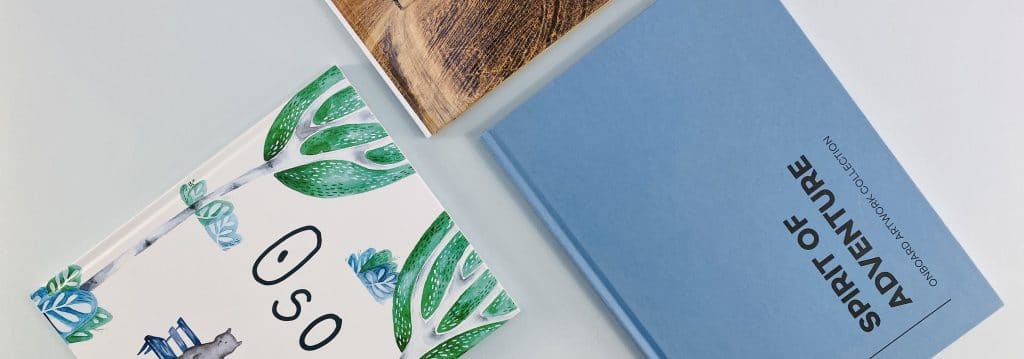
Companies offering hardback photo book printing have reduced the costs and other hurdles that used to be associated with self-publishing. As a result, people have come up with intriguing photo book varieties, and more artists are experimenting with photo books, making new formats and designs. This blog will guide you on the process of creating your own photo book, from conceptualisation all the way to hardback book printing.
The first thing you should do is to gather all your photos in one place. If your pictures are scattered across multiple devices or social media sites, doing this is a great way to stay organised.
Try moving all your image files to just one folder or sorting them based on your own criteria so you can easily go through them. This will come in handy in choosing photos for your book, which will be discussed in the next point.
Photographs are the star attraction in the best photo books UK-wide, similar to how storybooks would not be complete without the story. As such, we recommend that you select only the best pictures from your portfolio.
Not every photograph is created (or, in this point, taken) equally. There is bound to be a few really good shots that stand above the rest in terms of quality. Now that you have gathered all your photos in one place, it would be easy to go through them to find one photograph for each subject. In doing so, you should consider factors such as blurriness, focus, lighting, angle, and general presentability.
Some of these can be corrected with image editing software later on, but other things like angles are permanent. If a shot is great, but there are some parts that don’t look very good, always remember that you can crop or edit them out of the picture.

The best photo books have a coherent storyline that is essentially told through pictures. As such, it is important that you have a consistent theme with your page design. This theme should be the same all throughout your photo book, from its front and back cover to the introduction and the content. The design should also relate to the nature of your photos.
Additionally, avoid using too much of the same layout in your photo book. Although the term “do not fix what is not broken” also applies in photo books, you could do well with more variety. They add flavour to your photo book and prevent a bland, repetitive appearance. You can do different page styles and layouts, like a single photo panorama on two pages, centring a big photo on a page, placing multiple pictures on one page, and other creative designs. You can also use text to your advantage by combining your photos with descriptive excerpts.
Now that you are done planning a layout for your hardback photo book UK, it is time to find a place where you can have it printed. There are plenty of places online where you can find affordable hardback photo book printing in the UK.
You can do your research on the Internet by reading reviews and comparison articles that list the advantages, disadvantages, and prices of printing companies operating in the UK. You can also ask around online forums and message boards, especially those in the photography niche groups. Sometimes, you won’t even need to ask questions yourself since it is very likely that someone before you has asked about the top online photo book printing companies in the UK.
One such company is Ex Why Zed. We also print modern, beautifully designed perfect bound photo books that are guaranteed to be a hit. Plenty of people have found success with their photo books by working with us, and you could be one of them today.
Here on Ex Why Zed, we recognise that not all clients know the various terminologies, jargon, and other intricacies of the printing industry. As such, we strive to guide every customer through the printing process by providing informative content. We feature a video guide posted on this website that discusses the basics of what you need to know about hardback book printing, from paper size, binding method, paper type, and more.
If you have any questions, you can contact us via telephone at 01206 766647. You can also send your concerns directly to our email at hello@exwhyzed.fixed-staging.co.uk.
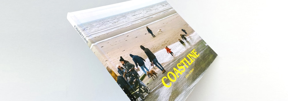
If you want your books to be enjoyed by the buyer for a long time, getting hardback art book printing is well worth the investment. However, it may be worth considering paperback photo book printing instead if you are on a tight budget. Hardback books can be sold for a higher cover price in comparison with their soft back equivalent.
Once a contract has been signed, the time it takes for commercial book publishing ranges anywhere between 18 and 24 months. Take note that it might also take one to three months to complete a contract. You should also consider the fact that it might take you one to twelve months to find a publisher in the first place.
However, if you self-publish through Ex Why Zed, we will aim to deliver your finished, bound, ready-to-sell hardback book in 1-2 weeks. Yes, that’s right, 1-2 weeks not 18 months!
Binding is the last stage in converting multi-page content into a coherent book. Perfect binding refers to the process of binding several pages with an adhesive to produce a clean, crisp, and professional-looking printed item.
Hand binding and mechanical binding are the most popular methods. Perfect binding is another option that some professionals prefer because of its high-quality results.
There are many options available when getting hardback printing for photography books. Some of the most popular options include perfect binding and case binding.
With perfect binding, pages are bound to your chosen book spine using strong glue. Meanwhile, case binding is used to create heavy-duty books, and the pages can either be stitched together or bound using adhesive.
When it comes to short production runs, such as those involving anywhere between 200 and 300 books, digital printing will generally be the most cost-effective alternative. There are no set-up costs involved with a production run when using a digital printing press.
There are plenty of cover material choices when it comes to hardbound photo book printing. The most common option is binder’s board. However, you can also use paperboard that is covered with another type of material, such as leather, heavy paper, or cloth.
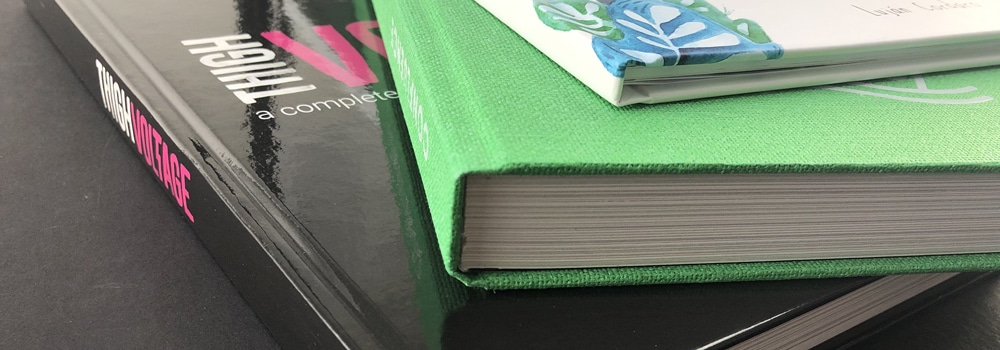
If your printed materials are of poor quality, your customers may believe that your services are of low quality as well. Because of this, your choice of printing services is crucial. Before hiring a printing service provider, first determine how they operate, ask questions, speak with the personnel, and generally get a feel for how they function. Looking up testimonials from previous clients would also help greatly.
If you would prefer to have certified experts work on your prints, just give Ex Why Zed a call!
When selecting a printing business for your project, you don’t just want to pick the first one that comes to mind. You should ideally select a printing company that offers all of the things you require, be it paperback or hardcover photo book printing.
You want to hire a printing firm that will deliver high-quality work. The final print of your project will have a big influence on how your brand is seen, which is why you must first verify the quality of the printing services that you’re hiring.
To do this, the easiest way is to view a few samples from the business’ website. With that said, seeing and physically examining the samples is the best option.
The hardback is a sign of quality and an indication that a publisher is serious about selling it. A hardcover demonstrates to booksellers and customers that this is a book worth their attention.
Also, bookshops may only order a small number of copies of your book if it’s published in paperback but are likelier to stock more copies if it comes out in hardback.
Hardback books look more beautiful and impressive than their paperback counterparts. There’s no doubting this. They are also far more durable, ensuring that anyone who buys the book is able to enjoy it for years on end.
On the other hand, paperbacks are much less expensive. For those looking to publish on a large scale for a lower price, paperback book printing is generally the way to go.
Overall, either is a fine choice for book printing. It all depends on your budget and personal preferences.
If you’ve been searching for “hardcover book printing near me”, you’ve come to the right place. Get in touch with Ex Why Zed today and learn how we can help turn your project into a reality.
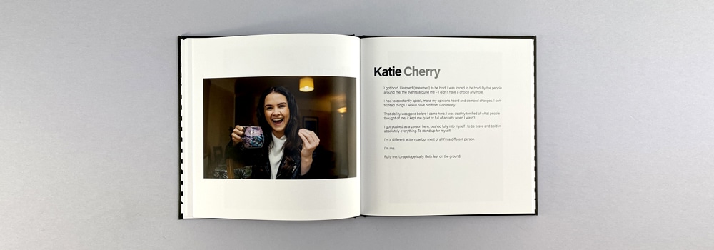
The year 2021 saw increased demand among consumers for physical books. However, the climate surrounding the pandemic also resulted in a shortage in their supply. While some authors chose to commission a short run of hardcover book printing to fill the supply gap, shipping issues also impacted the time it took for the products to reach stores and ultimately the hands of eager readers after soft and hardback book printing.
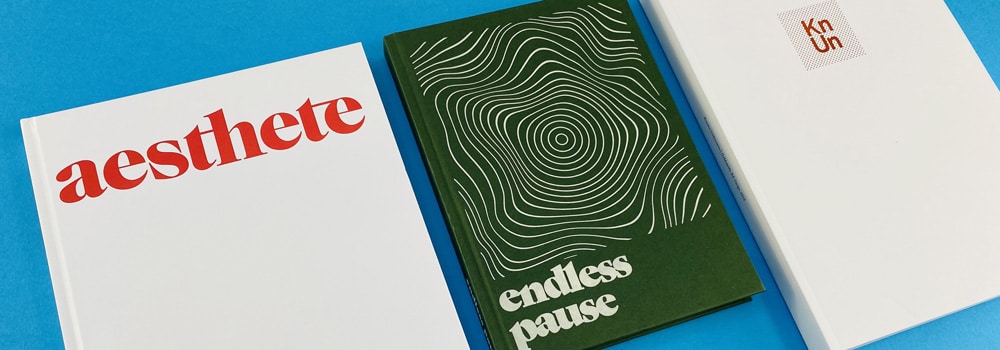
According to the executive director of the Book Manufacturers’ Institute, Matt Baehr, the shortage of physical supplies such as paper and ink is the main reason why books have become in shorter supply. The process of getting items from A to B has also been hampered.
The pandemic is the primary reason for supply shortages and delivery delays. But that’s not to say this has been the sole problem. Even prior to the pandemic, the supply chain was already in hot water. But when you add in the shortage of labour and paper globally – as well as increased demand for books from people forced to stay at home during lockdowns – you have the key factors behind the book shortage.
You may not have noticed empty bookshelves at your local bookstore over the last few months. That’s because the nature of the publishing cycle dictates that book releases are planned many months ahead of time.
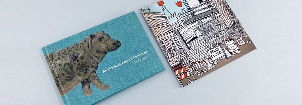
What has suffered is the printing of surprise bestsellers. Publishers tend to print some books only when demand creates a need, and these can then be shipped out immediately. And therein lay the problem in 2021. If books sold out fast, publishers were not able to replenish the stocks at such short notice. In some instances, it was the new year before they were able to send new copies.
Printed book sales typically increase by 3-4% year on year. But in 2020-21, sales increased by 13.2 per cent, according to industry tracker NPD Bookscan. And overall, they stated that the period from 2019 to 2021 saw an increase in book sales of around 21 per cent, a growth rate that according to Kristen McLean, an analyst at NPD Bookscan, was unprecedented.
The data makes it clear that it’s been the pandemic that has driven the sales of physical books up. Moreover, it’s illuminated to authors and publishers which types of books are selling well and which are not, informing new release lists.
When the global lockdowns began back in 2020, traditionally high-performing categories like self-help and business books suddenly slumped into a decline. Instead, sales of educational books and first aid books rocketed due to people keen to learn new skills and prepare for emergencies in the climate at the time.
Trends in book sales during the pandemic followed a certain pattern. Early on, people bought books on how to make bread. After a period, books on social justice and politics rose to the top of the pile. And once the US election period was over, sales of adult fiction titles began to take off.
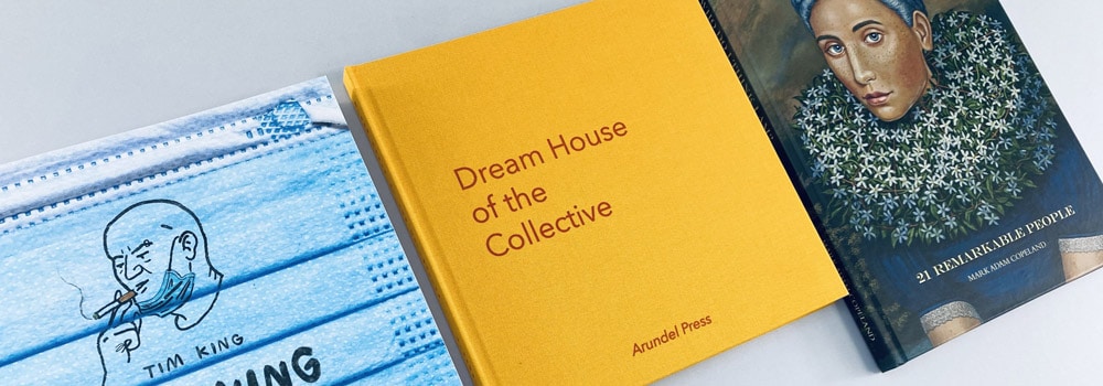
When people buy nonfiction books, they’re usually investing in them as a reference tool to inform a decision they have to make. They may also be interested in finding out more about a particular topic. But when someone buys a fiction book, it’s generally just to read for pleasure. According to McLean, the growth in sales across certain categories is a good indicator that people are now really reading and engaging with books again.
Reading is one of the top hobbies that people have adopted during the course of the pandemic, and another notable trend is that they are leaning more towards printed books than ebooks. In fact, ebook sales have not risen at all, with readers only buying these versions if they’ve found printed copies of a book have sold out. According to McLean, printed books are back in favour.
If the world was in a different situation, the increase in the sale of printed books would be a welcome positive for the publishing world and other associated industries. But even that has turned into something of a negative because of the many factors that have come into play.
In essence, printing books is not as simple as it once was. Paper, ink, and printing presses can only be found at a premium at present.
The paper shortage began with a shortage of pulp worldwide. According to reports, the price of wood pulp rose to $1,200 per metric ton in 2021 from just $700 to $750 per metric ton in 2020. The main reason for this increase is an environmental initiative in China that has closed 279 pulp and paper mills. There is also a global backlash against plastic and the rush to use paper as an alternative for all manner of applications.
The price of cardboard has also increased as more people move towards ordering products online. Paper factories have shifted production to cardboard manufacturing, taking resources away from fabricating book-grade paper.
In terms of ink, there are shortages in supply here, too – the Chinese environmental initiatives are affecting the manufacture of this as well. With the closure of wood-pulp factories, there is also decreased availability of resins, photo-initiators, monomers, oligomers, and additives.
Another contributory factor in the shortage of books is the ongoing difficulties surrounding shipping, something that’s affected the majority of industries.
The distribution network across the world is massively congested, and containers are not moving out of ports and into land transportation vehicles as fast as they would otherwise have done. On top of that, goods storage warehouses are still full.
The added complications of Brexit and the incident in which the Ever Given container ship inadvertently blocked all traffic on the Suez Canal in Spring last year also contributed to dramatic disruption to global supply chains. Then include a shortage of truck drivers, without whom products cannot be picked up and transported around the world, and it’s no wonder problems have arisen.
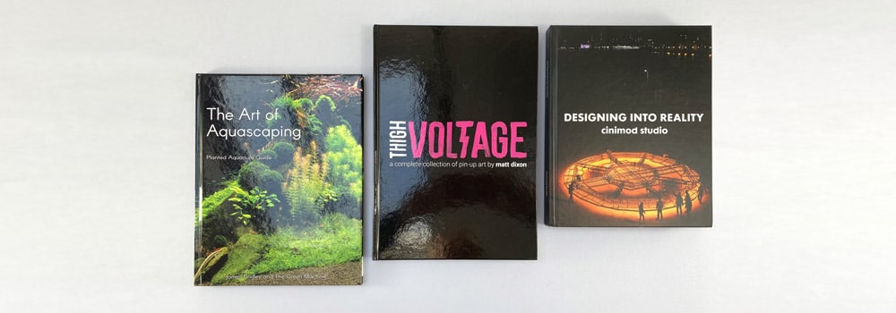
While all these factors have heavily impacted the publishing industry, some bright spots remain, such as the increased interest in reading, and of physical books rather than electronic versions to boot. If you’re an author here in the UK, you can still easily have your book printed locally. Working with a reliable and experienced printing company, you can commission short run hardcover book printing services, booklet printing services, and more.
When it comes to printing, there’s no better company to work with than Ex Why Zed. We use state-of-the-art, industry-leading printing machines that guarantee the best possible quality for your books. Not only that, but we also offer a wide range of customisation options, allowing clients to choose everything from the finish of the cover to the type of paper they want.
We are proud to have worked with many reputable companies over our years in the business, including Disney, Skype, BBC Sport, and more. Don’t hesitate to reach out to us today. We would love to talk to you and give you an accurate and reasonable quotation for your softback or hardback book printing project.
Self-publishing is a challenging endeavour because of the amount of work one needs to put in to achieve success. Despite this, artists in many fields are turning to self-publishing as a means to promote their work. Booklet printing services nowadays offer plenty of support for those who are looking to make their work more visible and well-known to the public. Many booklet printing companies nowadays can provide artists with a wide range of options, allowing for highly customised prints that don’t compromise on quality.
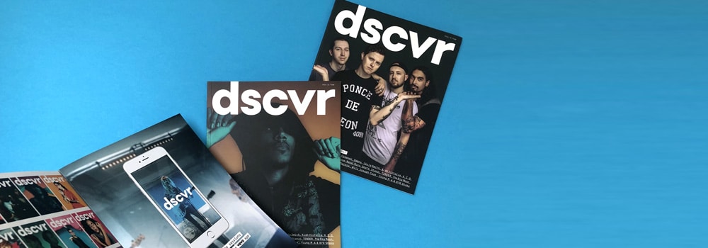
The main thing that attracts artists to self-publishing is the amount of control over the output that they can have. Some big names are taking matters into their own hands because this is a more convenient and empowering way of putting their work out there.
Many choose to go independent so that they can showcase their works and have control over what will be printed, as well as how it would look like an end product. Self-published artists say that doing it yourself makes your work seem more important, and there is a lot more emotion attached to it. Check out our content on unveiling the artistry and individuality of creative writing, typography and poetry zines..
In the early years of self-publishing, it was almost guaranteed to be gruelling work. In a book full of pictures, one had to shell out upwards of £5,000 just to get it published.
Another challenge in self-publishing a bookazine has always been that you have to surpass the standard that commercial publishing has set. The end result must be stunning.
Thankfully, independent authors and artists nowadays can simply hire a professional to help out with the printing process. Moreover, they now have a lot of say in terms of the overall design of the prints, as well as which materials are used. Independent authors and artists are encouraged to hire reliable booklet printing services from a reputable company so that the end result will be consistent with what they have in mind.
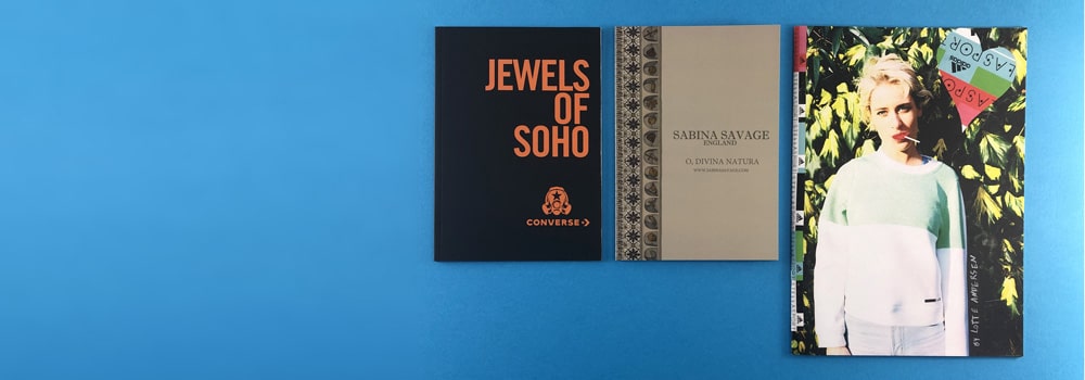
Those with little to no training or knowledge in designing an art book for self publishing can also benefit from an expert’s services. Hiring professional assistance can get what you have in mind laid out and so that you have a good idea of what could end up looking like.
However, if you do not have a lot of connections, self-publishing may also entail some self-learning, but that that is not necessarily a bad thing. You can learn a new set of skills that may become useful for you in the future.
Sometimes, learning a new skill may take as long as a month. Familiarising yourself with the equipment may mean investing even more time, but at the end of the day, when you learn these things, it will be easier for you to independently publish your booklets. Although there will be an adjustment period, through experience, you will find that you can really do it yourself.
Checking the quality is one of the biggest factors why many do not go the independent route. If you are signed with a publisher, all you need to do is to send the drawings or photos, and they do all the manipulation, layout, and quality control.
But when you self-publish, you have to oversee all the aspects of the process. So, if you spot any mistakes, you have to learn how to own them and be responsible for it.
Art and photography books need to be of top-tier quality, so it pays to check even the smallest details. Any small mistake in the printing or grammar can become obvious, so it pays to take great care when checking your work. You can ask your printing company to help out if they have this type of service.
One of the ways you can ensure a good booklet is to first create a dummy. You can print out a crude version of the booklet so that you can check it and have others see how it would flow and how the actual pages of the booklet would look.
An early version or a prototype can help immensely in getting feedback on what can be further improved or, more importantly, what needs to be revised or edited. Sometimes, a prototype may cost money, but the amount of stress it can reduce for you is priceless.
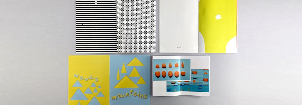
Choosing your partner printer is another great consideration to make, as they are the ones who will turn your vision into reality. You must note that different printing companies have different styles, which means each will put out a slightly different result.
You can ask your printing company to send a final on screen PDF proof to show what your booklet would look like once it has been printed. This is an essential step in choosing a printer because anyone who is flexible enough to accommodate small changes will be as passionate as you are about the output.
They should also not insist on implementing their own templates. While these can be useful when it comes to setting the printer, these can be limiting and could lead to massive changes to your vision.
A professional printer will also be more concerned about the deadline, always striving to meet and exceed the set expectations and timelines. If you want to sell your booklet at a certain time, the printer should be able to provide you with the copies at the date agreed upon or even earlier.
Self-publishing is a challenging but immensely rewarding undertaking. To ensure the best results, it’s crucial to work with a professional and reliable booklet printing partner. Such a company will have many options and services to choose from, allowing you to turn your booklet plans into a profitable reality.
At Ex Why Zed, we provide all the necessary services to assist you. We have worked with thousands of artists, self-publishers, children’s book authors, magazines, photographers, illustrators, and just about anyone who wants to see their work in high-quality prints.
Don’t hesitate to reach out, and we will do everything we can to produce the best possible results.
A5 booklets have a lot of uses for businesses and organisations alike, typically as informational brochures, providing knowledge in bite-sized books. A5 booklets are also excellent for advertising new businesses, products, and services. If you want to have your own A5 booklets for whatever reason, you’ll need to work with an A5 booklet printing service provider. Continue reading below to learn more about A5 booklet printing, including how much it will cost you.
As stated above, A5-sized booklets are best used as advertisements for businesses. They are large enough to contain crucial information about the services or products that a business offers. And, in case the information you want to convey doesn’t fit, you can always include more pages; unlike a brochure, which is limited to just a spread.
When given to customers, they can be easily put away in a bag for later reading, instead of going directly into the rubbish bin as is the case with larger, harder-to-carry posters. They can also be included on your help desk, so interested customers can simply procure one for themselves if they are interested.
A lot of manuals, especially those that contain a variety of illustrations, are generally printed on size A5 booklets. A5 is one of the best sizes for manuals. It provides a good page size for detailed illustrations or figures, and their corresponding text instructions.
Since you can choose between coloured or black and white pages, you will not run out of options to print essential information. The booklets can be used as a training manual for your employees or as a manual for some of your more specialised equipment.
If your business offers a wide variety of products, you can list them all in a product catalogue. A5 sized booklets are great for this purpose since they are small enough for portability. Moreover, they are also large enough to have more than enough space for product pictures and displays. You can have upwards of a hundred pages with an A5 size booklet, ensuring that you won’t run out of space to list most if not all of your best-sellers.
The option to switch to coloured pages is also handy if you really want to showcase how your products look. With an A5 size booklet, you can bring your products to life in a fun-sized package.
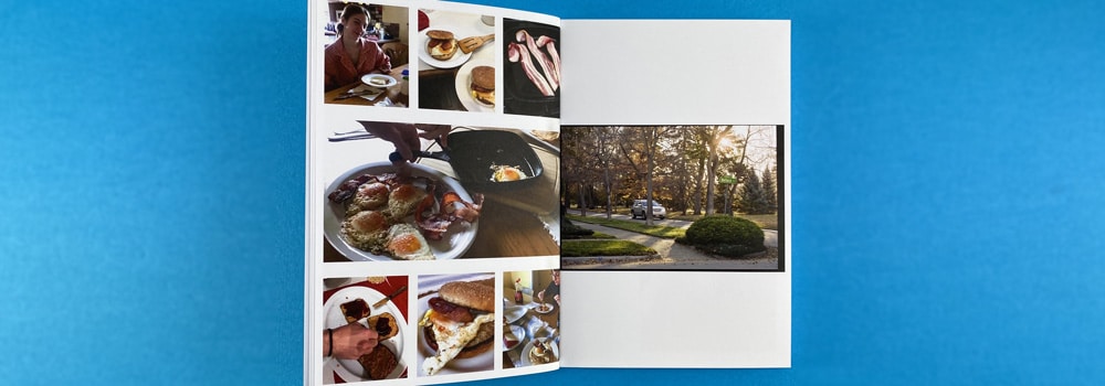
There is no definite answer to the cost of A5 booklet printing UK, as the price of A5 booklet printing depends on a variety of factors. These factors include the type of cover you want for the booklet, the type of binding, the paper used, and different finishes like matte, gloss, or no finish. The colourisation of pages will also affect its price, with black and white costing less than full-coloured pages. Lastly, the number of pages will also factor in the total price – obviously, more pages will cost more.
Nevertheless, expect to spend at least £58 if you are printing 25 copies of a book that uses silk with 150 gsm thickness, a long edge bond, a basic silk cover, and no lamination.
If you are looking for a booklet printing service provider that offers quality A5 booklet printing at affordable rates, give us a try here on Ex Why Zed. We provide close support to our customers, and we aim to give accessible service to everyone.
We offer full customisation on our A5 booklets. You can choose how you want it to be, from the page colourisation, binding, page finish and materials, and cover type, you can customise it all. The price will be automatically adjusted depending on your configurations. By working with us, you can expect to pay reasonable prices that depend entirely on your preferences.
Use the printed project builder on this website to get an idea of how much a project is going to cost you. Just put in the size, page count, materials for both the cover and the paper, cover type and finish, colourisation, binding type, and other details about your project; we will get back to you with a price quote as soon as possible. If you are interested in our other services like A4 booklet printing, browse our website for more information. For your other questions or enquiries, you can contact us via telephone at 01206 766647. Alternatively, you can also write to us via email at hello@exwhyzed.fixed-staging.co.uk.
A5 booklets are 148 mm wide and 210 mm long. There’s enough space for creative content to feature your brand’s products or services, despite A5 booklets being a bit smaller compared to A4 booklets. By going for A5 booklet printing, you would have several pages that can be utilised to convey vital information about your products or services.
Yes! We at Ex Why Zed produce numerous books within the A5 size. A5 is great because it offers portability without compromising on space too much. From guidebooks to novels, and even to children’s books, you can’t go wrong with A5 books. This is the reason why 148 × 210 mm booklet printing is very popular in the industry.
Several factors can make a difference in booklet printing costs, including the materials used, as well as the rates offered by your chosen printing company. Booklet printing prices can be anywhere between £18 and £18,000. To learn how much your project would cost, ask us for a quote today
You need at least four pages to make a booklet. Booklets are made by printing out four pages on one sheet of paper – two in the front and two in the back. Because of the way booklets are made, there can’t be an odd number of pages.
An answer for the question how long does booklet printing take depends on several factors, including the complexity of the design and the size of your order. To get a rough estimate of when your order will be completed, feel free to speak with our printing specialists.
Booklets are small bound books that have paper covers and a small number of pages compared to standard-sized books. Booklet printing is the process in which booklets are printed and bound.
Because booklets can display a lot of information while still being small enough to be portable, booklet printing has become a popular choice for many different purposes.
To obtain the best results possible for your printing project, it’s important to ensure that you’re hiring the best printing company out there.
Before hiring a prospective company, you need to make sure that they produce high-quality results. Your printed documents will represent your brand, and as such, they need to look professional. It’s best to ask your potential printing company about the projects that they’ve previously worked on and whether or not they’ve managed to deliver on their clients’ expectations.
Asking them about their services can also prove to be insightful. Ask if they offer any customisation options or what A5 booklet printing templates they use.
Practice your due diligence when choosing a printing company, and you definitely won’t regret it.
Booklets are excellent ways to market your brand’s products or services. They work similarly to brochures and are perfect for small businesses that want to engage more with their customers.
Booklets have the flexibility to be utilised in many different ways. For example, they can be used to explain your company’s best-selling products or your most popular services. Booklets also have more space for content compared to postcards or leaflets.
The low costs of zine and booklet printing for 148 × 210 mm booklets are also a major benefit. You can provide more information to your intended audience at a lower price.
The printing industry has been growing more and more in recent years, with everyone having access to a wide range of printing services in the UK market. To ensure that you’ll acquire the best printing results, you should get printing services from a company that has the right qualities.
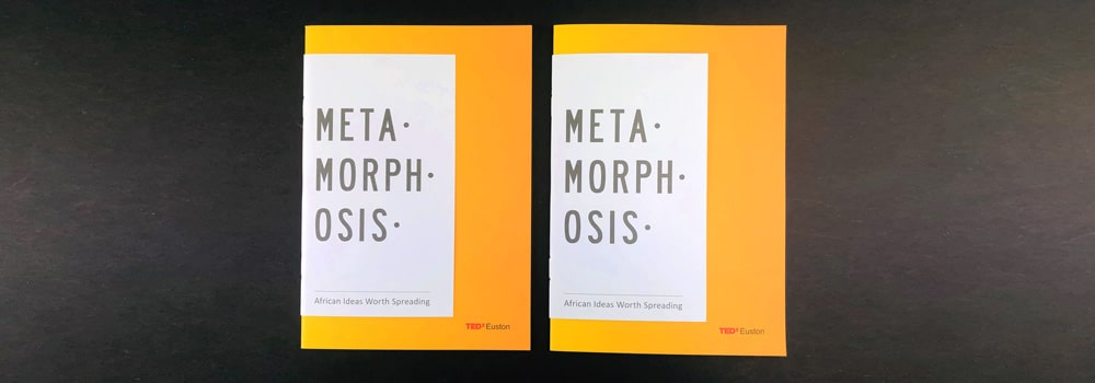
Look for companies that have shown creativity in their previous projects in printing for A5 sized booklets. Ask for samples of their work and determine if the quality is on par with your standards.
Above all else, you need to ensure that such companies provide high-quality services. Some companies have the latest printing machines and professional teams but cannot produce quality results. That’s why you should make sure your prospective printing company can exceed your expectations.
For all your printing needs, check out what we offer here at Ex Why Zed. You can rest assured that our printing experts can produce the best results for your project.
Before the prevalence of digital printing, the only option for printing hardback books was by ordering them in large quantities, or large runs. The use of resources between short runs and large runs was just not as economical, with short-run hardback book printing costing more money per book on average. Suffice to say, hardback book printing in small numbers was more expensive than the projected price for books that are printed en masse.
Luckily, things have changed in recent years. Short runs of book prints in every size, including hardback books, have become more seamless and have lowered in price. This opened a new window for people, businesses, and organisations that wish to publish a book but don’t have the resources for large-scale production. While it is still true that the more copies you , the lower the price per copy will be, you now only have to print a run as small as say 50-100 to make the unit cost commercially viable.
In this blog, we will discuss the benefits of conducting a short run of hardback book printing. In addition, we will also guide you in finding an affordable service provider online.
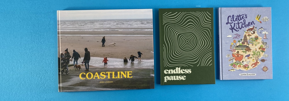
Digital prints no longer consume as much time in terms of preparation and setup, which means that you won’t have to wait for a while before getting copies of your ordered books. The reduced production time means that you will be able to get access to your printed materials, allowing you to sell them at an earlier date or use them for your business with less waiting time. If you print a short run of a few hundred copies of a self published book, we will aim to deliver 6-7 working days following receipt of your print ready artwork.
One of the main deterrents of large run hardback book printing is the associated cost. Although litho book runs (700 copies or more) are cheaper when you are comparing price per unit, they are more expensive in terms of upfront costs due to the sheer volume of copies being produced. Short-run hardback book printing, printed on our top of the range HP Indigo press is more affordable for new self publishers and children’s book authors, who want to try the market without over committing on cost for their first edition.
If you are planning a limited launch for your book, or you only want to print a few copies anyway, short-run hardback book printing in the UK is a must. Short-run productions are also recommended if your book is getting frequent updates. Since you have only released a few copies of your book, it is much easier to sell all of the previous copies before they are rendered useless due to the release of an updated edition.
Some of the best places to look online for inexpensive short-run hardback book printing service providers is online forums and message boards.
Various book printing forums on the Internet cater specifically to people residing in the UK. In these forums, you can find people with similar interests and, if you look hard enough, you might even find that your question has already been answered by another user. After all, it is very likely that other people have asked for help online concerning finding affordable printing companies in the UK. We are fortunate at Ex Why Zed to regularly receive word of mouth referrals from peer groups.
You can also consider looking through reviews and blogs that cover various printing companies in the UK and use them as a basis for your research.
If you are looking for a book printing service provider that allows short runs of hardback books, check out Ex Why Zed. Our website and printed project builder are built to be customer-friendly and easy to understand regardless of your familiarity with the printing process. We offer full customisation for our customers, from the book cover finish to the type of pages used. We also guide our customers through the whole printing process if they need or want assistance. Any questions, do give us a shout we are always more than happy to help.
Aside from hardback book printing, we also print booklets of different sizes, brochures, photo books, and portfolios, among other print products. Browse this website for the full details of our services.
We allow you to choose the exact number of copies for printing, and we even allow customers to have a single hardback book printing. Regardless of whether you are printing a single book for a private collection or if you want a few hundred copies for your business, we have got you covered.
Get a quote today by filling in our printed project builder, which can be found on this website. Our project builder can be completed in just under two minutes, and we will try to send a quote to your entered email address as soon as possible. For your other questions and enquiries, you can get in touch using our phone number: 01206 766647. You can also send us an email at hello@exwhyzed.fixed-staging.co.uk.
Short-run printing refers to a method in which a small number of “trial” books are printed. Think of it as the next step up from printing “on demand”. Although this method used to be costly, modern digital printing technology allows short-run hardcover printing for books, booklets, zines, brochures, and other items to be produced at a relatively low price.
Hardcovers are a signal of quality and an indication of purpose on the part of the publisher: it indicates to booksellers and reviewers that this is a book they should pay attention to. Those who want a hardcover release for their books should consider getting short-run hardcover book printing services.
The production turn time depends on the size of your order. A typical order of soft back versions is generally completed within 4-5 working days, while hardbound editions can take 6/7. If you would like an estimate on how long your specific project would take, do ping us an email on hello@exwhyzed.fixed-staging.co.uk or even jump on our live chat in the bottom right hand corner of this page.
A booklet is a small, bound book with a paper cover and a few pages. A booklet, as you might be guessed from its name, is generally smaller in size than other books. Booklets are frequently A5 or A4 in dimensions.
The factors which affect the cost of your booklet are the size, number of pages and quantity. Jump on our Project Builder, choose the Rockstar or Helping Hand route depending on your level of print experience and we will be back with an initial quote in a couple of hours.
When it comes to paperback and hardcover book printing in the UK, colour offset printing is one of the most popular printing techniques today. It is also widely used in printing for newspapers, magazines, stationery, brochures, and many more.
Below is a photo comparing a soft back perfect bound book with a case bound hardback book.
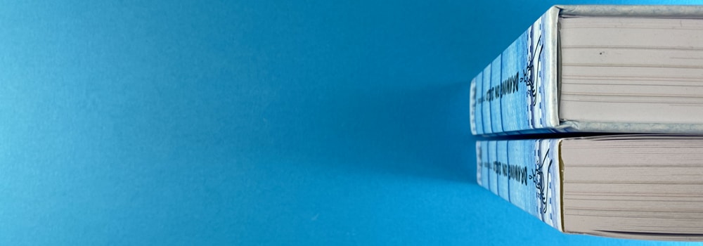
Short-run hardback book printing, or “print on demand”, is a type of printing that employs cutting-edge digital technology to produce smaller “trial” batches of short-run hardbound books. This printing method can also be used in paperback books, calendars, brochures, and other items.
Before the development of printing technologies, traditional offset printing was the only type of printing available. But today, short-run printing can yield plenty of benefits, such as a shorter turnaround time for products, fewer costs and wasted inventories, and more. And because short-run printing is done in small batches, it allows for easier revisions.
Many believe that bookbinding was the invention of Johannes Gutenberg in 1447. However, the Chinese tributary state of Korea actually came up with the first movable metal printing press 216 years earlier.
The rise of the textile industry during the Industrial Revolution influenced David McConnell Smyth to invent a sewing machine especially made for bookbinding. And during the 19th century, several improvements in the bookbinding system were made.
Bookbinding has come a long way since then. Today, anyone can have their books printed and bound simply by getting in touch with a reputable company.
When it comes to short-run hardback book printing, you only want to speak with print companies who know the idiosyncracies of that type of binding.. They produce prints with a high level of precision and efficiency. Aside from this, here are other benefits why it is best to use professional printing and bookbinding services:
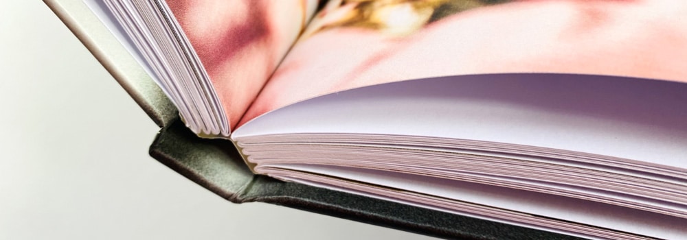
If you’re planning to have a printing project, you’ll need to choose the best printing company for the job. In doing so, here are some things to consider:
If you’ve been on a hunt for the best printing company for your project, look no further than Ex Why Zed. Whether you need printing for hardbound or soft-bound books, magazines, brochures, and more, we’re confident that we can produce the best results!
Custom notebooks can promote your business and provide your customers with something
to use and remember you by. If you want to run a campaign to increase brand recall,
notebooks may prove an excellent investment. Hardback notebook printing companies like
Ex Why Zed can provide you with various options that will fit your vision and budget.
Hardback book printing is a craft, and you should have a supportive and professional service
provider to do it for you.
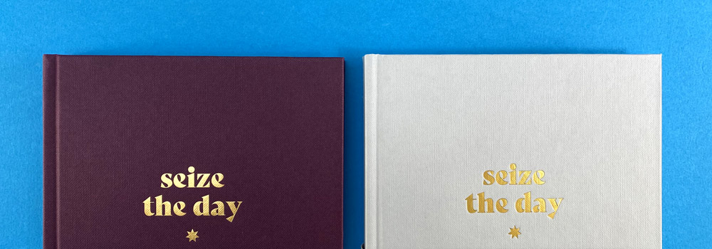
If your company has created custom designs based on your branding, you can convert them
to wallpapers, icons, greeting cards, and company paraphernalia. Transferring the branding
to a notebook will also be a great way to promote and strengthen your brand.
Notebooks come in all shapes and sizes. You can design it in a way that will speak to
customers and be related to your brand.
You can choose any photo to put on the cover. You can also put your company logo, some
creative typography, or just about anything you can dream of. Ask your hardback notebook
printing company what types of customisations they can do for you.
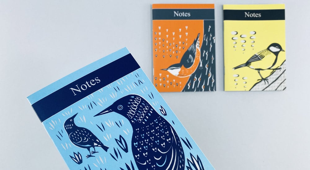
If you are thinking of printing notebooks, there is a wide range of options in terms of size,
cover design, and more. Below, we discuss the things you need to consider.
The most common sizes are A6, A5, A4, and 210×210 mm. When choosing sizes, consider
the intended purpose of the notebook, as well as its design. Smaller ones like A6 are ideal if
your target customers are on the go and want something handy to take along with them.
If you cater to people who work in the office and are always by their desk, a bigger A4 size
may be better. You can also make the notebook size completely unorthodox if you wish, but
take note that this may cost more.
Another consideration to make is the cover, and we’re not just talking about the design. The
weight of the cover page also varies. 300 gsm is typically a good weight for a notebook
cover.
Covers can also be coated with gloss, silk, or simply left uncoated. Lamination can also be
used to give the cover protection against scratches.
Inside pages are the most important parts of the notebook, which is why you should put
more thought and consideration into it. There are uncoated varieties, which have a brighter
and smoother finish. Some coatings can be used to make the pages appear off-white.
When it comes to the type of paper, you can choose between recycled paper or a house
blend. The weight of the paper usually ranges from 115 gsm to 170 gsm. The thicker the
paper, the better the ink, pencil, and crayon will stick.
You can have designs printed on the paper as well. There’s lined paper, graph paper, or
completely blank options, which each appeal to different people.
The key to making good notebooks is to define the goal and key concepts you want to
convey within the campaign. To get the most out of your investment, you must decide what
your goals will be.
You have to make sure that the branding is on point and consistent with your company
guidelines. This means the colour scheme, font, logo, and the things that make up your
corporate logo are reflected in your design and output.
It can be quite tempting to go with a nice design you saw while researching, but nothing
beats a consistent and on-brand design to provide the best recall for your company.
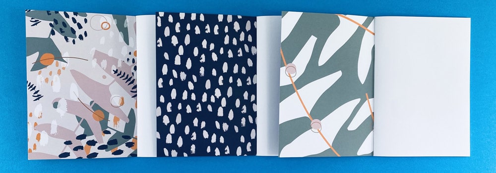
Another thing that many companies tend to forget is to remember their own employees and
associates. Remember that your employees are your primary ambassadors. If your
employees use a customised and branded notebook when jotting down notes, they would
not just look smart, but they would also embody the brand’s overall appeal. In a sense,
branded notebooks are subtle posters that showcase your brand to others.
When giving away notebooks to your clients, customers, or suppliers, you are providing
them with a piece of your company, in a sense. Notebooks may be small, but they are also
like bricks that help build B2B relationships and forge loyalty among customers and clients.
What’s great about a notebook is that it is used every day for a variety of purposes other
than office work. People can use them in daily life as well. So, think about how they would
use them and design them accordingly.
If you want people to perceive your business or company in the best way possible,
remember to make high-quality products. This will send the message that you don’t
compromise on the things you give away, which is why they can also rely on you to provide
high-quality services.
People will not just appreciate the thought of receiving a great gift from you. Quality
promotional items will also improve brand recall, enhance your company’s image, and
promote it to a wider range of people.
Surely, notebooks may seem like small things, but with the right treatment and design, they
can greatly aid your branding campaign’s success.
Hardback book printing can provide plenty of opportunities for companies, individuals, and
anyone who wants to promote their brand or simply make something to give away. To
ensure the best-quality prints, you need to seek out and work with a reliable printing
company.
At Ex Why Zed, we use the latest printing materials, methods, and technology to provide
you with the best outputs possible. We carefully collaborate with our clients to ensure that
they receive the right products of their goals, whether they need custom notebooks or custom journals,
booklets, hardback or paperback books, and many more.
For enquiries, don’t hesitate to reach out or use the quotation button to get started.
Hardcover book printing is a common choice for a lot of people, especially if they’re going after quality and longevity. However, hardback book printing is priced differently compared to paperback printing. That’s because there are a lot of factors to consider in terms of cost.
On average, hardcover book printing in the UK can cost from £3 and up per book. The cost can most definitely go a lot higher, though, depending on a number of different factors.
Compared to paperback books, hardcover books are more expensive to print. The material used for the cover alone can cause this, but that’s not the only thing that affects the cost of printing.
Here are some of the most important factors that affect printing costs:
There are a number of choices when it comes to materials that can be used for hardback books. Boards are used as the base of the cover, and another material is wrapped over it, depending on your preference.
Some prefer using silk, for example. Others who want an edgier look may opt for leather. Depending on the materials to be used, the price will also increase or decrease.
The more complicated a design is, the more expensive the total cost will also be. Evidently, having a simple group of words printed across a plain background will be the cheapest way to go. There are also over 50 possible choices in terms of the cover colour.
Some may opt to foil a few letters on the cover, which will mean additional costs. In some cases, you may want to print out a simple photo or have a colourful work of art splashed across the face of the book. The basic rule here is that the simpler the cover design, the cheaper it will probably be.
The more pages your book has, the higher the costs as well. Not only does the amount of paper required add up to the base cost, but it also becomes tougher to bind the thicker the book gets.
Some might think about making the pages bigger to lessen the number of pages, but that could affect the costs as well. That’s because bigger pages mean more printing on each piece of paper. So compare first, especially if you have quite a lot of coloured images on the pages.
Some hardcover book printing near me offers a number of different choices in terms of the type of paper to be used. Some paper is thicker, and some will feel smoother between your fingers. Different types of paper will have different costs.
The best way to determine what type of paper you’ll need for your project would be to request for some samples. There are great hardback book printing companies that provide these for free so that you can make informed decisions on how you want your book to be printed. The truth is, choosing to have your book or journal printed with a hardcover means that it’s a premium product. So, it should be the value that counts and not just the price. The good news is, working with a trusted printing professional can give you the best value for your money.
The saddest thing that can happen is for you to find the cheapest printing options and end up with a sub-par product. Even sadder is if you shell out a lot of money and end up not getting any real value with for your investment.
That’s why it’s important to choose your hardcover book printing partner well. Right off the bat, check how responsive they are to your enquiries. Do they answer questions in a timely manner? Do they work with you throughout the process? How well do they explain the printing process and what the pros and cons are for each option? The more informed you are, the better your choices and the final product will be.
Make sure you check on their portfolio, too. Look at the quality of their output and how satisfied past customers were with their entire experience, and not just on the final output.
Check also how flexible they are, especially if you want a few unique touches to your book. They have to understand your creative process well and not just stick to what they already know. Work with a company that also has a team of creatives working on your project.
Call us here at Ex Why Zed via 01206 766647, and let’s talk about how we could give you the best value for your money in printing your hardback book. You can also get an accurate quote for your printing project with our project builder here at https://exwhyzed.fixed-staging.co.uk/printed-project-builder.
Hardcover book printing uses thick, firm cardboard and other materials that add to the book’s durability. Special covers are sometimes used to protect books and their pages from dust and frequent usage. Pages are also usually acid-free to preserve the paper and ink.
Paperbacks, meanwhile, have thin, flexible covers that are prone to wear and tear. However, they are cheaper.
Yes, they are. That’s because many readers prefer the quality and robustness of hardcover books. As they are made with high-class materials and processes, it is also easier to preserve them. Overall, hardcover books can provide a lot of value to readers who are willing to pay more money for them.
The primary reason why publishers opt for hard back book publishing is that hardcover books bring in more money. But apart from this, hardcover books are winners because they are highly appreciated by readers and booksellers, given that they offer better quality compared to paperback books.
Yes, they are. To keep pages in place, they are sewn with a heavy thread at the spine. They are stain- and moisture-resistant because their cover is made from thick, sturdy paper board that is topped off with gloss-coated paper. These books have gone through a digital hard bind catalogue printing process that gives them their longevity and durability.
Many people believe that printed books are superior to eBooks for various reasons. Notably, studies have found that reading on paper is a far more rewarding experience compared to reading on a screen. Moreover, as physical books don’t emit any harmful blue light emissions, they will cause less eye strain and won’t interfere with one’s sleep.
Printed books are still popular because readers enjoy the feeling of holding a physical book in hand and flipping through the pages. Moreover, printed books have numerous advantages over their digital counterparts. For instance, they help readers subconsciously absorb details better compared to reading on screen.
When it comes to durability, hardcovers are the winner. That’s because hardcovers involve the use of durable materials such as binder’s board, cloth, or leather. It may also come with jackets to shield the book from further damage. Though these books can be rather pricey, they have the power to draw in plenty of sales during release dates.
Paperbacks, however, are the winners when it comes to price. Since they only use soft paper and glue, they won’t cost as much. This makes paperbacks highly accessible for the masses as well.
Hardcover books are published first, primarily because many people still purchase them despite their high price tag. Hardbacks have an attractive quality to them that makes them appealing to display on library shelves or in bookstores.
Since book collectors are drawn to buying hardcover books at the onset of their release, publishers take advantage of this profitability. The income that publishers could get from selling hardcover books during first launches are often enough to give them a good return on their investment.
Before hiring a hardbound book printing service online, you have to consider your printing options first. The right company would offer multiple choices in sizes, colours, and materials.
The next essential step is to look at their sample works. Observe inks and layouts that have been used on previous print jobs so that you get a good feel for the quality that they produce. Another thing worth considering is the ability of the printing company to meet deadlines.
Lastly, verify if the company’s staff demonstrates professionalism and excellent customer service. All these would help you recognise which printing companies are worth hiring.
When hiring a printing company, onlookers must consider two main factors: reputation and experience. If a printing company has earned certifications and awards, these serve as proof of their capacities, professionalism, and dedication.
Chances are, they would give the same level of commitment to every client who has hired their services. Satisfied clients would, in turn, serve as active promoters of their business.
Companies that have been operating for years will have displayed expert skills, innovation, and efficient methods in their previous work. You can learn more about how well they perform by checking testimonials from their previous clients.
If you’re looking for exceptional services for hardback, paperback, booklet, brochure, and art book printing UK-wide at competitive prices, check out our range of offers right now at Ex Why Zed. Call one of our representatives today!
Publishing has been rapidly evolving over the years. Half a decade ago, people thought it would be phased out and replaced entirely by e-books. However, traditional publishing methods such as softback and hardback book printing in the UK remain resilient to this day. Softback and hardback book printing have continued to evolve, and many different trends have affected the publishing industry over the years. In this article, we take a look at some of the most prominent publishing trends for 2023.
Over the past few years, print has been steadily overtaking digital again. Print will likely continue going strong even well into the second half of the decade.
Some readers even buy the same book in printed format, even though they already have a digital copy. The new generation of readers views the experience of holding a physical book as something to be desired. Most people also think that books make great gifts – another significant reason why physical books are getting increasing attention.
More business owners are now dipping their toes into publishing. This is because publishers have made it easier for books to get out into the market.
Collaborative and stand-alone books, in particular, are getting the attention of a wider audience, resulting in increased popularity for books that have around 20 or so contributors. With their collective reach, authors can easily promote their work and use their influence to sell a book.
Some publishing companies have seen a return of poetry books. The poetry community has used the opportunity set by the global pandemic to get online and deliver their content to their audience. Some of these books make use of hardback book printing in the UK to add to their appeal.
The retelling of fairy tales in children’s books has been trending as well. Children’s books have been popular during the lockdowns, and more interactive content has been welcomed by both parents and their children. This is why more people can look forward to a surge in such content in the coming years.
Classics have also had a massive return because more people are going back to their old favourites for a rush of nostalgia. This trend may significantly affect the future of publishing, and perhaps even the creation of new content, as publishers and authors strive to meet their readers’ demands.
An increasing number of people have been turning to audiobooks this year, especially self-help books. Podcasting will also be considered by more publishers.
As new audiobook platforms rise, people will find other alternatives to Audible, the leading platform for audiobooks. However, it isn’t likely for Audible to fall out of favour any time soon.
Educational institutions will also contribute to the growth of audiobooks as an alternative way to help students learn.
More and more small publishers are now opting to focus their marketing efforts on their specific niches instead of trying to cater to wider audiences. Doing so allows them to cultivate a loyal group of followers.
Industry insiders stated that the sales of physical books were surprisingly robust in 2020 and were even increasing. Some asked if this increase can be sustained when other forms of leisure, such as shopping and dining out, are permitted.
Some said that the sale of books online has dramatically benefitted them. Retail partners that have online components provide significant benefits to publishers. With other avenues aside from Amazon, the increase in sales of books from 2020 has trickled over to this year.
Marketing has been a key player in keeping book sales up. Even with the cancellation of book fairs and the closure of booksellers, online events have made it possible for authors to reach their audiences.
Zoom book tours have been one of the go-to solutions during the stricter lockdowns. However, somehow, they have petered out this year. Even with the hype of these online and virtual events, they do not translate to sales all that well. After all, the expectations for these virtual tours rarely meet up with reality.
Bookstores are still the primary means to discover titles. Experts say that publishers should be more experimental and entrepreneurial when it comes to marketing to their audiences using shops. In this way, they can tease and reach new audiences and demographics more memorably.
Various old and new business models have been thriving. Although bookstore sales have decreased, their sales online have been increasing, with direct-to-consumer sales being made possible by websites such as Amazon and Bookshop.org. Online book clubs have also increased in popularity.
The most notable trends are digital reading platforms for children’s books, which have attracted more than 50 million users.
However, one of the biggest challenges authors and publishers face is the tightening of the supply chain. On the manufacturing side, longer print cycles are the primary concern.
Production issues affect publishers on an international level. In the UK, shipping books from continental Europe has become more difficult due to Brexit.
Print-on-demand suppliers have seen the backlash of the tightened supply chain. Some of these companies were at maximum capacity in 2020, making it difficult for them to get new customers.
The future of publishing books will continue to evolve, and the love of reading for many will likewise carry on. Analysts say that the market for books in 2023 has remained strong.
The best time to publish a book is now. With the increase in interest in physical books and the availability of content online, the opportunity is ripe to make your book a reality. What you need is a reliable partner who can publish your work with the best quality possible.
With Ex Why Zed, you can find many options for publishing your book. You can use various methods, such as paperback printing, hardback book printing, magazine printing, booklet printing, and many more! We have a wide range of offerings to make your book the best it can be.
Reach out to us today, and let us help you turn your ideas into reality.
Over 200 million printed books were sold in the UK last year despite the COVID-19 pandemic. This is an impressive figure, and even more notable for being the highest volume of UK book sales in well over a decade. It would seem that the popularity of printed materials, as opposed to online-only publications, may not only be persisting, but even increasing. This could be an encouraging sign to companies and individuals looking to invest in custom booklet printing to promote their writing, products or services. If you’re a business or an independent author opting to self-publish, it’s well worth considering investing in affordable book and booklet printing.
The Bookseller magazine recently reported that official book sales in the UK increased by 5.2 per cent in 2020. The total book sales amounted to 202 million volumes, worth around £1.76 billion. This figure represents the largest rise in book sales since 2007, while the annual value was the highest since its last significant peak in 2009.
It’s interesting that physical books continued to sell in huge numbers despite the pandemic; not least because booksellers faced shutdowns for long periods last year, with the two national lockdowns from 23 March to 15 June and from 5 November to 2 December. However, the lack of open bookshops apparently failed to stop printed book retailers from thriving in the industry.
Sales director Vicky Ellis said that 2020 was a year like no other, a year of extremes, in fact. She said that the first lockdown saw a significant decline in sales; but once non-essential retailers reopened, sales skyrocketed. Ellis especially singled out an additional “Super Thursday”, which took place on 1 September 2020.
While the arrival of books at local bookstores saw delays during the pandemic, there was a huge increase in sales as soon as the shops opened.
Despite stringent social distancing rules, readers were quick to return to their favourite bookshops, and the first week of June saw sales of 3.8 million books. This totalled £33 million, a 31 per cent increase in sales in the same week of 2019. Print book sales rose by 9 per cent in volume and 11 per cent in value in the eight weeks following reopening after the first lockdown.
According to The Bookseller, the best-selling title of 2020 was The Boy, The Mole, The Fox and The Horse by Charlie Mackesy. Closely following in terms of volumes of sales were Richard Osman’s The Thursday Murder Club, and Pinch of Nom – Everyday Light.
Ellis stated she was not surprised that demand continued throughout the remainder of 2020 and the pandemic as a whole. She also noted that demand had remained strong during the second lockdown and ensuing restrictions. Her conclusion was that people had grown tired of watching so many Netflix series and had been in search of something else to fill their time.
Ellis also conjectured that books offer people a diversion away from spending too much time on their phones or in front of computers – devices that most people use on a daily basis for work and other purposes. Physical books can also be a home accessory capable of being put on display, unlike e-books.
Other industry commentators claim that the increase in sales of physical books could also have been prompted by a greater yearning for educational content. The home learning market, either for children whose schools have been closed or for adults aiming to benefit from lifelong learning, is continuously growing. People want to learn for themselves or to escape to another world, even for a brief moment in time. A physical book, though often viewed as outdated these days, can do something for readers that an electronic version cannot.
Businesses too can capitalise on this trend. Custom booklet printing gives their customers something more tactile and less ephemeral than an advert, a website or online pdf. In short, printed notebooks can help a brand get noticed and make a company stand out from its competitors.
Back in the world of publishing, publishers were unable to release their offerings during the April 2020 lockdown, so they had to postpone new releases until the following season. In previous years, the weeks that lead up to the autumn have been viewed as the busiest months for new releases as people stock up on books as presents for Christmas and to entertain themselves during the forthcoming holiday season.
Since 2008, there has traditionally been a Super Thursday in October, on which a host of new titles are released onto the market. But this year, because of delays in release dates during the lockdown and the inability to hold face-to-face conferences, festivals and literary events in spring and summer, there was a huge backlog of titles waiting to appear on the shelves.
The industry, therefore, decided to have a whole series of Super Thursdays, with the first, on 3 September 2020, when almost 600 books were released on a single day.
However, while readers rejoiced in the wealth of new material available to them, book publishers and authors were less enthusiastic. Greater numbers of new releases equate to greater competition. It was even harder to attract attention, especially for first-time published authors, whether for sales or for reviews by major publications. The pandemic left little unaltered in the publishing world last year.
Increases in book sales were also mirrored in the US. In 2020, sales increased by 8.2 per cent to reach a massive 751 million books purchased. Similar to the UK, many people who were avoiding Covid were stuck at home and took to reading books as one of their key sources of entertainment, comfort, and escape.
Book analysts have given their insight into the state of book markets in the UK and beyond and have stated it has changed dramatically for the good in recent years. Growth in sales came in waves, whether driven by increased interest in analysis of the political scene in the context of the presidential election or in purchasing texts to teach children at home during school closures. Others looked for new interests or to improve existing skills during lockdowns by purchasing cookbooks and DIY books, for example.
One huge area of growth during 2020 was the juvenile fiction category. Sales of print books classified in this niche contributed a third of the growth across the entire US book market. The percentage of juvenile fiction books sold increased by 11 per cent, totalling 18 million volumes more in 2020 than across 2019. Adult non-fiction printed book sales also increased by 4.8 per cent, selling 14 million more books in the same period.
Whether you’re a business looking to advertise, an aspiring author or a seasoned writer, a good publishing partner is essential to help realise your ambitions. With the increased interest in physical books and other printed material, self-publishing could prove a valuable tool in your arsenal as you seek to reach new audiences.
When you want to transform your ideas into print, Ex Why Zed can help you. Our services range from pamphlet, magazine, and booklet printing to artists’ catalogues and self-published children’s books, novels and non-fiction. We ensure that every aspect looks professional, from the quality of our printing to our binding, and all at the most competitive prices.
Why not see for yourself by asking us for paper samples? We’re also delighted to offer advice and support for any printing project. Call us on 01206 766647 or email us at hello@exwhyzed.fixed-staging.co.uk, and we’ll be glad to help you out.
As in all areas of life, the printing industry has seen many technological advances over the years. Booklet printing UK-wide and printing of many other formats like newspapers and magazines are very different to how it was done in the past. Major improvements to booklet printing technology have made the process more environmentally friendly and efficient, as well as resulting in better-looking, better-quality prints.
This brief guide will offer tips on finding affordable but high-quality booklet printing services for whatever purpose you need. It also lists some of the qualities and services you should look for when choosing a booklet printing company.
Nowadays, you can find most UK printing companies online. Just search for ‘booklet printing UK’, and you’ll be presented with a long list of companies that offer this service, as well as details of their processes and how much you might have to pay.
Some of the most helpful and transparent companies will offer quotes for their printing services upfront online. All you have to do is provide the necessary information, such as the number of copies you want to print, the page colouring, materials to be used, and whether you require multiple or single book printing UK-wide, and so on.
After doing a degree of research online, you can shortlist the printing services company you want to work with. Then, compare and contrast the companies on your list by factors such as price, the company’s reputation, customer service, delivery estimates and so on. Finally, narrow your options down to the best one on the list.
If you’ve been searching for “booklet printing near me” on Google, here are several factors to take into consideration:
The first thing you should look for in a booklet printing company is the quality of their print. Nowadays, people have higher standards than ever and expect professional presentation. Something produced in a low quality of print, no matter how compelling the words inside are, will stand out like a sore thumb and give people a poor impression of your business.
Print quality is all down to the company’s procedures and the quality of the printing equipment they use. To ensure your words make a great first impression, make sure you find a printer that has a proven track record of producing high-quality outputs.
Try requesting some print samples from any company you intend to use before signing a deal with them. If you ask for print samples from a few printing companies, that’s even better, so you can decide which looks and feels the best. That will help you a lot in deciding which company to entrust your business to.
Consistency is the key to building your brand and setting your printed materials apart from your competitors’. If you plan to print more booklets or other forms of literature to promote your business in the future, you may want to select the same colours, fonts, shapes and style, so your regular readers can familiarise themselves with your brand.
If you were printing a comic book, you’d want to ensure that the page and book cover elements matched the story’s theme. But generally, aim for consistent design across all your publications, as inconsistencies could result in confusion among your customers. Aim to work with a booklet printing service provider who values consistency at all times and can advise on building a unique and memorable house style for your company.
If you are looking for affordable yet high-quality children’s booklet printing services in the UK, you’ve come to the right place. Here at Ex Why Zed, we are dedicated to helping our customers get the best printing services by providing close support and accessible services.
Get your print quote today using our printed project builder. To determine the total price, we factor in size, the number of pages, cover material, binding method, colouring, matt lamination, and other properties.
We offer various binding options for booklets, such as saddle stitch, staples, wire stitch, perfect binding, and so on. Each of these binding options for booklets is designed for different booklet thicknesses. For example, saddle stitch is generally only required for booklets with 48 pages or less.
Alongside booklet printing, we also offer a range of other printing services for our customers, such as the printing of business cards, children’s books, photo books, notebooks, newsletters, portfolios, and much more.
Our website is highly user-friendly, whether you are a beginner when it comes to printing processes or an experienced publisher. We provide extra help, tips, and resources to help our customers who are unfamiliar with the printing process. But if you’re more experienced, you can skip straight to our project builder. It takes just two minutes to use, and we aim to get back to you with an email quote as soon as possible.
If you have any further questions, you can email us at hello@exwhyzed.fixed-staging.co.uk or give us a call on 01206 766647.
The cost of booklet printing depends on various factors, including the page quantity, booklet size, the binding methods used, paper types, colours and turnaround time. A company that offers top-notch booklet printing in the UK will aim to provide a competitive quote for your project. Contact us today for an estimate for your publication.
You need at least four pages to form a booklet. Each sheet of paper contains four pages, two on the front and two on the back. The paper is folded so that the pages all run consecutively. The number of pages in your booklet, then, must be in multiples of four. Typically, a booklet has a minimum of eight pages.
It can take between five days and two weeks or more to print a booklet. The duration of the printing process depends on the design’s complexity and other variables, including file submission, proofing, binding styles, and quantity. Orders of a hundred or fewer copies take five days to print, while orders of five hundred or more copies take ten days.
A5 booklet printing is an effective way to market products, issue user instructions, or even showcase stories in a compact form. Booklets are bound or stapled, making them stronger and longer-lasting than a pamphlet. Printed booklets typically have a standard size of 210mm x 148mm, 210x210mm or 240x170mm which reduces waste as well as the overall print costs.
A booklet is a document containing multiple sheets of paper with four pages printed on each. Once folded, these sheets correspond to a page order. Printers can print on both sides of the pages using automatic or manual processes. A professional service offering bound booklet printing in the UK can provide a range of design options as well as scalability.
The many benefits of brochures include the following:
With the rise of high-tech e-readers and the like, it can be tempting to publish your book online instead of having it printed. However, many people still prefer printed books to e-books. Here are a few of the reasons why:
If you’ve been searching for a printing company that offers top quality outputs at competitive rates, check out our wide range of services at Ex Why Zed!